Art and Golf Design
by Geoff Shackelford
A select few golf courses inspire passionate discussion and motivate golfers to travel around the world to experience whatever it is that makes them so interesting. These layouts are genuine works of art, conceived with care and built by craftsmen.The great courses subscribe to certain values that serve as the same linchpins of timeless art forms such as music, architecture and painting.
Working with Mike Miller over the last six years and watching him develop his impressive collection of paintings that has culminated in The Art of Golf Design, I keep coming back to certain principles that Miller lives by in his art. They are the same standards that apply to the golf course architecture of merit. The vital principles shared by painting and golf design include variety, irregularity, spontaneity, time and a study of the masters.
If you take in Miller’s portfolio of paintings, the variety of colors and his choices for subject matter prove to be impressive because each page contains a new surprise. Yet, amidst this constant variety, Miller maintains a consistent ability to accentuate the architecture at some of the world’s finest courses. This is not an easy task, especially when you notice how drastically some artists change styles over their careers, often with conflicting results. Certainly some of the variety in Miller’s work comes from his improvement over these last few years as a painter of landscapes (most of his work prior to and continues to be non-golf). But the real secret to Miller’s varied collection comes from constantly mixing colors and avoiding overuse of raw, primary colors.
Great painters separate themselves by almost never using colors in their raw states unless the subject matter calls for it, just as golf architects who genuine respect nature try to emphasize subtle hues and features over anything resembling a raw color or shape. Artists trying to elevate their work are constantly mixing paint and experimenting to come up with soft, but still rich colors similar to those found in nature. We don’t find many ‘raw’ blues, reds or greens in nature, yet in golf architecture, we see prolific designers who never mix their colors, yet who have massive bodies of work that consistently fail to inspire discussion more than a couple of years after they open. Their courses offer a stark blend of bright bunkering contrasted with clean borders made up of even more raw, flat colors. Even their contours all too often appear raw, not having taken any kind of subtle shifting of soil to mask machine work.
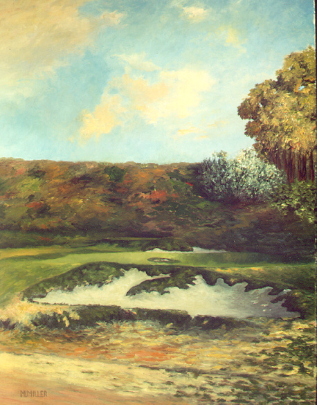
A phenomenal variety of colors is found in Miller's painting of the 6th at Riviera.
Much of the modern golf art we see is representational, with clean, accurate renditions of golf holes. But a certain sameness and flat feeling is usually found, all because the artists are rarely mixing colors or presenting the holes in a variety of moods. The work is nice to look at, but one senses something is missing. Like with all too many modern course designs, there is a constant hard, polished and flat feel that your eye recognizes as the work of a manufacturer, not an artist. It becomes evident that the builder did not take the time to mix his colors or take the extra time to shave off the manufactured edges.
The growing popularity of Coore and Crenshaw’s designs is happening not because they have reinvented the wheel, but instead, because they subtly mix their colors. Their courses are built by the same men from job to job, even with a similar bunker style for the most part. Yet they inject a variety of nuances and fresh ideas from job to job, while their overall style is inviting to the eye because they constantly battle to mimic nature’s finest features, and religiously work to create irregularity. They mix their colors by sticking to hands-on, site specific design. They craft a routing of the holes that works with the site, and their personal supervision of details is part of the design until the course is complete.
Irregularity is the second principle of Miller’s paintings that is vital to individuality in both art and golf design. Creating irregularity serves as a constant battle from painting to painting. Regularity should not be evident when painting a landscape that contains nothing but irregularly shaped features. Straight lines of any kind can be loosened with the proper brush strokes, just like they can during the construction of a golf course. But to create irregularity requires a sharp eye, input from others who are not so close to the work, and hands on efforts to rid golf landscapes of man’s bizarre obsession with cleaning and straighten things up.
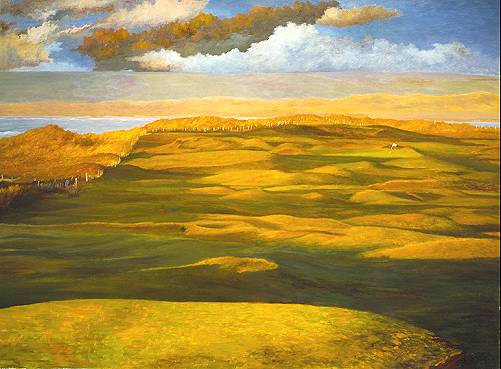
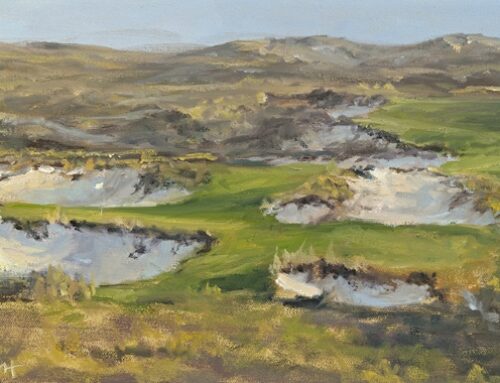
The wind has shaped these irregular land forms for decades.
Sometimes, the best irregular lines in a painting or the most unique random edges of a bunker are the result of a mistake. Watching some of Miller’s paintings evolve and having rough shaped my first bunkers and green complex this summer, I can attest that many of the best features in art happen simply by accident. That is why time, spontaneity and a general relaxed atmosphere are key to success in any art form. Building golf courses from a set of plans and expecting it to have character just won’t work. It’s a fine idea to start out with a concept that looks intelligent on paper, just as Miller does with the paintings when he works from a historic photograph. But sometimes things happen as you go “ whether when mixing colors or moving soil on a bulldozer “ features often turn out far better than what was originally thought to be the best approach on paper, and the artist must be open to such events when they occur. I am not ashamed to admit that the first I green shaped, contained features that work well and might even fool golfers that they were carefully thought out for strategic purposes. However, most of those subtle changes of elevation or contours happened by accident or evolved from things I would not have imagined when I started, but these features were kept after realizing they worked.
To allow for spontaneous mistakes to evolve into interesting art, time must be on the artist’s side. Some of Miller’s best works happened quickly, usually those where the subject matter was undeniably special. Others were a struggle. But they evolved into beautiful paintings only after a ‘cooling off’ period. Pine Valley may be the ultimate testament to a golf course where features were built and a similar ‘cooling off’ period occurred. Over the course of years, someone like George Crump could leave greens or hazards or tee locations, and come back to them with a fresh approach later on. Time also allows you to see how certain holes fit into the context of the design, just like a composer might adjust some of his music to better fit into the context of a symphony. And sometimes the spontaneous, ‘by-accident’ features that seemed so fascinating when they first happened, just don’t work on second review. But only time will tell, and that is why the most interesting and complete designs are almost always the result of a reasonably paced construction process.
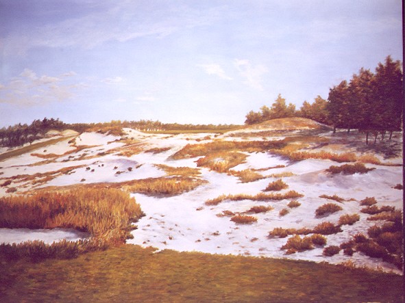
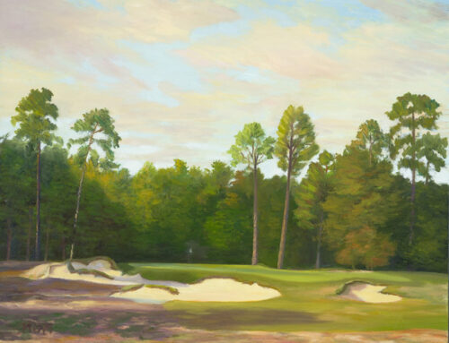
Hell's Half-Acre. The exact nature of the 7th hole at Pine Valley evolved over several years, with thanks due to the input of several men.
Finally, there is little question that Mike Miller continues to improve as a painter because he has studied the ‘masters’ and continues to analyze their work. Living in Los Angeles, we are surrounded by several fine collections of art and a few classic golf holes. Studying the masters is vital to anyone’s success in either art. It is unimaginable to think that a painter or golf architect could ever create something of real substance without having studied the masters, or even having started out by replicating masterworks to understand what is required to create something that holds up over time.
Posted under a painting at the Norton Simon Museum in Pasadena is a quote from French artist Edgar Degas, who in the vein of C.B. Macdonald and Seth Raynor, tried his own renditions of some of the early masterworks as a part of his initial education. Even though Degas was constantly experimenting with new ideas throughout his career in an attempt to take art to different places, he was adamant that artists understand the great ones first. Degas wrote, ‘The masters must be copied over and over again ¦and it is only after proving yourself a good copyist that you should reasonably be permitted to draw a radish from nature.’
Raynor certainly proved that he was a good copyist by the many subtle and fascinating variations he created of certain holes over and over again. He evolved quickly from copyist to artist, and the subtle variety of his renditions of the classic hole principles explains why the ‘concept’ or theme system he employed has aged admirably. But credit C.B. Macdonald for recognizing the masterworks long before most anyone even knew how interesting the Redan or Eden or Biarritz holes really were.
Throughout the process of working with Miller and putting together the appropriate text to accompany his paintings, it became apparent that examples of true art in golf architecture are rare and will continue to be as long as a fast food, mass-manufacturing approach is embraced by the golf business. Beauty in golf courses comes down to not who can fabricate the ‘prettiest’ course. Because the kind of pretty we’ve come to know in golf today is in an artificial, effeminate, picturesque type that Max Behr wrote about in ‘Art in Golf Architecture.’
Interesting art is usually requires time to warm up to its beauty. It relies on subtle, natural colors as opposed to raw ones. It surprises with its fresh take on old ideas and never strays too far from the principles that have been proven to work over time. Most of all, to create a timeless design of artistic merit, the architect must respect Nature and do everything in his power to mimic her best features. As Behr wrote, ‘The forces of Nature must expend themselves in the design. Only in this way may golf architecture reach finality as an art.’
The End


