All,
Following a very kind PM from Alex I have decided to post my entry for public critique.
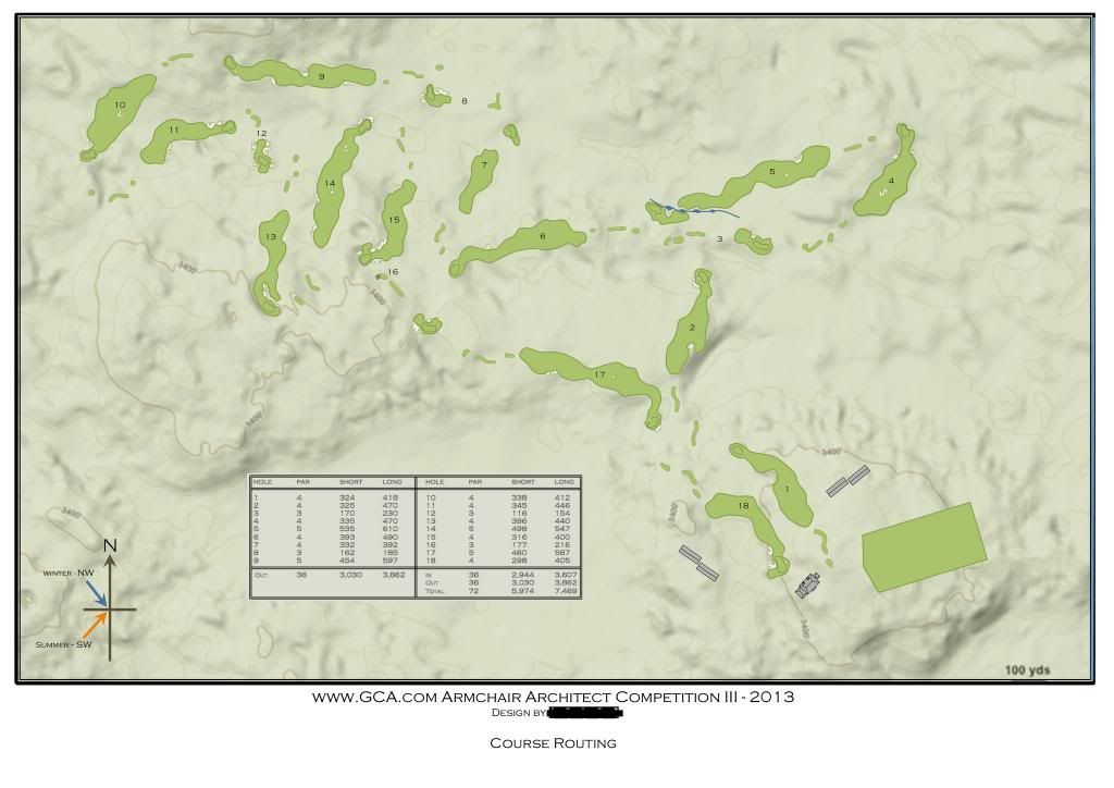
I must say I was quite pleased with how it came out. I made a couple of mistakes in reading the topo which led to a couple of semi-blind shots into greens eg holes 4 & 9. In addition hole 13 played more uphill than I had envisioned but all in all I felt the holes used the land really well and provided a nice mix of required shot types. I was extremely happy with how holes 1, 2, 6, 8, 10, 11, 15, 17 & 18 came across when viewed in the video.
As this was primarily a routing competition I can see others entrants views that those entries that were more graphically enhanced were more visually appealing and thus more voter friendly as being part valid. That said, it was permitted for certain features to be drawn to provide more clarity for the routing and ultimately the designers intent. What did surprise me was in some instances where greens / bunkers had been drawn was an apparent disregard for scale. In my design I attempted to keep things 'real' so kept away from enormous bunkers and green complexes.
My feedback was predominantly favourable, with comments regarding my good use of the land and overall strong strategic design of the holes.
One area which came back to haunt me though was the dreaded 'transition' - I hate that word

I'm not sure if it is due to a voters geographic location that they get so hung up on transitions but personally I don't mind the odd long walk from green to tee provided it is not unnecessarily uphill or convoluted. Bill Brightly made a very valid point regarding locating tees extremely close to an adjacent green - would it be accepted on the grounds of safety? Probably not, which begs the questions how far is too far or how close is too close?
My average walk came in at ~60 yards - that was from green to back tee in a majority of cases - but I chose to do that in order to best utilise the ground and natural topography I had without the need for any earth movement etc. I thought (wrongly?) that people wouldn't mind a few extra yards walk provided the next hole was a solid architectural challenge and didn't present as a blind or semi-blind drive or worse still a blind green location.
Bill also made the point that, and I paraphrase, anyone can design great hole after great hole if they aren't concerned with transition or are using a buggy. I accept his point in part but again the issue is how far are golfers prepared to walk? I for one don't believe there is or should be a 'magic' number.
Did my entry suffer because of transitions - without a doubt, could I have made alterations - yes, but they would've been only a handful and the difference possibly would not have swayed the vote.
I must say I was surprised at some entrants location of the 18 green in relation to the clubhouse, in that they were either a long way away from each other or not visible from one another. This was one part of my design that I was also very happy with.
Another area that my design possibly didn't quite nail the brief on was 'sunset golf'.
I guessed that a 6 hole combination would be sufficient so allowed for holes 1 & 2 along with holes 6, 16, 17 & 18.
If more time was available then you could play holes 1 thru' 6 and then holes 16 thru' 18 for a 9 hole combination.
In hindsight I possibly should've made a greater effort in making other hole combinations as is the case with other entrants but chose not to at the expense of the overall routing.
Finally I would like to thanks Alex for organising the competition and Jim for taking the time to create the videos - it's a shame that they weren't utilised as well as they could've been.
Anyway, here is my entry: -
