Feature Interview with Mike Miller
August, 2002
Mike Miller’s biography can be found under the Art & Architecture section on this web site.
You have been around golf your entire life and you have been painting for over thirty years, yet you have just married your passions together in the past seven years. Why do you think it took you so long to recognize golf courses as attractive subject matter?
The ‘traditional’ type of training that I received led me to ‘still life’ painting first. This was fortunate for me, as I am sure that the years spent painting ‘traditional subjects’ before doing golf landscapes was critical. After doing the cover painting for The Captain,and having requests for more of that type of painting, I naturally became involved with golf course architecture as an art form in itself. This opened an entirely new look at golf courses that I had not really seen before. It is amazing that having been around courses my whole life, it still takes study and conscious observation to be knowledgeable and appreciative of the ‘great designs’ in golf. Those golf designs are more than worthy, as subject matter.It is the same in appreciating art in that it takes study.
How did the concept of painting historical golf landscapes develop?
In 1995, I was commissioned to do a cover for the Geoff Shackelford’s upcoming book, The Captain, about the great golf course architect, George C. Thomas.
The painting of Riviera’s 6th c. 1926, was well received by the publisher, Sleeping Bear Press. Sleeping Bear suggested two more books that would involve golf landscape painting. The first, The Golden Age of Golf Design, was published in 1999. The second, The Art of Golf Design, appeared in early 2002.
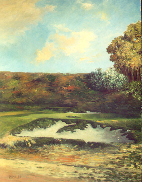
Miller’s cover painting for The Captain.
Architecturally, how accurate are your paintings?
Obviously, I work from historical photos, records and documentation from the era depicted in the various paintings.
Although I make many artistic choices, such as the time of day, season, weather, quality of light, etc., the accuracy of the architectural features is not left to poetic license. In this area, I strive for complete accuracy in rendering such features as green shape and size, bunker shapes, depth, and edge characteristics, elevations, mounds, prevailing course condition, and so on. Insofar that I have a sincere appreciation and affection for the ‘great golf architects,’ it becomes self evident that it is a necessity to convey correctly the aspects of design when undertaking these types of landscape paintings.
What parallels do you see with the art world today and the state of golf architecture?
The parallels are exact, as both of these endeavors are products of ‘today’s’ society and contemporary values. Of course, there are those who populate this site and some others, who resist and refuse to condone the ‘commercial’ and superficial aspects of ‘today’s’golf architecture,nor the direction it is going. I count myself among them. In the world of art, I would be considered a !9th Century style painter. I strive to avoid any hint of ‘commercial stylization’ and attempt to create a representative painting without being ‘photo realistic’. My training has schooled me in applying the principles of fine art as opposed to catering to public tastes.
Would architects and golfers benefit from an education in the basics of painting and art history to better interpret golf architecture?
Yes, in both cases. But learning to paint and studying art history require the same passion that one needs to put up with the frustrations of learning to play golf. It takes a tremendous amount of interest, or it is just too tough.It is, therefore, impractical for someone not passionate about the ‘fine arts’.
However, as mentioned earlier, golf architecture is fine art in itself. The principles of painting or appreciating fine art are the same as the criteria for appreciating fine golf architecture.

Miller’s training is in still life painting.
Is it fair to say that the courses that are more attractive to paint, are in general, the best examples of architecture? If so, why? Does it have something to do with color and texture?
It is more than fair to say that. The architecture is the ‘subject’ of the painting. The ‘best’ architecture will make the most interesting painting from my point of view. Although I’m attempting to paint a ‘landscape’, and therefore, the surrounding topography plays an important role, the attention of the viewer should be ‘lead to the’ subject. Basically, the better the architecture, the better the subject. I do keep in mind that great architecture is in itself, ‘fine art’, and should be rendered as faithfully as possible.
I don’t think it is a matter of ‘color and texture’, although color, specifically, is an essential part of any painting.
How do you determine the view or angle from which the golf hole is painted?
This is a complex question as there are many criteria involved in the selection process; but for the sake of simplicity, let me discuss a few major areas. Naturally, the view must be artistically attractive. By that, it should reveal the beauty and diversity of the natural environment and design characteristics. An indication of the strategy involved in the play of the hole can often be achieved through the view selected. For instance, it may reveal the best angles to approach the various pin placements or where the slope of the green indicates the better places from where to putt. Very often this will not be a straight on view from in front of the green.
I rarely use a view directly from the tee.Usually it is too static and over used.Those few that I have done from the tee seemed to come out fine, but are the exception.By necessity,they must be par 3’s. I find that unusual side views and close up views are generally better. These views allow for more interest as they reveal the green surrounds and bunker architecture. Compositionally, I strive to have the main subject be’off-center’ in the overall painting.
After a particular golf hole is selected, how do you start the painting?
Of course, the landscape must be first drawn in charcoal. This is where the architectural features must be properly placed, shaped and perspective is rendered. After that I always start with the sky. Herein lies the determination for the time of day, season and weather. These phenomena of color will dictate the color of the landscape. Quality of light and position of the sun (which is generally off the panel) determines the length, shape and depth of the shadows. The representation of the effects of light is the only means of producing a feeling of mood. ‘Sun Down at Winged Foot, #10 c. 1929’ appears to be a good example.
In the interest of variety I try to paint different conditions each time. Sun up, sun down, dusk, mornings, afternoons, calm, windy, overcast, after rain, etc.
Other than commissions, how do you select which holes to paint?
I try to select the best holes of the best historical architects as a general rule. By best, I mean a combination of many diverse and some times unrelated criteria. For example, I always look for attractive hazards, a rustic beauty (not pretty) in the overall design, an angle or view that reveals the play strategy of the hole or approach, but also a view that is unusual and not commonly employed.
Obviously, these features are best found in the work of the great architects of the first part of the 20th Century.
To name just a few – and admittedly overlooking some; Alister MacKenzie, George Crump, George Thomas, A.W. Tillinghast, Donald Ross, Seth Raynor, William Flynn, C.B. Macdonald, H.S. Colt, Robert Hunter, Hugh Wilson, C.H. Alison a Billy Bell.
If you are working from a historical, black and white photo, how do you determine the color of the grass?
The grass colors are determined by the other colors of the painting. The sky, season, time of day, weather, play of light, all influence grass color. Yet, strangely enough, green grass is not always right for a well toned painting. Grass that is ‘too green’ usually makes the painting assume a ‘commercial’ look that should be avoided at all costs. In fact, grass is many related colors and shades (unless it’s color is the result of high fertilization and irrigation) and to look best it must just ‘seem’ to be green.
How do you get the ‘right angle’ for a commission, if the client takes the picture of their ‘favorite hole’? What about the colors?
The client and I usually discuss the selected hole first. At that time, I recommend that we take as many pictures from as many angles and distances as possible. While discussing ‘composition'(angle and distance), I usuallycover issues like:time of year, weather, time of day, and any client preferences.
What are some examples of challenges that you have faced when doing a painting?
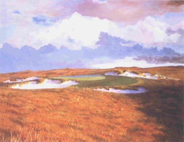
Passing Weather, Seventeenth at Sand Hills, c. 1997 36′ x 48′ oil on panel, Architects: Bill Coore and Ben Crenshaw
The uniformity in the color of the late season ‘high grasses’ and the tendency for this type of landscape to appear forlorn and lost in this great expanse of countryside was a primary obstacle. Therefore, I chose a ‘lively’ and ‘active’ sky in an attempt to animate what might otherwise be a, too desolate look. The orange of the grasses would be overpowering without shadows from the late afternoon sun, and the softening effect of a complimentary blue, in the sky.Also, the highlights in the bunkers provide ‘life’ and ‘warmth’ to the scene while reinforcing the effect of low sunlight. As I always try to be faithful to the architecture, the shape, size,ruggedness and character of the bunkers, the green surrounds and putting green shape, and the depth of view, are all essential elements that must be depicted accurately in order to convey the feel of this hole.
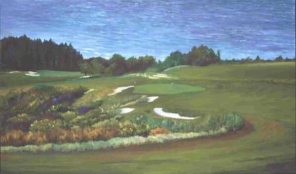
Mid Day at Kapalua’s Eighteenth, c. 1999 28 x 36 oil on panel Kapalua, Hawaii. Architects: Bill Coore and Ben Crenshaw
The painting of this contemporary view of a recently designed course,posed one major obstacle among many problems. Without a horizon line to separate the ocean from the sky,a viewer, not familiar with the course,could become disoriented and mistake the ocean, shown in the painting, for the sky. Therefore the ocean, although not the ‘subject’ of the painting had to be convincingly portrayed without distracting the viewer from the architecture. The ‘chasm’ to the left of the fairway had to be filled with growth yet appear deep. Finally, the distance from the vantage point in the fairway to the green had to be maintained. This exciting ‘finishing hole’ offers all kinds of strategic possibilities to the player as the hazards ‘intimidate’ and ‘tempt’.
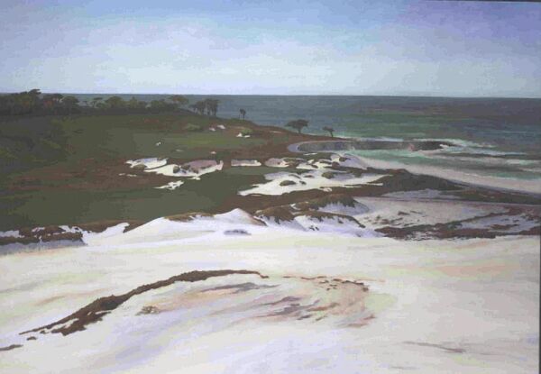
45′ x 60′ oil on panel Cypress Point, View from the Dunes, c.1930 architects: Alister MacKenzie and Robert Hunter
This, most ambitious of projects, took over a year to complete as many ‘reworkings’ were necessary to finally reach this stage of a very large Cypress Point Painting. Size alone is a huge factor in any painting, and as these paintings require exacting architectural detail, time, by necessity,had to be invested. Further, in large painting, color must be harmonious or fragmentation is a distinct possibility. This, for reasons still unknown to me, is a more dangerous characteristicof larger paintings than is the case in smaller ones. The foreground is left fairly ‘loose’ and un-detailed in order to retain the middle ground as the main focus.Hopefully the viewer will appreciate, as I do, the incredibly artistic bunker work of MacKenzie and Hunter seen around the 13th green complex.Here is a course that literally melts into the landscape and thereby remains one of the most ‘natural’ creations in the world of golf architecture.
As someone who played high level amateur golf, played in the Los Angeles Open and worked as a golf professional for many years, what do you think of the technology situation today and its effect on the game, particularly architecture?
A complete answer would take too much time. The effect on architecture? Bad. Briefly, as most who would read this interview know, the ball is out of control (it goes too far) and that situation diminishes the strategy and challenge inherent in good architecture. As courses are rashly altered to accommodate the ball, great architecture will ultimately suffer. This has already happened and looks like it won’t stop until there is a ‘shorter’ ball. New courses that are constructed to take into account the ‘new’ distances? I am very pessimistic. 7500 yards? 8000 yards? 5 and 6 hour rounds? Everyone must ride a golf car? To me, this is a bleak future. I don’t see these courses offering the charm of the’great architecture of the past.’
Do you see holes on television or in photos that you’d like to paint? And , if so, what draws your eye to those holes?
Absolutely, I see very attractive golf hole pictures from time to time. The most attractive feature will almost always be the architecture. The elevations and depressions, placement and shapes of the bunkers and hazards. The green shape, contours, size and green surrounds.Things like trees and bushes have lesser import as they are transitory and change over time, and sometimes are removed or even added.
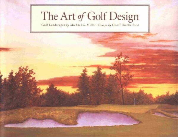
Miller’s cover painting for The Art of Golf Design.
The End


