Feature Interview
with
Samuel Ingwersen, AIA
September, 2017
Part One
Before we get into details, please provide an overview of your book and why you wrote it.
First, I want to thank you for your work and its benefit to the game. I have read your GCA site for many years and consider it a significant contribution to the literature of golf. GCA’s course profiles and system of questions peel off layers of veneer and get to the essence of an issue. This makes for a source of in-depth knowledge and insights to the game that is rarely found in periodicals and books. Whether entertaining or not, it is beholden only to the best interests of the game. So, thank you.
As for an overview of my book with Michael Hurdzan, this book is about beauty. It consists of more than 150 of my watercolor paintings of golf course landscapes. The paintings and the narratives also address the beauty and attractions of the game that have been impacted by another type of beauty, an innocent, fatal type of beauty called landscape effect. The book’s main argument is this: “The beauty of golf course landscape effect is corrupting the game.”
To that end, I use my watercolors to reveal an interesting story about the decline of the game. For the fact that the industry has done no basic research seeking understanding of golf’s loss of almost 10 million players in the last 15 years, the book’s message is timely; an exposition worthy of discussion. The paintings and narratives tell the story of an innocent type of beauty that would drive the scenic movement that started in England shortly after 1890 to improve dull and dismal looking courses. By the year 2000, the movement to achieve pleasant scenery on courses had exceeded all expectations; and now the game is in decline.
Can you quantify the decline?
The declining numbers of players in the US is staggering and the underlying cause is baffling, as seen in following reports: Pellucid, a golf industry research service states: “The number of players plunged from a peak near 30 million in 2002 to 20.9 million in 2016. (1) The industry is starved for insight …and action to stabilize our industry and return it to growth… we keep doing these drive by shootings of programs…as part time jobs. It’s not cutting it.” The National Golf Foundation 2013 Report states: “Golf has been losing more players than it is gaining (loss numbers per year are similar to Pellucid’s). The downward trend in participation is more alarming. …two thirds of lapsed golfers weren’t having any fun.” And Links Magazine, Winter 2015 cover story offered: “American Golf In Crisis-Where Do We Go from Here?”
My friend Mike Hurdzan and I agree with the prevailing appraisal of the industry that the major problems that face the game today are: 1.Excessive costs, 2. Excessive time to play the game, 3. Its difficulty for the majority of players and 4. Its diminishing fun. However the artist/authors argue that these 4 major problems are only symptoms of the underlying cause of the decline of the game. The artist/authors have advanced a thesis that provides new insight into golf’s underlying cause of these symptomatic problems; it is “landscape effect” and its impact upon the qualities of the game of golf.
Essentially, you contend that the beautiful landscape effect is visually pleasing but bad for the game. Please explain this apparent paradox!
Many of the paintings of scenes in the book that depict examples of landscape effect, a landscape component contrived for an aesthetic look, are usually more visually beautiful than paintings with minimal or no landscape effects. Any combination of golf landscape components or artistic features of water, structure, bunker, foliage, fairway, margins, green and tree may be devised by a creative designer to look unique, different, memorable and beautiful.
Landscape effects have the facility of being easily defended as strategy by defensible ignorance. But strategy devised for who, that 5% of golfers that can break 80 or for the other golfers? The paradox is that what I have praised as visually beautiful, I have also scorned as landscape effects because they have, more often than not, created an obstacle to enjoyment of the game for 95% of players.
What is visually pleasing may not be a pleasing experience at playing golf.
The term ‘landscape effect’ is at the center of your premise. What does it mean precisely and what is its origin?
The meaning and explanation of the term “landscape effect” was first attributed to F.W. Hawtree (1916-2000), English course designer and golf historian. Although the term had been used in a general way, landscape effect as described by Hawtree specifically refers to a golf course landscape component that is contrived to achieve an aesthetic “look.” Hawtree’s realization of a landscape effect occurred when two English course designers, Herbert Fowler (1856-1941) and James Braid (1870-1950) champion golfer, were discussing visual aspects of bunkers at Walton Heath. The word component as used throughout the book means a distinct part of a landscape.
Hawtree quoted from Horace Hutchinson’s book, Golf Greens and Green-Keeping published in 1906. Fowler and Braid contributed material to the book, Fowler said: “…it does not “look” so formal if one bunker is some little distance in front of the green, and another starts….” Braid said: “…raise bunker banks to make them “look” as natural as possible.” Hawtree had done his research of this trend and concluded from Fowler’s writings: “Landscape effect has crept into the designer’s vocabulary for the first time.”
There is no contradiction, the book states that the beauty of many on-site landscape scenes made up of contrived landscape effects of golf course components and artistic features are more beautiful than scenes that are not contrived, simply because the designer has been more creative in achieving the objective of stunning, ornamental, individually unique “looks” with shapes, forms and colors of materials arranged in aesthetic patterns.
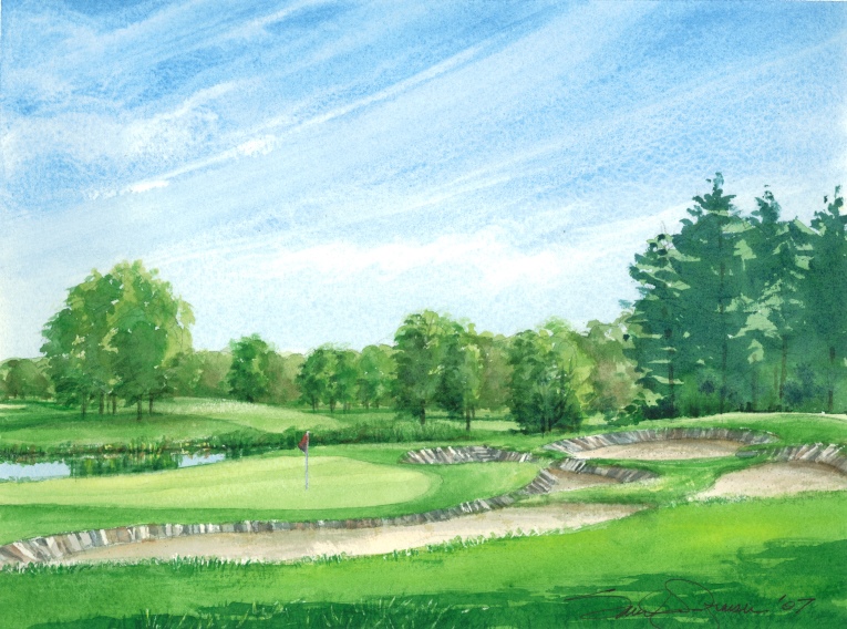
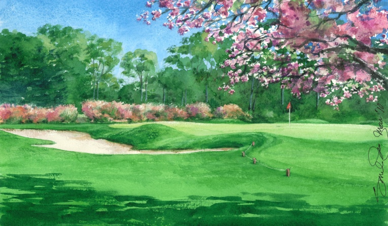
An example of a visually beautiful landscape effect was achieved at the 185 yard-par-3 third hole of The Golf Club, 3R view of which is shown below. The bunkers are as visually pleasing as any beautiful piece of abstract sculpture. It is also no fun where no backswing is permitted by the batters that line the edges. The illustration of landscape effect is shown below. It is typical of many paintings that will appear in the part 2 of this Feature Interview illustrating how the game has been corrupted by landscape effects.
Originally it had four bunkers that surrounded the open green. Pete Dye (b1925) had some doubt about the scene. When Pete asked Jack Nicklaus (b1941) for his opinion of his work in progress on hole No. 3 hole at The Golf Club, Jack told Pete that he felt that the hole was dull. Based upon Jack’s critique, Pete would say later about his No.3 hole: “I went back and built a gigantic three level bunker on the left hand side and used more than 450 railroad ties for bulk heading.” The moral of the story: “When in doubt, bunker.”
Unlike any other bunker scene on the course or any bunkers anywhere on any other course, the scenic statement is a delightful intertwining of forms and colors. The curving lines, colors and patterns of the rail ties, some bleached blue-grey to white, others reddish brown create a dramatic scene, but, they are obstacles. The irascible owner of the course, Fred Jones probably liked the creative stuff surrounding his other bunkers in spite of the fact that he was opposed to ostentation. For example, when questioned why he did not use white sand in his bunkers instead of gray sand he reproved his interrogator with the answer that white sand was for “show-offs.”
Nothing has changed. Imagine if you will, Dye and Nicklaus discussing the same subject Fowler and Braid had discussed in 1906 about “the look.” This time it was not two bunkers at Walton Heath relocated to a more interesting location but a three-level structure, a landscape effect, made of a curvilinear pattern of bunkers and 450 rail tie batters at The Golf Club that saved the hole from being dull.
As we shall see, Hawtree’s observation foretold a trend in the development of golf course architecture, known in its beginning as linkscape gardening, which would not bode well for the game’s future. He was a revered authority, so esteemed by his peers for his insightful research on golf that a contemporary designer/critic proclaimed, “Anyone who knew Fred Hawtree would be crazy to write an article on a subject he had researched.” Hawtree would later write; “Golf course architecture has become an exercise in pure landscaping.”
His insight into landscape effect of course design was prescient of something amiss, but at the time, exactly what it meant for golf’s future was only a guess. We shall see in the paintings in Part 2 of this Feature Interview a fraction of the possibilities of ornamental landscape effects that designers have had at their fingertips. The possibilities count into the millions of combinations counted by a factorial of 18 landscape components and artistic features.
The show must go on.
In addition to the landscape effect and its undesired consequences, you delve into another theme. Please elaborate.
In addition to discussion of beautiful golf course landscapes and the innocent, fatal beauty of landscape effect, the book addresses another theme, the beauties and attractions of the game of golf. What are those qualities of participant games that make them attractive and popular or unpopular in our society today? The book investigates these qualities that are found in the research of the relatively new social science of games and theories of state of flow, a state of fun and joy attained while engaged in games.
Experiences vary from frustration, anxiety, boredom, enjoyment, fun to optimal joy, influenced by state of flow and Challenge/Skill (C/S) balance. Too easy a task is conducive to boredom, too difficult leads to anxiety and frustration. The paintings and narratives illustrate the influences of landscape effect upon the game, which include C/S balance and other flow components. The subjects of the power of beauty and the landscape effect and their influence upon qualities of games have never before been written about or published in the literature of golf.
Let’s get to some examples.
Below, I show several paintings that illustrate the use of landscape effect in the form of water compared to scenes with water that are not landscape effects. These paintings are typical of other golf course landscape components that are discussed in later parts of the interview. Many of the paintings are a delight to look at but illustrate the tyranny of design in pursuit of unique, different and memorable beauty that is imposed upon play of 95% of golfers, that group that cannot break 80. Ironically, many like Rory McElroy, in that group of the world’s professional tour players (.0001% of the world’s male golfers) also undeservedly suffer the same fate; when a slightly errant shot ends up in the water with no recovery play.
The Trump National GC, (TNGC) LA was formerly known as Ocean Trails in Rancho Palos Verdes. In 1999 the cost to build the golf course was reported to be $126 million, but closed before it opened. Part of it slipped into the Pacific Ocean. By the time the golf course opened it cost a reported total of $264 million. The new owner built an assortment of new inland lakes. Even here the sought after landscape effect came at a high cost. The costs are maintenance, stabilizing banks, keeping the water clean free from vegetation and debris, controlling the water level against leaks, evaporation and cost to acquire the water in some locations. It is not free, a point often lost to casual observers. What is also not so obvious is that endeavors to bring beauty “in your face” to the course may bring new obstacles and diminished enjoyment to the game.
The aesthetic beauty of water is powerful attraction and the compulsion to get beauty close to the player’s face often results in inferior functional solutions, contrary to the purpose; fun and pleasurable excitement of games.
Five examples of TNGC, LA lakes are shown in plan views below. Each hole may appear fair to rabbits with provision of short tees, colored yellow. However, locations of the water ponds hard to the edges of putting surfaces are a prescription for no recovery, no sense of progress and frustration. Water at greenside in each layout requires skill levels the same as required for professional golfers. Where is the break for the high handicapper or recovery option for a slightly miss-hit shot? There are none. The No.1 hole is a forced carry with a water moat, water falls and fountain surrounding the green. The beautiful water fountain cost $ 2.5 million and was being renovated in 2015. Sorry for Trump National, LA; golf is not a garden show, otherwise it would be in the finals.
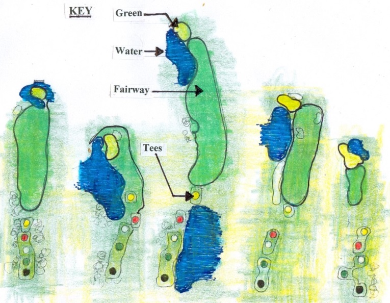
No. 1 No. 8 No.9 No.16 No.17
Trump National GC, LA, Rancho Palos Verdes, CA
Plan Views of 5 Holes showing water landscape effect
As an accommodation of equity to players of various skill levels, each hole has 5 tees, each with shorter hole yardage. But it is no advantage to the high handicap player whose ball will often be in the greenside waters with no chance of recovery. Challenge is not a bad thing if recovery play is allowed for slightly miss-played approach shots. Typical of many modern courses is lack of creativity in balancing challenge expectations with skill expectations.
The Trump National Doral Blue Monster GC, Miami, FL has 14 holes that are adorned with water ponds. 318 balls were hit into the water by pros in a recent tournament, suggesting that the ponds may be too penal. The world’s No.1 player, Rory McElroy (b1989), was having so much fun that in his fit of frustration he threw his 3 iron in the water after the ball. For players and pros alike, this eliminates state of flow, agency, recovery play and simulation experiences. Research has shown that these qualities are essential to experiencing fun in games.
There are 4 courses at the Doral complex that have a total of 60 water ponds. Doral‘s sales of used golf balls should generate over $1 million a year based on calculations of frequency of the pros being in the water in the referred to recent tournament. Even though posted signs say that the course is difficult, there is too much water in play. Lack of design imagination is no excuse. If water must be used think first and then again about the purpose of the game, for example: Design water to enhance the game, position ponds in wind sheltered viewing areas that may reflect images filled with colors and light, out of the line of play. Study the St. Andrews Old Course and its beautiful little pieces of golfing ground that provide pleasurable excitement and interesting, challenging shots around greens, without the presence of water or bunkers.
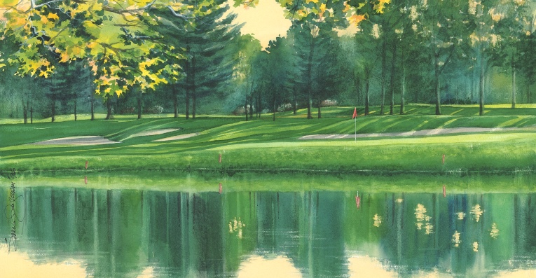
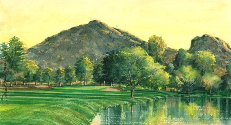
The present 11th hole formerly the 10th, shown above, as seen at this time of day with a late afternoon sun creates a delightful experience. A person walking past this point is stopped in their tracks; I was. I was attracted to reflections on the water and the backlit leafage.
Although the water provides a beautiful landscape effect, most any shot that misses slightly right of the green will end up in the water. For a slightly pushed or sliced shot this is a very harsh penalty, but most importantly there is no opportunity for recovery play, the soul of the game. The scene is absolutely beautiful, but consider another, more important form of beauty; the beauty of the game. Both forms of beauty could be vastly improved by inventing chipping challenges for all levels of skills.
An example of a delightful landscape scene that is dominated by water is the Trump Turnberry GC, No. 10, Aryshire, Scotland, which is the cover of my book (seen above). The water is not a contrived landscape effect. The water is not located in the line or adjacent to the line of play. However the delightful water in the cove may become a landscape effect as rumor has it that the new owner has plans to modify the routing of this hole. Whether the cove is moved into the line of play or the hole is moved close to the water it could easily become a landscape effect and another obstacle for long handicappers.
The following three paintings; Buck Hill GC White Course, No.9, Sea Island GC, Marshside, No. 4 and Paradise Valley CC, No. 16 display great variety with thoughtful use of water. They are not a forced carry and are far enough removed from play that they are not considered a landscape effect.
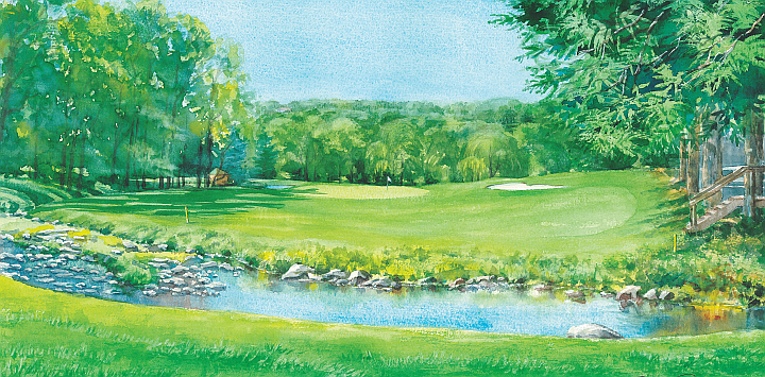
Buck Hill GC White Course, No.9 is a short par 3 with the slow meandering brook in front of the tee. It is a delightful and thoughtful use of water, not a contrived landscape effect. What is your idea of a fun day? Nice weather, golf, a beautiful partner and lovely scenery? You can have the nice weather and the beautiful partner; I’ll take the golf at Buck Hill GC.
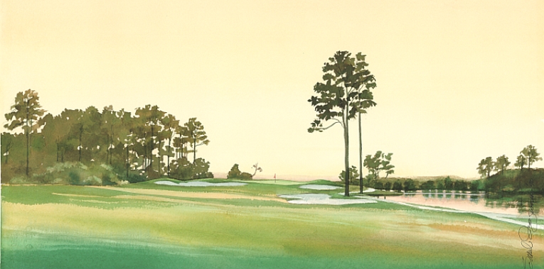
Sea Island GC, Marshside, No. 4. The stream is a beautiful part of this hole. Reflections of a fusion of colors vary by the time of day. It is not a contrived landscape effect. The fairway is exceptionally wide. The water is a good distance to the right of the cart path and follows the route of the hole from the tee to the green.
Surely the golf industry recognizes its problems and is doing something to address them?
The book extends criticism to the $75.9 Billion GDP golf industry for its lack of initiatives to perform any basic scientific research in the attempt to understand the underlying cause of golf’s present decline. The non-players side of the game has done some applied research but none directed to the cause of the decline. The interests and motivations of the non-players side are different than the players’ side and it is prospering, doing quite well by all measurements.
Golf periodicals have an obligation to the game but as of late appear to have soft pedaled the issue of decline; who wants to hear of doom? Not readers and certainly not advertisers. The National Golf Foundation reported a loss of 38.3 million players with only a gain of 33.2 million in 9 years, 2005 through 2013 while 643 courses went out of business (2). The two largest Associations, the PGA Tour and the USGA with profitable entertainment businesses reported gains in net assets 2010 through 2012 of 25% to a total of $1.125 Billion in net assets (3).
The book concludes with a proposed Golf Logic Model as a first step to facilitate understanding of the underlying cause of golf’s problems to turn the decline around and adopt a process for continuous improvement of the game. For without understanding there can be no solution to the decline of the game and establishment of a process for stable growth.
So is that why you wrote the book?
I wrote this book for the purpose of forever extending the beauty of the game.
Originally this book contained paintings and descriptions of beautiful golf holes with biographies of these course designers. However in discussion with my advisers, two of the finest minds concerning history of the game and course design, they pointed out that the multitude of golf books with designer bios, hole descriptions, play strategy, instruction and stories of entertaining tournament competitions have beaten these subjects to death. They wisely persuaded me to change my focus and to write about what interested me as an artist, architect, and a golfer, in scenes that I painted.
My interest in painting a golf scene has always been the thrill of the creative experience. Painting is like golf, with a stroke of the brush or the club one may achieve a heightened sense of reality. When I am painting and become involved with some passages my feelings often attain a pleasurable high, a state of flow. I painted for the sake of beauty, exclusively for pleasure. Beauty has no conscience of right or wrong. Nor did I have any conscience or feeling of right or wrong of a visually beautiful golf landscape; its meaning or influence upon play of the game. The scenes I painted were interesting. My interest was a strong motivator, interest being a precursor to a subjective, pleasurable sensation of beauty.
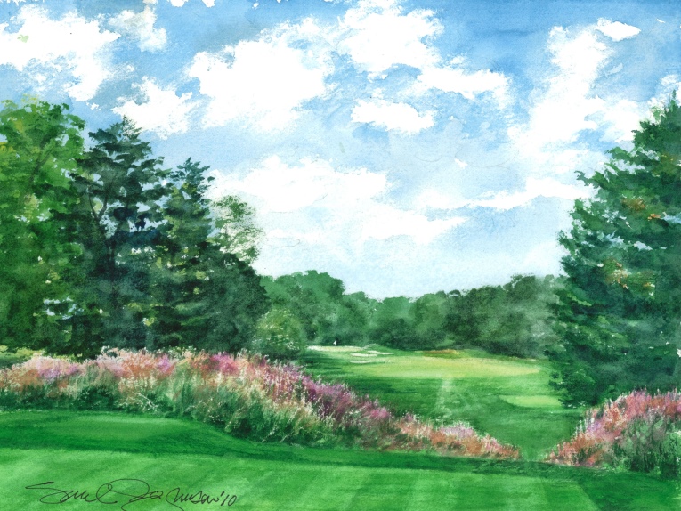
I was not only interested, I was captivated by the beautiful Miscanthus grass in the paintings below at the side and front of No.11 tee at Hollywood GC. It is not a landscape effect. It is landscaping, out of play. Particularly impressive was the fact that the plantings were not spread over the entire course, not diluted, but concentrated only in the most effective places.
As seen in the prior 5 images, water with interesting reflections and images with colorful grasses positioned sparingly in the most effective places, is all the beauty that is needed to achieve a memorable play experience. Contrived landscape components and expensive, over indulged foliage have taken another route to achieve beauty and memorability of a play experience. My advisor found an article on golf course landscaping written in 1952 by Hugh McRae, superintendent at Treagon GC, Baltimore, MD that suggests an inexpensive means to satisfy the need for visual beauty and the most important feature of color. “Color that can…last the whole season” Landscaping does not have to expensive and over indulged or be a contrived landscape effect justified as a challenging stratagem, only to become another obstacle to play. McRae posited: “ The average superintendent concentrates so much on his greens and fairways … but for a $200 investment and care of one acre of land of rooted material, enough can be planted to eventually take care of the whole course.”
How long did it take for you to develop your premises into something that you felt was important to share? Did it come over time from painting?
Like all writers, the scope of a work often changes as the writer does research and acquires new knowledge. As I began to research ideas about beauty and means of ornamenting courses, my focus changed. It expanded to include emotional and mental experiences in addition to visual experiences of beauty of a golf course and the game. The paintings were finished; I began to write about them. But I found that to write about the beauty of golf required not only visual considerations of a course’s many landscape components; their forms, features, colors, composition, layout, and patterns but judgment of emotional and mental experiences that may occur while engaged in play of the holes depicted in these scenes. Otherwise, if when I was describing my watercolor landscapes and said nothing of their implications involving playability I would be saying nothing significant, only making vague statements.
Judgments of visual, emotional and mental experiences of a golf hole are inextricably bound one to the other. The philosopher Immanuel Kant (1724-1776), made the same point centuries ago, affirmed by aestheticians and thinkers today: “Judgments of beauty are sensory, emotional and intellectual, all at once.” The focus further expanded to include extensive research into a new subject; the theories and science of the qualities of games in general and specifically those qualities of the game of golf which appeal to players. The myriad variety of on-site, decorative golf course landscape effects, contrived in pursuit of beauty would profoundly influence the game.
Please expound more about the idea of beauty and the pursuit of scenic golf course beauty.
Enjoyment of beauty, be it nature’s or decoration and ornamentation of things made by man, has been one of life’s pleasures, pursued and venerated in nearly every culture. For a golfer, nothing is more beautiful than a stunning golf landscape. Part of golf’s appeal today comes from courses with pleasing scenery and visual effects that are contained within the course boundaries and also in settings with a distant seascape or landscape. However, for the first four centuries of golf, the beauty of the game and its attractions came first, long before beauty of the course. Designers and social imperatives eventually over the next 100 years would change this emphasis. Commercial interests of non-players associated with the game would also influence the looks of golf courses (landscape effect) and imagery of golf subjects (TV tournament productions) with the objective of providing golf fans with exciting entertainment staged in beautifully landscaped settings.
An example of course beauty aggrandizing by non-player interests is the behavior of TV producers who have not been enamored of multi-colored or patches of brown grass. They have been known to ask course owners to dye their grass greener for TV events. Ted Steinberg (b1961 ), author of American Green, wrote: “To make the scenes more beautiful to the viewing audience, the media’s request was: fertilize this … paint that!” (4) To dye and paint grass to achieve a landscape effect is just the tip of the iceberg of over-indulged pursuit of beauty that has influenced decision makers about what is good course design. As an indication of this growing obsession of ornament on courses, costs for typical state-of–the-art US course landscape installations in the 1960’s increased from $7,500 to $1,050,000 by the 1990’s. (5)
Art historian Brent Brolin (b1939-), has observed the universal use of ornament to achieve beauty: “…ornament has been part of virtually all cultures gracing almost every appurtenance of life… Perhaps ornament has been such a consistent part of human history because it has satisfied a need for beauty that all people share. With rare exception, when ornament could be used it was, and in most cases, in proportion to wealth. If there has been one constant in the history of the arts, it has been the lack of debate about the use of ornament-until our time.” (6)
Ornamentation is a fact of life; landscape effect will always be a part of golf courses. The knack is to provide a course environment for landscape effects that meet the needs of players as well as non-players and commercial entertainment, but eliminate the obstacles that landscape effects create, namely golf’s excessive expense, prolonged time, difficulties and disruption of flow and challenge/skill balance levels If all were eliminated it would increase the fun of the game.
The definition of beauty has been debated for centuries, but what is certain is that visual beauty is consistently sought through ornamentation of a culture’s artifacts. Architecture, landscape architecture and golf course architecture are similar in their respective professions and their artistic modes of operations. Each builds socially useful facilities in a way that requires management of skills and of complex materials that are put together in pleasing variety according to designers’ creativity and values. Architects decorate buildings with forms, colors, and patterns of building materials. Landscape architects decorate the land with patterns, colors and forms of landscape materials.
Golf course architects are no different. It was only logical for golf course architects to decorate golf landscape components with a variety of shapes, forms, colors and patterns of landscape effects that have been developed over centuries of advancements in the art of landscaping. However the continued indulgence in ornamental green grass, over indulged foliage, contrived water, bunkers, trees and greens poses dire consequences to the future of the game as a participant type game.
Please share with us your perspective on the evolution of golf landscape painting.
Former French Minister of Culture André Malraux (1901-1976) stated in his book Voices of Silence: “The purpose of painting is the excitement in creating the painting; not to put a frame around it, hang it on a wall and ascribe immortality to it 200 years later. Once it is finished, the thrill has gone out of it.” Not so!
Viewing art is also a pleasant recreation. Upon completion of a successful painting the thrill has not gone out of it. Contrary to Malraux’s theory, the pleasure in viewing a painting may never wane, for a painting transcends reality. In reality time has its way and nature its own. Colors will fade, foliage will wither, water will lose its sparkle, and the mood will vanish. However, the painting of the moment lives. These may be no small moments for the moment can be a thrilling experience, progressing in various degrees from casual interest to attraction to captivation, especially when a viewer gains new knowledge and new meaning to the art being looking at.
As golf became popular in the British Isles, many appurtenances of life, from hat pins to ale tankards were adorned with golf themes. Early English paintings of golf subjects from the 17th century were individuals or groups of golfers positioned in the foreground with no scenery or vaguely defined scenery in the background. By the mid-20th century the subjects of golf art flip flopped, reflecting society’s values of what was worthy of extending and commemorating.
Golf imagery in the form of TV productions, media advertisements, digital and paintings today that best meet social and commercial preferences feature scenic landscapes with figures absent or relegated to minor background positions.
Who are some of your favorite watercolorists?
A prized book, Golf Courses of the British Isles, (1910), by Bernard Darwin (1876-1961) includes 64 watercolor paintings by artist Harry Rowntree (1878-1950). The paintings captured the artist’s impressions of Darwin’s selection of best courses in the British Isles. Rowntree was turned loose, using the easier language of the brush, replacing words, to depict the state of golf course scenery. Rowntree, more an artist than a golfer, found less interest in the golf courses, painting fewer scenes that featured fairways and greens than scenes that featured dramatic skys, adjacent landscapes, and fascinating water bodies of seas, estuaries, creeks, rivers, ponds and puddles. Preoccupation with visual beauty of the course was not yet an indulgence.
Darwin wrote little of visual beauty in his book. Darwin’s sense of beauty came by contemplations that heightened his pleasurable thoughts and feelings. He wrote: “Wind in our face…really beautiful” or pleasant contemplations of: “It is the beauty of solitude…” and in reference to St. Andrews Old, “…Beauty of … the contours in banks and braes…” which he emotionally felt and thought about while preparing to play a run up shot.
St. Andrews Old is recognized as the finest course in the world. Tom Morris (1821-1908) is responsible for its present character. Tom also designed 60 other courses in the Kingdom, many of which were beat upon by that cudgel taste, for being “dull,” by critics who were preaching scenic beauty. Ironically, today players consider some of Tom’s courses more fun to play than modern courses that are beautified with over indulged landscape effects.
Darwin’s only comments about visual beauty were off-site borrowed views. When he remarked of beauty of a distant view, it was stated only as a fact: “It is beautiful.” Darwin had no descriptions of on-site scenes of visual beauty. There were none or none of interest. However, pleasant scenery of the course was starting to become of interest. During the time around 1900, before Darwin was gathering material for his golf book, the idea of pleasant scenery from the allied field of landscape gardening was beginning to be associated with ideas for improving course dull scenery. The idea was promoted by Horace Hutchinson, the most respected authority on golf of his time. He invented the term “linkscape gardening.”
The two most famous English landscape painters of golf scenes, Harry Rowntree and Arthur Weaver (1918-2008), were both watercolor masters. Although there were other contemporary artists, Rowntree and Weaver were the most published.
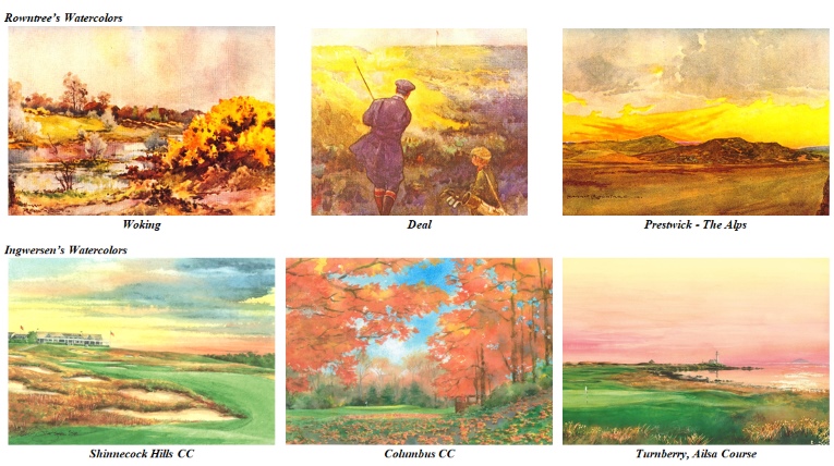
Each had different styles. Comparisons of Rowntree’s, Weaver’s, and my paintings appear in examples above and on page 1-3 in the book. Rowntree’s three paintings, top row, each make a strong statement of one or two dominant landscape components featured in vivid colors. Rowntree either omits putting surfaces and greens or represents them as minor components in his compositions. For example, Woking has one component consisting of a patch of multi-color gorse in the foreground, Deal has an expanse of yellow gorse in the middle ground, and Prestwick has an intense yellow and red sky over the Alps. Rowntree has wrung the most out of his colors. Upon viewing, some components have an intensity of coloration that approaches the unreal.
The three paintings by me, above bottom row, use the same model, pushing color to the limit of realism, but not to the extreme of Rowntree’s watercolors. Consistent with most of Rowntree’s paintings there is puzzlement: Where are the golf greens? No matter, the paintings are a delight!
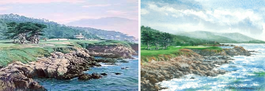
Arthur Weaver did his golf paintings mostly in the post WWII era. Weaver’s technique was not as loose as Rowntree’s, employing tighter delineation of a realist and less the impressionist. Weaver used a lighter pallet. Colors of all of the components in my Cypress Point No.17, below right, are brighter, broader in range of colors and more saturated than Weavers of the same No.17 hole, below left.
Rowntree’s coloration is more intense. My style is for golf green surfaces to always be shown. If a green is obscured, the view point is raised slightly higher using my time multi-viewpoint (TMV) device to expose more putting surface. It is then accented by a lens shaped sliver of color. Unlike Weaver’s and Rowntree’s paintings, most all of my paintings are devoid of figures for the same reason that the famous landscape artist Claude Lorraine (1600-1682), disdained figures. They tend to detract from the theme, lessening its impact.
There is another important difference. Note that in Weaver’s Cypress Point No.17, the residence in the background is too prominent for the setting. It is distracting. The residence is subdued in my painting of No. 17. I have laid a sea- mist over the landscape background kicked up by a rough sea, allowing the eye to be move away from such distractions and focus upon more interesting components of the course. Distracting objects in scenes are either painted out or obscured in many of my paintings while more interesting components are accented for purposes of a first round knockout.
Weaver is famous as a watercolorist although he used oil media. In his golf scenes he employed a wide range of colors for all surroundings. Grass may appear slightly blue, when at time of mid-day the grass reflects blue sky, or seem yellow/gold when the sun is low in the sky and Weaver’s paintings were not possessed by the ambient surroundings as were many of Rowntree’s. His paintings focused more upon the traditional components of a golf landscape; fairways, bunkers and greens. Flag sticks were sometimes obscure but ever present were caddies and players.
How/why did you become attached to watercolor as the best medium to express your ideals?
Watercolor is my favored media for effects of light on form, for certain luminous qualities, for delicate gradations, especially atmosphere, skies and the fusion of colors in water reflections to best express impressions of nature in all its moods and light effects. Watercolor allows no reworking of pigments to the extent that other media permits; otherwise a watercolor turns to mud. The most popular style of watercolor today is similar to that of the early English watercolorists who pioneered the media, bringing new freshness to painting. Their watercolors were uncluttered with fussy detail that was present in the Pre Raphaelite style where photographic like images of trees and foliage were detailed to the point that a botanist could identify the species of every leaf and blossom. Most important, watercolor technique lets viewers exercise their imagination; to discover the illusion of existence, and the mood …more fascinating than if it had been real.
The 17th-century landscape artists Paul Bril (1554-1626) and Claude Lorraine and later Englishman John Constable (1776-1837), counted amongst the world’s great landscape painters, enhanced scenes of nature with the use of artificial, technical devices that controlled light, focus, contrast, and sense of depth. They have influenced most of the world’s landscape artists. Constable, the great English landscape artist, was mostly influenced by Claude, calling him the greatest landscape artist that the world had ever known. English author Horace Walpole was so captivated by Claude’s landscape paintings that he said he not only wished to be buried in one of his scenes; but buried alive.
I use Constable’s snow device to achieve highlights by scratching out pigment over tree leaves and other foliage. I use Bril’s invention which was the genesis of a device known to artists as the “Claudian Device,” which used dark objects or shadows in the foreground and to one side which Claude perfected and rightfully attributed to Bril, the originator. Substitute a golf green and a flag stick in Bril’s painting Jeu de Mail à la Chicane, below, instead of an Abby door, and you have a view not unlike that from an elevated tee on a present-day golf course, similar to Pasatiempo No.1 shown below with the Claudian device. With one important exception, there is color in the shadows; my shades and shadows tend to always have a hint of color.
Talk more about your technique.
The most important technique that I use for my paintings allows me to show putting surfaces and other components not visible from a single viewpoint. It may also show original design lines in unbroken patterns. I adapted the device, time multi-viewpoint, referred to earlier, from an idea advanced by Sir Herbert Read (1893-1968), English art historian. This technique permits one to simultaneously view several parts of a golf landscape scene from multiple viewing points, all represented in one painting. The eye moves across a stationary subject much as a player traverses a golf hole and stores a series of snapshots, not just a single snapshot, in the mind’s eye. Select images are then melded into one painting.
Read used this analogy of images stored in his mind’s eye after strolling through a garden. Technically, reality has been altered, but the TMV scene is real, reality being experienced by the mind’s eye storing a series of images acquired over short intervals of time that are expressed in one image.
When I began to experiment with TMV, I was aware of the cubists and their concept of aesthetic representation of reality. Although the principles of Cubist and TMV styles are the same, they are radically different in application. The differences are significant.The Futurists or Cubists, as they were later known, deconstructed and reassembled their subjects, depicting them with geometric forms, distorted and abstract.
Most typical of cubism are human figures, for example, Marcel Duchamp’s (1887-1968) painting, Nude Descending a Staircase, 1912. The painting depicted multiple, overlapping images of the same figure at each step of the staircase to convey a sense of motion. Duchamp was unable to sell his painting in Paris. One art dealer told him that nudes did not descend staircases, they reclined. Undeterred, Duchamp brought his painting to America where his and other cubist paintings created a scandal but made a hit with the dilettanti in the 1913 Armory Show, New York City.
Teddy Roosevelt (1858-1919), after visiting the 1913 Armory exhibit, was quoted, saying that cubist art reminded him of the Navaho rug that he had in his bathroom. Fortunately for landscape painting, cubist landscapes are not favored as subjects by cubist artists.
An important lesson that emerged from centuries of English leadership in the art of landscape gardening has found its way to my golf landscape paintings. This lesson involves the curved line, the most beautiful line of all lines. As English landscape gardening gained a world following, the straight, geometric, axial lines of French style gardens became disfavored. All landscape styles, rough or manicured, symmetrical or asymmetrical became reconciled to the desirable effects of the curved line. But to be curved, one must see the line continuously curved and unbroken, not a series of staccato line segments that produce visually agitating shapes. The TMV device solved the broken curved line syndrome.
The following is an explanation of how the TMV device has been applied to many of my landscape paintings in the book. Many of the enhancements in my paintings are subtle but very important to the aesthetic feeling of the total painting. The TMV device is best understood by comparing my multiple viewpoint locations that are combined into one painting, with the original, actual view.
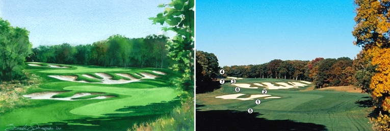
The above TMV painting and the photograph of Bethpage Black No. 4 are the subjects of comparison. In the two scenes of Black No. 4, viewed from the tee, there are several golf landscape components that have been altered. These components include bunkers, fairway, fairway margins, and the green. Note in the photograph of hole No.4 that the perimeter edges of all three sets of bunkers at points numbered 1, 2 and 3, are not continuous curved lines but are broken lines. They only appear to be broken because a ridge of turf blocks the line of view at points 1, 2 and 3 which are tangent to the top of each of the three numbered circles. Note that the broken lines of the bunkers that are at these points are continuous lines in the painting. This is done by raising the view point, thus in effect lowering the bunker edges at points 1, 2 and 3and adding white sand. Upon looking closely one will see that many segments of lines have been connected, made into a continuous curved line as if one is standing nearby and looking.
The TMV device permits the perimeter lines to be displayed as continuous curved lines. This visual effect could have originally been accomplished at the design stage by the course designer. The exposed series of major and minor curved lines in the bunker create fingers and noses that complement the curved fingers of fairways to create a stunning and pleasing visual impact.
The number 4 point in the photograph indicates the location of the green’s putting surface, a thin lens of color in the painting (obscured by trees in the photo), which has been attained by establishing a view point close to the greenside bunker. Points numbered 5, 6, and 7 in the photograph identify the location of fairway fingers and margins. The curved lines of the fairway fingers in the painting are all distinctly defined, resulting in a strong counterpoint that reinforces the theme. This is Tillinghast’s finest hole with bunkers incorporating a thoughtfully designed challenge/skill balance.
In order for the book to most effectively reach its intended audience we chose a format of many paintings and short narratives. The watercolors stand alone as enjoyable entertainment, but more importantly they are an allurement for readers to look deeper into the book. Readers will enjoy discovery rewards in meanings of the paintings. The book’s paintings have meaning, but who gives meaning to paintings, the artist or viewer? Viewers give meaning to paintings based upon the knowledge of the art they are looking at. (7)
Thus, in order for readers to more readily enjoy the paintings, the artist/authors have provided narratives with insights from over 100 years collectively in their practices of art, aesthetics, architecture and golf architecture.
End of Part One
Footnotes:
1. Felsted, Andrea and He, Elaine, Bloomberg Gadfly, pg.1, Bloomberg Businessweek, May 25, 2017. Pellucid Corp, data source: The number of players in the US has plunged from a peak of just under 30 million in 2002 to 20.9 million in 2016, according to Pellucid Corp, an industry information provider.
2. Links Magazine, Winter 2015, with data source National Golf Foundation, pg 72.
3. Outside the Ropes, Pellucid Corp. Golf Industry Associations: A Tale of Two Cities, Vol 14, Number 2, pg 2.
4. Steinberg, Ted. American Green, W.W. Norton, 2006, page 94
5. Fazio, Thomas. Golf Course Design, Harry N. Abrams, New York, London, 2000, pg. 53
6. Brolin, Brent C., Flight of Fancy, The Banishment and Return of Ornament, St. Martins Press NY, NY, 1985, Introduction 1st pg
7. Sylvan, Barnett. A Short Guide to Writing about Art. Pearson/Longman, NY, NY, pg 24


