News:

Welcome to the Golf Club Atlas Discussion Group!

Each user is approved by the Golf Club Atlas editorial staff. For any new inquiries, please contact us.


Emile Bonfiglio

  • Karma: +0/-0
The quality of the scorecard related to the course
« on: August 30, 2012, 01:44:39 PM »
I was recently given a scorecard from Chambers Bay and noticed how flimsy it felt. I realized after looking at it that it is a "Drycard" which must mean its waterproof'ish. Nice feature but the card doesn't feel like a card from a top 100 course. What are some of your favorite scorecards you have seen and were they from nice courses?
You can follow me on twitter @luxhomemagpdx or instagram @option720

Tom Culley

  • Karma: +0/-0
Re: The quality of the scorecard related to the course
« Reply #1 on: August 30, 2012, 01:59:34 PM »
I collect scorecards, my collection is not that vast but it is growing slowly.

My favourite scorecard in the collection is probably from Oakmont, it's classy and simple.
The Pine Valley card i have is not particularly special, but I'm unaware how old it is.
Augusta National's is delightful, as is Merion's.

I was surprised how cheap the card from Portrush felt considering the quality of the course.

Cheers,
Tom
"Play the ball as it lies, play the course as you find it, and if you cannot do either, do what is fair. But to do what is fair, you need to know the Rules of Golf."

John_Conley

  • Karma: +0/-0
Re: The quality of the scorecard related to the course
« Reply #2 on: August 30, 2012, 02:14:06 PM »
Glossy, finished paper with color photos is usually indicative of an upscale daily-fee course.  At the best of the best private clubs you will often only find a simple card to jot down scores and track a match.

I have a huge scorecard collection that I no longer add to because it is just too hard to store them all.

Mark Pearce

  • Karma: +0/-0
Re: The quality of the scorecard related to the course
« Reply #3 on: August 30, 2012, 02:51:35 PM »
It's a scorecard.   That's all.  I love the simplicity of the scorecards at Muirfield.  At Elie there are visitor scorecards (glossy, colour, map of the course, two folds) and members sore cards(simple, just numbers, no colour, perfect).
In June I will be riding the first three stages of this year's Tour de France route for charity.  630km (394 miles) in three days, with 7800m (25,600 feet) of climbing for the William Wates Memorial Trust (https://rideleloop.org/the-charity/) which supports underprivileged young people.

George Pazin

  • Karma: +0/-0
Re: The quality of the scorecard related to the course
« Reply #4 on: August 30, 2012, 03:20:13 PM »
I love the simplicity of the scorecards at Muirfield.


I recall someone posting a scorecard on here once that didn't even have yardages or pars, just boxes next to hole numbers.
Big drivers and hot balls are the product of golf course design that rewards the hit one far then hit one high strategy.  Shinny showed everyone how to take care of this whole technology dilemma. - Pat Brockwell, 6/24/04

Joe Stansell

  • Karma: +0/-0
Re: The quality of the scorecard related to the course
« Reply #5 on: August 30, 2012, 03:39:04 PM »
I was recently given a scorecard from Chambers Bay and noticed how flimsy it felt. I realized after looking at it that it is a "Drycard" which must mean its waterproof'ish. Nice feature but the card doesn't feel like a card from a top 100 course. What are some of your favorite scorecards you have seen and were they from nice courses?

Chambers Bay has two scorecards -- the waterproof version and the one that apparently you wished you would have grabbed.

Jeff Evagues

  • Karma: +0/-0
Re: The quality of the scorecard related to the course
« Reply #6 on: August 30, 2012, 03:39:22 PM »
That was probably Friars Head.
Be the ball

PCCraig

  • Karma: +0/-0
Re: The quality of the scorecard related to the course
« Reply #7 on: August 30, 2012, 03:55:09 PM »
The simpler the better in my book. A small logo, basic hole information (number, yardage, handicap), and maybe the rating and slope.

A few of my favorites:

1) Old Elm Club - perfect in my book.

2) The Country Club


3) ANGC


H.P.S.

Nigel Islam

  • Karma: +0/-0
Re: The quality of the scorecard related to the course
« Reply #8 on: August 30, 2012, 04:00:11 PM »
I think the quality of the scorecard is not a close correlation to the quality of the course (or lack thereof)

Jim Franklin

  • Karma: +0/-0
Re: The quality of the scorecard related to the course
« Reply #9 on: August 30, 2012, 04:00:33 PM »
Sagebrush has a good one.
Mr Hurricane

Howard Riefs

  • Karma: +0/-0
Re: The quality of the scorecard related to the course
« Reply #10 on: August 30, 2012, 04:07:44 PM »
That was probably Friars Head.

Friar's Head does have par listed:


"Golf combines two favorite American pastimes: Taking long walks and hitting things with a stick."  ~P.J. O'Rourke

Keith Doleshel

Re: The quality of the scorecard related to the course
« Reply #11 on: August 30, 2012, 04:11:38 PM »
My favorite has to be San Francisco Golf Club.  The elegant logo on the front, simple hole numbers with yardages, and the CR/slope.  USGA Rules govern all play on the back.  Simple and timeless.

Howard Riefs

  • Karma: +0/-0
Re: The quality of the scorecard related to the course
« Reply #12 on: August 30, 2012, 04:18:05 PM »
For a good collection of scorecards:

http://www.golfblog100.com/

"Golf combines two favorite American pastimes: Taking long walks and hitting things with a stick."  ~P.J. O'Rourke

jeffwarne

  • Karma: +0/-0
Re: The quality of the scorecard related to the course
« Reply #13 on: August 30, 2012, 04:28:07 PM »
The worst scorecard I've seen recently was highlands links which had. Different handicap assignment for each set of tees
Good thing they only have three sets of tees
"Let's slow the damned greens down a bit, not take the character out of them." Tom Doak
"Take their focus off the grass and put it squarely on interesting golf." Don Mahaffey

Chris_Hufnagel

  • Karma: +0/-0
Re: The quality of the scorecard related to the course
« Reply #14 on: August 30, 2012, 04:32:15 PM »
I love a simple scorecard and love an uncoated, heavy paper with a good hand...

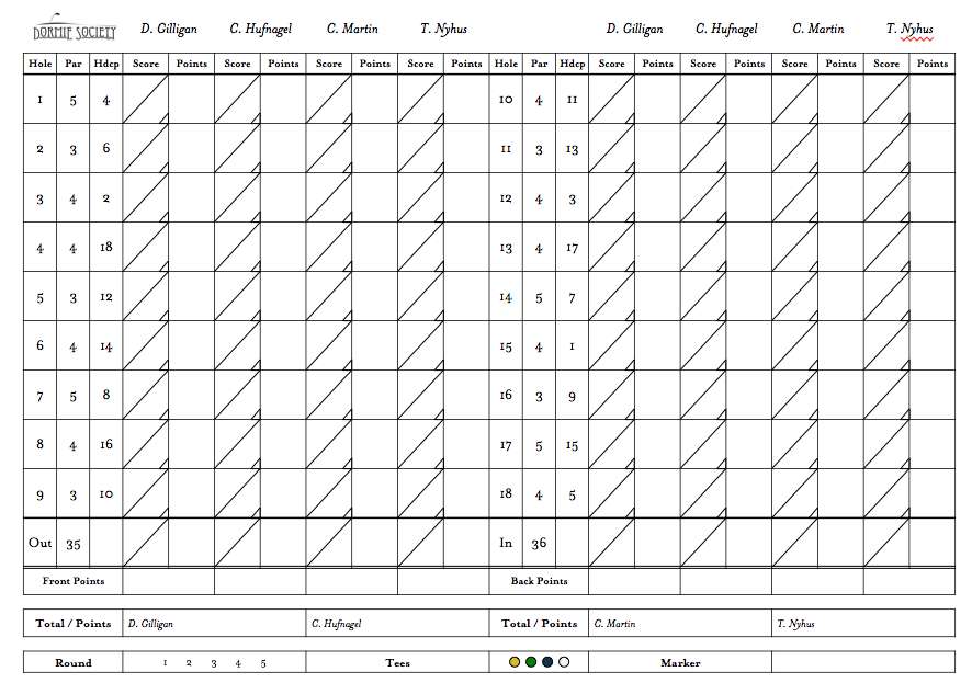
For the past three year's I have run an event (The Dormie Cup) at the Kingsley Club for the Dormie Society - which is essentially me plus three of my very good friends.  I tend to get carried away in stuff like this and as such, I created our own scorecards for the event.

We have two competitions now, the first is a 90 hole individual competition (10 points per hole - 4 to the low score, 3 to the second, etc. - 900 points available in total over the three days).  It is played with handicaps and I wanted a simple way to mark both who received strokes and when, plus gross and net scores per hole.  The other event which we started this year is the "Jameson" - an 18 hole, team, Pinehurst Alternate shot format.  

Here is the outside of the card - it is a vertical card, so the left hand side is actually the back.  I have already updated it for next year...


Here is the inside of the card...


Tim Gavrich

  • Karma: +0/-0
Re: The quality of the scorecard related to the course
« Reply #15 on: August 30, 2012, 05:33:24 PM »
The glossy, huge, loud scorecard has always been a bane of my existence. Even at resort courses, I really see no need for the scorecard to be any more elaborate at all than most private clubs'.

As if the place isn't idyllic enough already, Copake Country Club's "Walking" scorecard is just perfect--no larger than it needs to be.
Senior Writer, GolfPass

Emile Bonfiglio

  • Karma: +0/-0
Re: The quality of the scorecard related to the course
« Reply #16 on: August 30, 2012, 05:44:08 PM »
NEW QUESTION.

Does the scorecard need a map/routing, assuming that yardage books are not available?
You can follow me on twitter @luxhomemagpdx or instagram @option720

Bill Shotzbarger

  • Karma: +0/-0
Re: The quality of the scorecard related to the course
« Reply #17 on: August 30, 2012, 07:04:14 PM »
Do the members at Friar's head have the handicaps of the holes memorized? Are they marked on the signs beside the tee box (assuming they have those)? Or, I can't imagine, but.. do the members never play money matches??  ???

I ask because I've played my home course hundreds of times and I couldn't tell you how all of the holes are handicapped.

Scott Warren

  • Karma: +0/-0
Re: The quality of the scorecard related to the course
« Reply #18 on: August 30, 2012, 07:05:57 PM »
Emile,

IMO, if there is any correllation at all, the quality of a scorecard is inversely proportionate to the quality of the course.

And if the routing is sensible, you shouldn't need a treasure map on the card to show you where to go.

Emile Bonfiglio

  • Karma: +0/-0
Re: The quality of the scorecard related to the course
« Reply #19 on: August 30, 2012, 07:09:24 PM »
you shouldn't need a treasure map on the card to show you where to go.

At times I'm guilty of looking at the map for bunker placement on a course I've never played before. Your right that routing should not be that difficult.
You can follow me on twitter @luxhomemagpdx or instagram @option720

Keith OHalloran

  • Karma: +0/-0
Re: The quality of the scorecard related to the course
« Reply #20 on: August 30, 2012, 07:41:24 PM »
Bill,
The idea came from Sand Hills, and is utilized at Friar's Head. The handicaps change based upon the wind direction. The member is suopposed to handicap the holes for the day based upon the conditions.

Cliff Hamm

  • Karma: +0/-0
Re: The quality of the scorecard related to the course
« Reply #21 on: August 30, 2012, 07:42:59 PM »
GCA's Nick Campenelli has a spectacular collection of scorecards:

http://www.cognizantgolf.com/scorecard-database.html

Ben Kodadek

  • Karma: +0/-0
Re: The quality of the scorecard related to the course
« Reply #22 on: August 31, 2012, 10:12:22 PM »
Palmetto Golf Club.  All you need. 

JSlonis

  • Karma: +0/-0
Re: The quality of the scorecard related to the course
« Reply #23 on: September 01, 2012, 11:27:47 AM »
I've yet to play Friars Head. I'm assuming all play is with caddies and they tell you the yardage of each hole?  I don't understand why yardage wouldn't be on the scorecard as well.
« Last Edit: September 01, 2012, 11:30:05 AM by JSlonis »

Chris Newton

  • Karma: +0/-0
Re: The quality of the scorecard related to the course
« Reply #24 on: September 01, 2012, 11:59:51 PM »
NEW QUESTION.

Does the scorecard need a map/routing, assuming that yardage books are not available?

I recently played a course that had an actual aerial photograph of the routing printed on the scorecard. It was neat to look at, but served no real purpose. Like others who have commented in this thread, I've always preferred simple/classic scorecards with minimal print. In regards to the size of the scorecard, smaller is better.