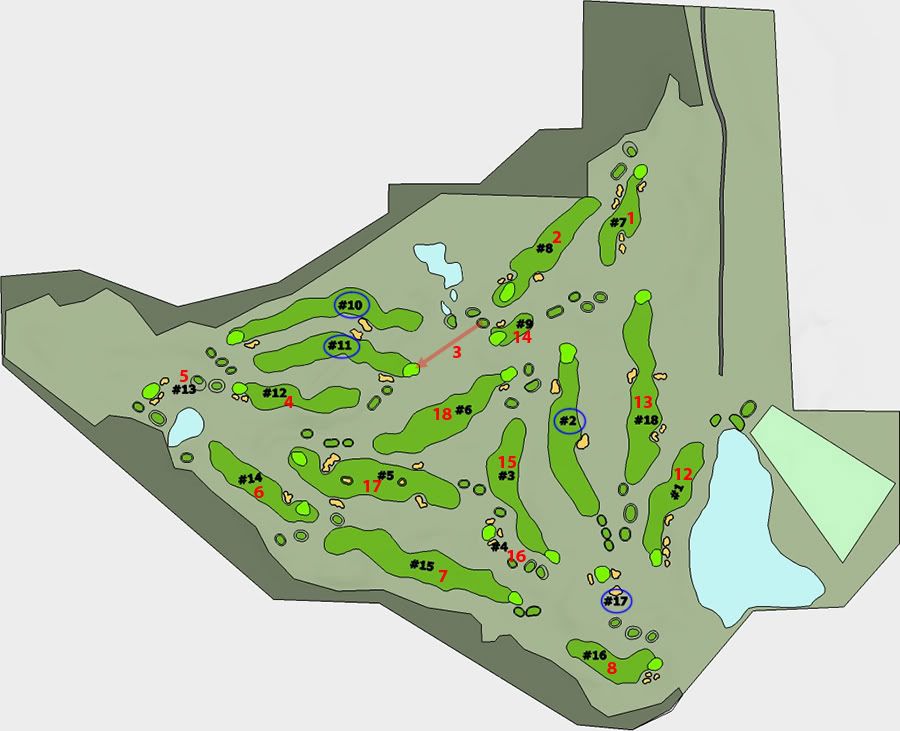
Let me start by saying thanks to Tom, it was fun and interesting to translate (some of) your hole designs to sketchup.
A couple of points:
1. The comparisons to the current Erin Hills are not totally valid. When Erin Hills was designed more land was available. Judging by the disjointed nature of the collaborative routing, Tom would likely have come up with something significantly different than what you see here. I think what you can do is judge the holes on their use of the ground (as well as you can, considering its only in sketchup) and go from there.
2. I suck at this. In the image below Ive given some idea of the original routing (in red) and highlighted my contributions by circling them in blue. Now in my defense, I was trying to preserve as many of the original holes as possible, so thats why you see things like #9 black practically doubling back on the routing, and why there is such a long walk from 6 to 7 black. (also note that the location of hole 2 black was the original clubhouse/parking location)
Ill give a couple of explanations of my routing decisions below, but here is the map:

Given that the 3 holes down and around the large wetland wouldnt be useable (because I didnt carry the topos out around there) I knew Id have to do at least 3 new holes. Plus, since there wasnt enough room to go out and return back from anyplace on the property to the north of the existing holes, I figured Id need to ditch at least one more. So I worked from the idea that Id keep all of Toms holes you see here accept for 1. That one ended up being Toms 3rd hole, though I kept his green exactly as is using it for the 11th. (I also basically kept Toms 3rd tee with minor shifting.
I chose that spot because it offered the largest open area free of other holes and bottlenecks and just laid them out. I see other areas I could have gone, but I went the way I did because I figured it needed a couple of longer holes ( to replace the ones around the wetland).
Numbers 2 and 17 were born of necessity, but frankly 17 sucks, though I think 2 works okay.
Number 10 is a bit boring, but with some bunkers it would be better. Number 11 should have used that Esker that it doglegs around but, again, I suck at this.
Bottom line is I think Toms collection of holes overall is great. There arent any crappy holes, bad blindness is at a minimum, the holes look natural and there is logic and strategy to most of the shots. But most importantly to my eye, they are pretty. Ive mentioned a few times that strategy rarely comes into my mind when Ive been looking at the topos and sketchup files (Im glad that most architects do, and Tom most certainly does), I just like to find something that looks right and go from there.