Okay, the day is finally here and the contest will commence. Before getting into the details, Id like to thank the judges for generously donating their time and effort to this contest. They are:
Yannick Pilon
Rich Goodale
Ian Andrew
Jeff Brauer
Tom Naccarato
Mike Nuzzo
Dave Schmidt
Paul Cowley
Ron Farris
Now as for the prize for the winner, a custom score card (as shown below; the reverse side is for a course map) signed by the judges, will be awarded.
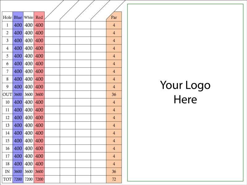
Perhaps additional prizes will come about, but for now, thats it.
There will be few rules for the contest. Youll have about a month to complete your design. If one or more people just cant finish in that amount of time well extend it a bit, within reason. Were going to use Google Sketchup to design the course, but if for some reason you are not able to make sketchup work properly, let me know and well come up with a work-around. That might entail you printing out a hard copy of the map and drawing on it, then scanning it in and sending it to me for final conversion. Bear in mind that there is no way I could do this for everyone, so its best if you can do the sketchup work yourself (Ill be available for questions/help throughout the process). When youre done, send me your final sketchup file with your name in the filename. It can be emailed, or uploaded to your own online storage (if you have online storage set up...Microsoft gives you 5GB for free) and a link emailed to me. Ill then replace the name with a number and forward to the judges. Ill keep the database of names/numbers in a secure spot online.
The plan for rating the courses is as follows:
Each judge will score each course in two areas on a scale of 1-10 (with 10 being the best).
The first area is routing. As I see it this includes using the natural features of the site well, providing a good variety of holes, and having a well thought-out course. However, the judges are free to interpret routing however they wish.
The second area is strategy. This should include an evaluation of any built or added features like trees and bunkers, but should also take into account any design decisions made by the contestant that are not covered by routing.
Additionally there will be a contest for best par 3, 4, and 5. The details are not all worked out yet, but the judges will be divided into 3 groups with each group coming up with the winner for one of the 3 categories.
For the purposes of the contest, I assume the judges will want to view the sketchup files, but if a simple aerial image with contour lines is preferred, that will be arranged.
Also, each contestant should prepare a post with an overall aerial and a few close-up shots of individual holes and accompanying descriptions. Those will be posted to another thread.
(Links for sketchup and the contest files will be in a following post. Tutorial and help information will follow as well.)
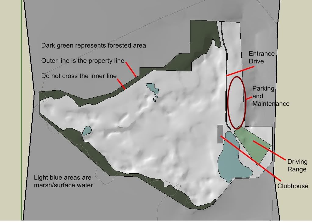
The client specifications are described in conjunction with the image below. Basically just dont cross the entrance drive and dont go into the dark green area. The area for the range is already decided, so all you have to do is design 18 holes. It will be a high-end public facility, but there is no set par or yardage. Returning nines would be preferable, but not to the detriment of the design. The course will be open 6-7 months a year, and under snow for much of the remainder. The actual site has nice mature hardwood trees scattered about its interior, but I have not mapped them in sketchup. So, if an area seems to fit well with a tree, place one there, and well call it a mature transplant. Design it with 3 sets of tees.
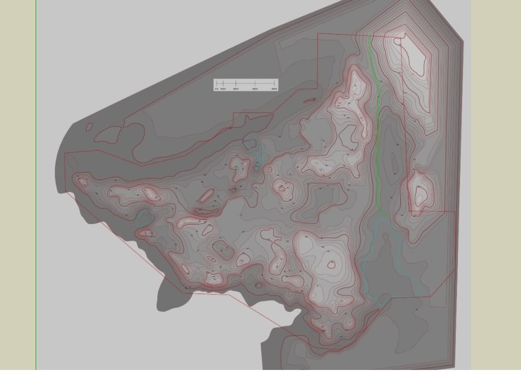
Here is a topo map overlay that shows the higher elevations as lighter, and the lower elevations as darker. The contour lines are in 3-foot intervals. A high-res version of this map will be available for use outside of sketchup.
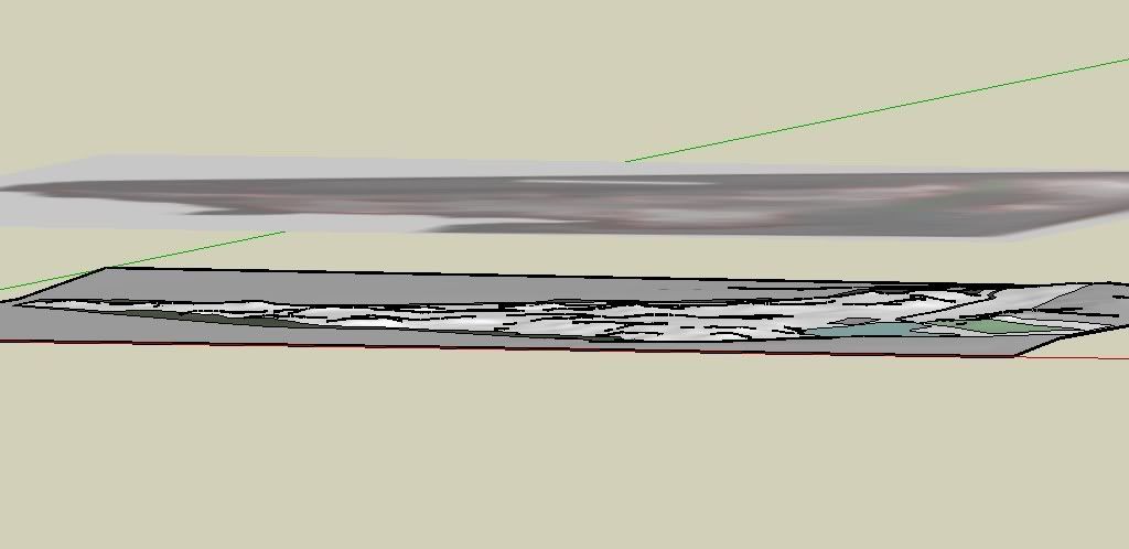
Here is the image rotated so that you can see how the map overlays the 3D model image:
Sketchup was chosen as the medium for the contest because it is free, and it allows for drawing in 2 dimensions, as well as working in 3 dimensions. It also allows for choosing color schemes that make viewing/differentiation easier and for creating views that can help elucidate the design.
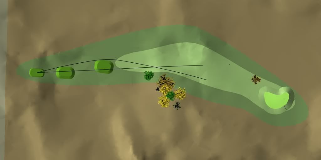
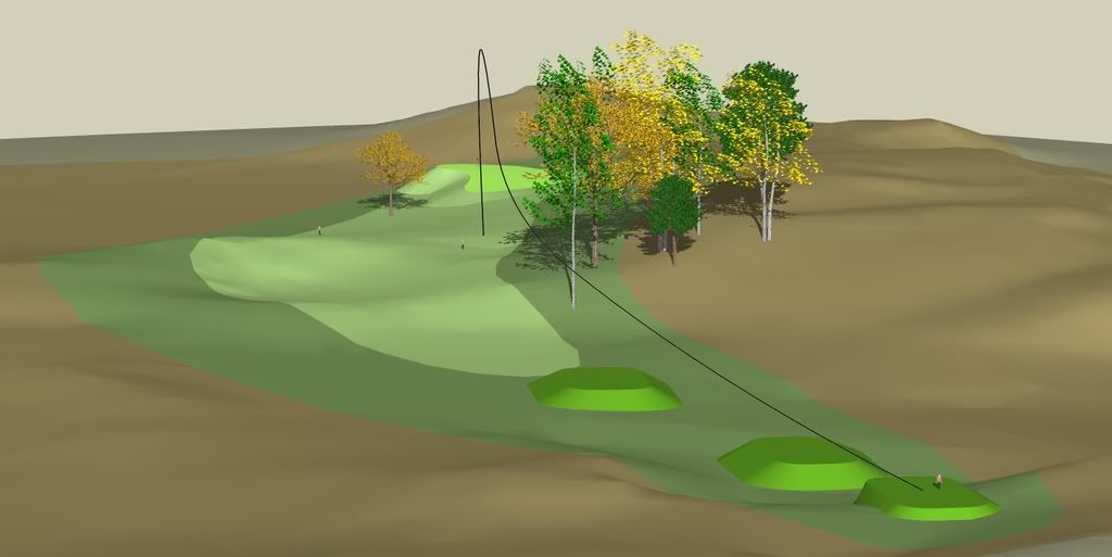
Here is an example I did in sketchup using a different map.
Aerial:
View from behind the tee:
So, additional info to follow, but the bottom line is to let the creativity flow.
Oh, and post any questions, comments, considerations to this thread.
Good luck to everyone,
Charlie