News:

Welcome to the Golf Club Atlas Discussion Group!

Each user is approved by the Golf Club Atlas editorial staff. For any new inquiries, please contact us.


Charlie Goerges

  • Karma: +0/-0
It's time for some Armchair Architecture
« on: September 08, 2008, 02:14:04 PM »
Hi All,

I am new to the group, but have been following fairly closely for about a year now. In that time I have gotten interested in architecture and what it takes to route/design a good golf hole. Since I will probably never design a real golf course I sought out a way to try my hand at it and view the end result as realistically as possible. So for my own edification I created a 3D model of a topographic map and began designing a few different holes to see how they would look.

I’ll make the file available to everyone and we can use this thread to share our results.

The 3D software program I used is Google Sketchup. So anyone who wishes to use the file to design something would need to download Google Sketchup for free from this link: http://sketchup.google.com/download/.

Note: to avoid problems, I suggest downloading and installing google sketchup first so that windows doesn't throw any file-type errors.

Click here for the file: http://cid-f73fd6728c175582.skydrive.live.com/self.aspx/Public/armchair%20arch.skp

The map that I digitized (with permission) is the one that Renaissance Golf Design distributed with its 2007 internship application, so some of the folks on this site may have already seen it or even designed a hole or holes and submitted an application. I chose that map because it represented a relatively small area (to keep me from feeling overwhelmed with the possibilities) but could hold more than one hole.

Now the process is a bit complicated so a tutorial on how to use the program and file is available here: http://cid-f73fd6728c175582.skydrive.live.com/self.aspx/Public/simplified%20tutorial.pdf

Also, anyone should feel free to post questions to this thread because others may have the same question. (Anyone with some sketchup experience should feel free to post an answer to a question or suggest something that I haven’t thought of… I am not the be-all end-all of sketchup, believe me)

I’ll post some jpegs of my own designs for inspiration/derision to get the process started. But first I must admit that I did not follow the exact process that I am putting out there for others on the images I’ll be posting. Rather than do the drawing in Sketchup I did it in Adobe Illustrator because it was easier to create more flowing lines that way and fine-tune them, then I imported the information into sketchup. (Plus, Illustrator was a key step in converting the original map to a 3D model, if you want to know more about this, let me know.) Since Adobe Illustrator is not a free program I devised a way to do it all in sketchup. It’s not as easy to create nice flowing lines, but the routing and shape of the holes should still be fairly well represented. If someone wants to use illustrator, just let me know and I’ll make the file available.

Note: if you don't want to be influenced sub-consciously or otherwise by my (or other's) images, design your holes and post them before reading further than this first post. But don't worry, you'll get no accusations of being derivative from me if your ideas are similar to mine. Chances are most/all of us are getting our ideas from somewhere else.

Also, just so it’s clear, this is not a contest… I will not be the sole critic and there will be no prizes (except the sweet accolades sure to come your way from fellow GCAers). If someone needs some kind of prize to push them over the edge, then come on up to MN and I’ll give you a great big kiss. On the lips no less (from what I believe, I’m a very good-looking guy).

So there you have it…now go do that voodoo that you do so well.

Charlie

Added tips/ideas:

When exporting a jpeg from sketchup, play with the field of view under the camera menu. Adjusting the FOV yields pretty dramatic results.
« Last Edit: September 08, 2008, 11:21:58 PM by Charlie Goerges »
Severally on the occasion of everything that thou doest, pause and ask thyself, if death is a dreadful thing because it deprives thee of this. - Marcus Aurelius

RJ_Daley

  • Karma: +0/-0
Re: It's time for some Armchair Architecture
« Reply #1 on: September 08, 2008, 02:40:30 PM »
Charlie, it sounds like fun.  One problem... here is what I get to try and open the file...

Quote
File Type: Unknown

Description: Windows does not recognize this file type.

You may search the following Web site for related software and information:

Windows Live Search
You may purchase or download software related to this file type from the following Web site:

Windows Marketplace

That leads to this:
http://fileextensiontype.com/open.aspx?file=skp

I'm having enough bugs and gremlins in my PC lately.  I'm not sure I want to go through all that downloading, despite them saying it is 100% clean.  Many of us GCA.ers are from the mesozoic era, you know.  ::)
No actual golf rounds were ruined or delayed, nor golf rules broken, in the taking of any photographs that may be displayed by the above forum user.

Charlie Goerges

  • Karma: +0/-0
Re: It's time for some Armchair Architecture
« Reply #2 on: September 08, 2008, 02:46:51 PM »
Sorry, I should have said to download google sketchup first then my file. If you download sketchup and install it, windows should have no problem with it. I will edit my original post to change the order.

If there are addition issues anyone runs into, let me know. I'll try to make/keep everything as simple as possible. I'll provide any additional instructions that come up in my original post.

Charlie
« Last Edit: September 08, 2008, 02:51:28 PM by Charlie Goerges »
Severally on the occasion of everything that thou doest, pause and ask thyself, if death is a dreadful thing because it deprives thee of this. - Marcus Aurelius

Charlie Goerges

  • Karma: +0/-0
Re: It's time for some Armchair Architecture
« Reply #3 on: September 08, 2008, 03:12:07 PM »
Okay here are my images.

Note, scroll quickly past if you don't wish to be influenced or contaminated.


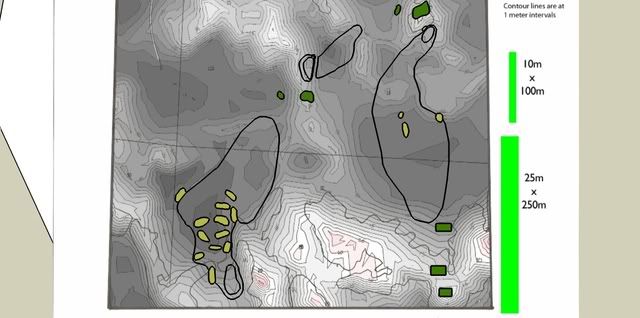
First, the overhead showing the holes with contour lines. We'll call the left-hand hole #5 and the right-hand hole #4


Here is an overview of hole 4


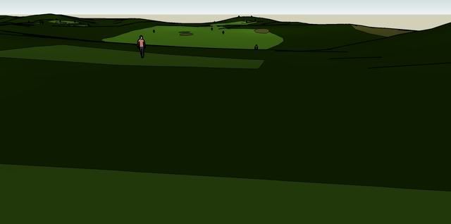
Here is hole 4 from the back (lower right tee). The idea is that if you drive closer to the bunker, the view of the green will open up.


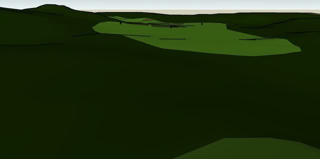
I'll stop here to critique the design, though my next image from the fairway will make it clearer. The small round bunker fronting the green is stupidity personified (in me). Not only is it totally blind, but it takes away the advantage one gains by strategically placing one's drive close to the fairway bunker. Also, as shown below, not much of a view opens up. You can see the tippy top of the flag as long as it's on the right hand side of the green, not much of an advantage.


Now, hole 5 overview, par five, about a 250+- carry over the left-central bunker. My idea of a split fairway design.


A critique here as well. The carry should probably be much longer from the back tee to make it a real choice for the strong player. Perhaps I will move it back in a future iteration.

Shown below is a view from the middle (lower right) tee.


So there is my start on things, Gradually I'll post a few more, but I hope to see many ideas from others.
Severally on the occasion of everything that thou doest, pause and ask thyself, if death is a dreadful thing because it deprives thee of this. - Marcus Aurelius

Mike Nuzzo

  • Karma: +0/-0
Re: It's time for some Armchair Architecture
« Reply #4 on: September 08, 2008, 04:44:06 PM »
Charlie,
Why did you separate the fairway on the par 5?
I'd like it better as one big fairway - especially since it is hidden.
Cheers
Thinking of Bob, Rihc, Bill, George, Neil, Dr. Childs, & Tiger.

Charlie Goerges

  • Karma: +0/-0
Re: It's time for some Armchair Architecture
« Reply #5 on: September 08, 2008, 06:18:22 PM »
Mike, thanks for the reply.

I guess I decided to separate the fairway (rather than have 1 big fairway) out of a bow to standard fairway widths. (I guess I should have probably put a scale into the images).

What I was going for was a real distinct choice with a safe option. With that I wanted to see a large flat fairway to the right to provide easier lies with a less imposing 2nd shot (as opposed to staying short of the bunker if it were a more conventional narrower par 5.

Now that you've mentioned it, if there were no rough between the two, I could see how a sliced/faded drive could bound down the hill all the way to the right leaving a much longer 2nd shot vs. getting held up in the rough on the left (upper) fairway and leaving a shorter second.

(FYI the length of the hole from either the middle or back tees is about the same at approx 550 yards. Right or wrong, I figured the extra height/view made up for the lack of a distance advantage. Also, the widest part of the short/layup fairway is about 50 yards with the widest part of the main fairway at about 65 yards.)
Severally on the occasion of everything that thou doest, pause and ask thyself, if death is a dreadful thing because it deprives thee of this. - Marcus Aurelius

Charlie Goerges

  • Karma: +0/-0
Re: It's time for some Armchair Architecture
« Reply #6 on: September 10, 2008, 09:49:04 AM »
I am bumping this thread so that anyone who may have missed it will get a chance to see it. If it's considered bad form for one to bump one's own thread, let me know.

Thanks,

Charlie
Severally on the occasion of everything that thou doest, pause and ask thyself, if death is a dreadful thing because it deprives thee of this. - Marcus Aurelius

Kyle Harris

Re: It's time for some Armchair Architecture
« Reply #7 on: September 10, 2008, 09:50:49 AM »
I am bumping this thread so that anyone who may have missed it will get a chance to see it. If it's considered bad form for one to bump one's own thread, let me know.

Thanks,

Charlie

No, it's not bad form at all. Especially a germane and interesting thread as this.

John Kirk

  • Karma: +0/-0
Re: It's time for some Armchair Architecture
« Reply #8 on: September 10, 2008, 10:26:04 AM »
OK, this is truly armchair architecture, since my role is player and observer.

I don't understand the positioning of the greenside bunker on #5.  Nor do I like the way it looks from the middle tee perspective.  Do you really want to reward the player who carries the bunker with the worst angle into the green, requiring a carry over the greenside bunker?  It does appear that a ball carrying the fairway bunker on the tee shot may kick off a slope into the right center of the fairway, and the attack angle will be pretty good.

Also, if the greenside bunker stays in some form, I'm not sure the second left fairway bunker, furthest left, is necessary.  Already a bad angle, perhaps a blind shot.

Finally, that greenside bunker would look great from the middle tee perspective if sort of blended into the fairway bunker in front of it, so that it all looked like one hazard.  Right now,  it looks like a fin sticking out of a whale.

I hope I don't sound like I'm nitpicking.  I'm not interested in creating architecture to download the program, so I thought I'd play the armchair architect part of the game.

Charlie Goerges

  • Karma: +0/-0
Re: It's time for some Armchair Architecture
« Reply #9 on: September 10, 2008, 11:33:45 AM »
Hi John,

Thanks for your thoughts. I don't think you're nitpicking. Criticism is not a dirty word on this thread.

I do agree with your assessment of the bunker just short of the green because it does look stupid from the tee. I wanted something to throw a wrench in layup shots from the lower fairway and approaches from the upper fairway, but not so much that the risk was too great to be worth going for it in 2. I think I'll re-design that one.

I also agree that the bunker farthest left seems unnecessary. Especially since my main reason for putting it there was to increase the visual intimidation from the tee (a job at which it fails miserably because it is barely visible from the middle tee and blind from the back tee). It should be removed I think.

I may try also taking out the strip of rough between the upper and lower fairways and lengthening the carry from the tee over the large central bunker. (I may have to move some actual earth to give the tee shot some interest from the back tee).

I am curious if you think the main thrust of the hole (a real distinct choice for a split-fairway hole) works or is apparent. (The hole is about 550 yards in a straight line from tee to green, with a carry of about 250 yards to the back edge of the central bunker)

Thanks again for your thoughts/ideas,

Charlie
Severally on the occasion of everything that thou doest, pause and ask thyself, if death is a dreadful thing because it deprives thee of this. - Marcus Aurelius

Ian_L

  • Karma: +0/-0
Re: It's time for some Armchair Architecture
« Reply #10 on: September 10, 2008, 09:41:05 PM »
Hi Charlie,

I'm trying to make a golf hole following your tutorial and am coming up on a few problems:

1.  After I "hide" the golf hole as you suggest, and change to perspective view, the golf hole remains hidden, unlike your tutorial suggests.  Should I unhide it after switching to the perspective view?

2.  My hole does not fall on the terrain, it remains suspended above it.

3.  When I try to shade the fairway, rough, etc., the entire land changes color.

Thanks, and great idea!

Charlie Goerges

  • Karma: +0/-0
Re: It's time for some Armchair Architecture
« Reply #11 on: September 11, 2008, 12:42:16 AM »
Hi Ian,

Sorry about the trouble you are having. I am pretty certain that point number 2 is the problem, but I think that rather than try to help you troubleshoot it via the board here, I'll ask you to email me your file if that is possible. My email address is available via my profile.

Chances are that I went too light on information in the tutorial, and depending on what I find with your file, I can change the tutorial to be clearer on that area for others. When done, I'll email you a link to download it, so that you don't have to worry about your email server/program blocking it.

Once again, sorry about the trouble, and I look forward to seeing your results,

Charlie
Severally on the occasion of everything that thou doest, pause and ask thyself, if death is a dreadful thing because it deprives thee of this. - Marcus Aurelius

Ian_L

  • Karma: +0/-0
Re: It's time for some Armchair Architecture New
« Reply #12 on: September 11, 2008, 12:47:15 AM »
No problem Charlie, your tutorial in general is great, I'm not a computer expert but got through most of it with ease.

I can't seem to access your profile, so if you want to send me an e-mail  I can get your address that way.

Thanks again.
« Last Edit: February 01, 2009, 05:52:21 AM by Ian_Linford »

John Kirk

  • Karma: +0/-0
Re: It's time for some Armchair Architecture
« Reply #13 on: September 11, 2008, 10:06:58 AM »
Hello Charlie,

Yes, I think the hole concept works pretty well.  I agree with Mike Nuzzo that it should be one big fairway.  For me, 250 is a pretty big carry.  If the carry bunker is a tough one, where it's difficult to advance the ball very far, then I'm bailing out every time.  If it's possible to advance the ball to wedge distance from there, then I'll go for it regularly.  But I'm a medium-long hitter.  Long bombers will aim over the bunker every time.  This hole, as designed, rewards long ball hitters.  Chicks dig the long ball.

Ian_L

  • Karma: +0/-0
Re: It's time for some Armchair Architecture
« Reply #14 on: September 11, 2008, 07:32:21 PM »
Well, I’ve given it a shot, my first flail at a golf hole design.  Here are some things I’m unhappy about already:
1.   Holes 1 and 3 are too similar in concept.
2.   #2 tee is close to #1 green
3.   The bunkering on #3 is WAAY overdone (you'll laugh when you see it), the hole needs to be rethought.  I might be able to simply take out a bunch of those bunkers and keep the strategy of the hole mostly intact.  I really don't know what I was thinking when I put all those in.

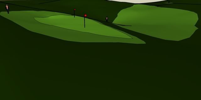
Here’s an overview of the holes, #1 is the par 4 on the lower right, #2 is a par 3, and #3 is a par 4.  I didn’t realize that Charlie had a very similar hole to my #1 until I just looked back at this thread.


1st hole, 420/405 yards.
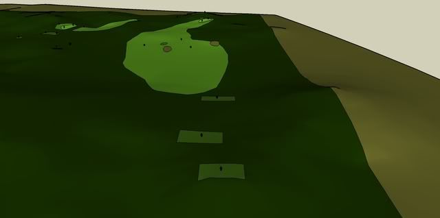


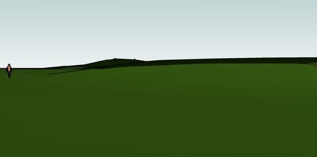
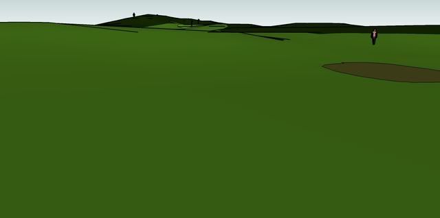
The concept of this hole was to give the player who chooses to go right of the bunkers a shorter, but blind, approach.  It turns out that if the player hits it 290 or more down the right, he’ll have an adequate view of the green.  The left side offers an open approach with a good angle to the green, but too far left also leads to a blind 2nd shot.  I think moving the bunkers 5 yards right might make the choice a bit more interesting, but I’d like to hear what others think.
A 260-yard drive down the right leaves about 145 to the green:

A 260-yard drive down the left leaves about 160 to the green:

2nd hole, 203 yards.
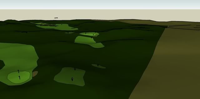

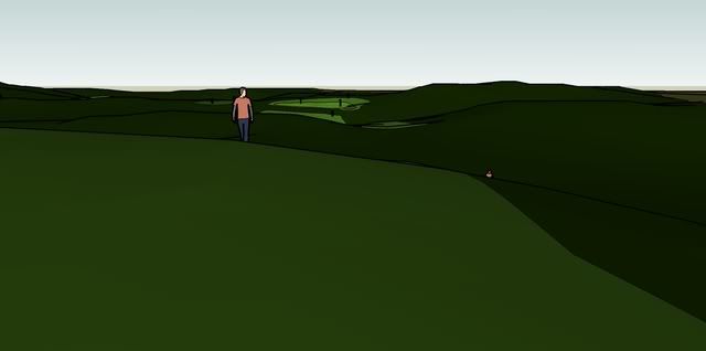
This natural ledge looked interesting, so I decided to try to use it.  My idea here was that a ball clearing the bunker on the right should bounce onto the green.  Anything long should have a chance at coming back as well.  I would be interested in feedback on my decision to leave some rough between the fairway and the green (I assumed all rough to be slightly penal, but to still allow a good hack).  The green narrows to the left (the left side of the green would need to be leveled slightly).
A lay-up is somewhat blind:

A view from behind the green:

3rd hole, 355/310 yards.
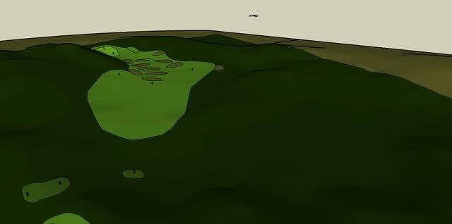

I was excited when I started this hole, but I soon found my idea much more difficult to apply practically than I had anticipated.  The sea of bunkers in the fairway shows pretty clearly that I tried to force my strategy on the hole when the terrain didn’t comply with my concept.  Had there been a natural hazard there (I suppose I could pretend there was), the hole might have had more potential. I also realized as I was finishing that the hole ended up being a more extreme version of hole #1. Maybe if I thin out the bunkering I can come up with a better hole...  I think I tried to make a short hole too hard instead of just taking what I'd been given.

(the oval by the green is a bunker, it wouldn’t change colors)


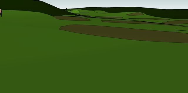
The idea was to give the player the choice of:
1.   Going for the green (a blind 285-yard carry),
2.   Playing a 200-yard shot down the left, leaving a blind 100- to 115-yard shot to the green,
3.   A 220- to 265- yard drive down the right, leaving a 125- to 145-yard shot with a good angle at the green, or
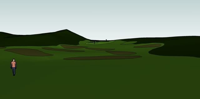
4.   Laying up short of all the bunkers, leaving about a 155-yard shot with a mediocre angle.
I thought the quantity of options was fun, but I didn’t like having to put 12 bunkers in to make it work.
Option 3 leaves:

Option 4 leaves:

From behind the green:
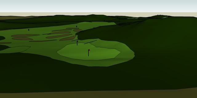

Any comments would be appreciated, I don’t expect accolades so don’t worry about hurting my feelings :P

Charlie, how did you get your course to look so nice?  I get these black lines on ridges…

« Last Edit: September 11, 2008, 07:34:45 PM by Ian_Linford »

Charlie Goerges

  • Karma: +0/-0
Re: It's time for some Armchair Architecture
« Reply #15 on: September 11, 2008, 10:12:05 PM »
Ian,

Don't sell yourself short, it's an admirable first effort. I'll give a few tips on how to spice up the images at the end of my post, but first, onto the criticism (the good kind).

I dig your first hole. You really put a lot of thought into strategy. Your images from the right and left portions of the fairway and your descriptions of them show clearly the trade-offs between each option. I agree that moving the center bunkers to the right might be better. I also think the green is a little bit too small to be able to hit easily. I don't necessarily think that 2 tee is too close, it's up a steep hill.

Also, your first hole is not that similar to mine, the tee area is the same, but your hole has actual strategic choices. On mine, there was absolutely NO advantage to playing the riskier shot. On yours, there is.

Now to the second; this was my least favorite of the holes. I don't think the rough short hurts the player much because I think that slope might be a bit too steep to run one up anyway. I do think it's serviceable but I won't dwell there because I want to get to the third.

Your third was my favorite by far. It looks cool on the overhead, and cool from the tee and even better looking from behind the green. I do think you need to lose a bunch of bunkers, but don't change the routing. Maybe one good-sized bunker somewhere to keep players honest and/or a false-front green that is pushed up (something my tutorial didn't go into, but which is possible) a bit to make a really short approach from the front more treacherous. I am completely jealous of this one.

Of course take that critique for what it's worth (not much), after all I am an armchair architect. This is what I love about this site.

Okay, to improve the quality of the images you need to do 4 things:

1. Turn off the display of edges as shown below. Uncheck both "Display Edges" and "Profiles".


2. If the shadows toolbar isn't already visible, display it by making sure shadows is checked as in the image below.


Then play with the shadows functionality. Turn on shadows by clicking the shadows button second in from the left on the top in the image below and then click the shadow settings button, top left button (box with a blue circle with an I in front of it). Check the boxes as shown, but slide the sliders every which way until you get a look you like. (make sure your view is the way you want to be looking at the hole first, to see how the shadows fall).


3. Use the Field of view tool by clicking in the menu shown below.


Then click and drag (up or down, I can't remember which) in your screen to bring the objects in the distance closer in the same way a camera can. After you do this, you may have to re-position to get the shot as you want it.

4. make the image bigger, you don't have to go as big as is shown below (in fact you shouldn't go that big), but you'd be surprised how much a little more square footage will do for you.


Alright, there you go, I gotta cut this off so I can post my updated design. And as always, let me know if you need any help.

Charlie
« Last Edit: September 11, 2008, 10:17:17 PM by Charlie Goerges »
Severally on the occasion of everything that thou doest, pause and ask thyself, if death is a dreadful thing because it deprives thee of this. - Marcus Aurelius

Charlie Goerges

  • Karma: +0/-0
Re: It's time for some Armchair Architecture
« Reply #16 on: September 11, 2008, 10:22:05 PM »
Okay, here is my redesign taking John's and Mike's suggestions into account and making some changes of my own (on hole 4). I'll take it in the same order as before. (FYI, the reason I keep calling them hole 4 and 5 is because they are the fourth and fifth holes I tried to design and I can't get my brain to re-route the numbering)

First, an overview with yardages. On hole 4 I moved the green closer to the tee and to the right to give a distinct advantage to a good tee shot on the right. On hole 5 I've slightly decreased the carry from the middle tee and increased it from the back tee.


Here is the overview from behind hole 4:


Hole 4 from the back tee:


Hole 4 from the middle tee:


Hole 4 fairway overview. Now the advantage to going right is more clear.


Hole 4 looking back:


Hole 5 overview:


Hole 5 from back tee:


Hole 5 from middle tee (the bunker near the green still looks like a shark fin somewhat):


Hole 5 from the middle of the fairway (after a long shot over the central bunker):


Hole 5 from right side (safe route):


Hole 5 look back:


So there you have it. Tear it apart you piranhas  ;) let's hear your worst. And let’s get some others out there besides Ian and me.

Take care,

Charlie
« Last Edit: September 11, 2008, 10:23:56 PM by Charlie Goerges »
Severally on the occasion of everything that thou doest, pause and ask thyself, if death is a dreadful thing because it deprives thee of this. - Marcus Aurelius

Ian_L

  • Karma: +0/-0
Re: It's time for some Armchair Architecture
« Reply #17 on: September 12, 2008, 02:23:05 AM »
Thanks for the instructions, it's looking better already.

I like how your approach shot looks on #4.  What's your reason for that bunker on the left side?  I'm not quite sold on how it would look, but maybe I just can't picture it.

On #5, have you thought about moving the second fairway bunker a bit farther left, or adding a new one?  That way the golfer might need to think about more than whether or not he has the brute force to carry the ball 257.  I do like the strategy of the hole.

Out of curiosity, what don't you like about my #2?  Anything that could be improved?
My question about keeping the rough on #2 was more about whether a ball slightly short would stay on the slope or roll all the way back down the hill.

I would be interested in learning how to "move dirt," but I don't want to take up too much of your time.  One thing I've been having some trouble with is draping.  Sometimes it seems like the map gets draped, and other times I can't find the right spot, and nothing happens.  Then when I hide the hole nothing's left.  I usually get it after a while, but is there anything I should be aware of?  Thanks again for taking the time to help me out.

I just realized we've got holes 1-5 so far...

TX Golf

  • Karma: +0/-0
Re: It's time for some Armchair Architecture
« Reply #18 on: September 12, 2008, 02:29:19 AM »
Wow.. Current technology allows for some pretty impressive digital images. Thanks for the photos/images Charlie.

Robert
« Last Edit: September 12, 2008, 02:32:17 AM by Robert Warren »

Tim Gavrich

  • Karma: +0/-0
Re: It's time for some Armchair Architecture
« Reply #19 on: September 12, 2008, 03:11:04 AM »
This is awesome stuff!  It reminds me of when I was younger, spending hours on the Jack Nicklaus 4 computer game designing holes and then playing them.  I played the Links games that had that Arnold Palmer Course Designer feature.  But I could never get it to work.

Is there a way to scoop out the bunkers and give them some 3-D looks?

Cheers.

--Tim
Senior Writer, GolfPass

henrye

Re: It's time for some Armchair Architecture
« Reply #20 on: September 12, 2008, 09:39:17 AM »
Charlie.  This is neat stuff.  My only question is what is the purpose of the 2nd bunker on #4?  Is it a flashed up bunker for visual effect?  Don't think many people would hit into it.  Balls hit nearby would bounce away as it looks to be on top of a knoll.  The approach from the left or right side of the fairway will be anything from 120 to 70 yards in and hitting over that bunker shouldn't be a problem.  I like the little pot bunker you had in the original, because I think lots of players would find it.

Charlie Goerges

  • Karma: +0/-0
Re: It's time for some Armchair Architecture
« Reply #21 on: September 12, 2008, 10:03:59 AM »
Well, many good points/questions.

Ian,

On your #2 there wasn't anything I specifically didn't like, it was just my least favorite of the three. On the other hand, when you mentioned about the rough keeping the ball from rolling back, I realized that there was more strategy involved in the shot than I had originally thought. Unfortunately the weakness of this medium is that subtle features like that don't show up very well (not to mention that I don't seem to be a very strategic thinker when it comes to golf).

Henry and Ian,

On my #4 that second bunker is there for no other reason than eye candy. On the overhead I thought it looked like a nice place, and in general I like to put bunkers on an upslope so they are more visible for players (and for the images that I output) but I guess that fact may not make a better golf hole. That's also why I put the second bunker on 5 where I did.

Tim and Ian,

earthmoving and scooping out bunkers is possible. a couple of examples below. I used a different technique for each.

this was the more time-intensive technique:


This was the easier technique (only the lower-right bunker was done):


I've got to get going, I'll try to put some more in-depth explanation this evening. Oh, the second technique can be reversed to produce raised tee boxes as well.

charlie
Severally on the occasion of everything that thou doest, pause and ask thyself, if death is a dreadful thing because it deprives thee of this. - Marcus Aurelius

Ian_L

  • Karma: +0/-0
Re: It's time for some Armchair Architecture
« Reply #22 on: September 12, 2008, 10:48:15 AM »
Cool stuff! 

I suppose you could say the bunker tempts the less confident iron player to take on more risk on the tee shot to avoid hitting over the bunker on #4...

Jim Colton

Re: It's time for some Armchair Architecture
« Reply #23 on: September 12, 2008, 12:02:14 PM »
This is awesome stuff!  It reminds me of when I was younger, spending hours on the Jack Nicklaus 4 computer game designing holes and then playing them.  I played the Links games that had that Arnold Palmer Course Designer feature.  But I could never get it to work.

Is there a way to scoop out the bunkers and give them some 3-D looks?

Cheers.

--Tim

I used to spend a lot of time with JN's designer and then Arnold Palmer course designer.  I made a Links version of Blackwolf Run River that was only about 95% completed but very highly regarded in the Links community (that is still out there, apparently).  I was hoping someone would take it over and finish it but it never happened.  I also started Whistling Straits and had all the shapes mapped but the 1,000 bunkers was just too much to shape.  My 3d version of the clubhouse looked pretty cool though.

So, with Sketchup, is the idea to draw the hole and then change the elevations up or down with the lines?  I might have to give this a shot.

Ian_L

  • Karma: +0/-0
Re: It's time for some Armchair Architecture
« Reply #24 on: September 12, 2008, 12:05:10 PM »
Hey Jim,

You draw the hole out on the topo map, and then transform it into 3-D by using the "drape feature."  You can then look around like we have in the pictures above, and go back to previous saved versions to edit your holes.