News:

Welcome to the Golf Club Atlas Discussion Group!

Each user is approved by the Golf Club Atlas editorial staff. For any new inquiries, please contact us.


Pete Blaisdell

  • Karma: +0/-0
Jon,

  You are the MVP of GCA !!Another home run.

  I was there for the Woman's Amateur in 2002 and walked the course for four days. The green complexes were among the best I have ever seen. The tree removal has made the course even more spectacular in so many ways. I have got to get back there.

  Much appreciated!
' Golf courses are like wives and the prom queen doesn't always make for the best wife "

Peter Le

  • Karma: +0/-0
Wonderful review and spectacular pictures!! I played the course last summer and was very impressed with the work that has gone into the both the lower and upper courses over the years.
PL

Bret Lawrence

  • Karma: +0/-0
Thanks for the tour Jon.  Your pictures are so captivating. 
I've already looked over these pictures several times and I'm sure I'll be back for more.

Chris Hans

  • Karma: +0/-0
Been waiting for someone else to mention it but since nobody has, I will.  Tom Leahy is the Golf Course Superintendent at Sleepy and the conditions he provides there are world-class.

Josh Stevens

  • Karma: +0/-0
Re: Sleepy Hollow Country Club - A Photo Tour and Architectural Appreciation
« Reply #29 on: February 01, 2015, 12:00:29 AM »
Purely an aesthetic preference. But it is clearly and interesting and varied landscape.  Movement of terrain, rock and soil, different vegetation colours. And yet against that, I find the white sharp edged geometric bunkering far too jarring against that backdrop. That in no way degrades from the strategy of the course, just its appearance.

By Faux wood, I mean those bridge railings made of what appear to be branches. Perhaps faux wasn't the correct term, but again it jars my senses.  To have such a manicured and geometrical course, and then juxtapose those strange balustrades, doesn't work for me. 

And the clubhouse? Well yes perhaps there is history, but I prefer small humble buildings than mock Versailles palaces.  Im sure the beer is cold and the sandwiches tasty

Chris Mavros

  • Karma: +0/-0
Re: Sleepy Hollow Country Club - A Photo Tour and Architectural Appreciation
« Reply #30 on: February 01, 2015, 09:03:25 AM »
Fantastic review and photos, thanks for posting.  The combination of scenery, template, Tilly and even the bridges makes the course look very good.  I could hit tee shots on that Short hole for days. 

Steve Lapper

  • Karma: +0/-0
Re: Sleepy Hollow Country Club - A Photo Tour and Architectural Appreciation
« Reply #31 on: February 01, 2015, 11:24:18 AM »
It looks as though it may have some interesting features and make for a fun round.  They do however perhaps loose some charm by being so clearly contrived in the bunkering and presentation.  It seems a landscape and a course that would benefit hugely if it were not so manicured and so damned neat and not so much of that silly faux wood railings.  The club house also a touch OTT for my personal taste.

And the 12th hole is hideous

Otherwise it looks fun

Josh,

   Please, in earnest, tell us what your idea of a wonderful, charming course is? I'm also very interested to her what makes the 12th hole so "hideous" in your estimation? I take it you've never played at Sleepy Hollow, but I do wonder what (beside the "silly faux wood," "so manicured and damned neat" bunkers and scale of the clubhouse caused you to feel so polarized about the place??? Do tell.


PS....Jon, another terrific photo essay. Larry Lambrecht and Brian Morgan should feel lucky you have a different day job! ;D
The conventional view serves to protect us from the painful job of thinking."--John Kenneth Galbraith

Sean_A

  • Karma: +0/-0
Re: Sleepy Hollow Country Club - A Photo Tour and Architectural Appreciation
« Reply #32 on: February 01, 2015, 06:44:46 PM »
Very fine Jon!

Ciao
New plays planned for 2024: Nothing

Malcolm Mckinnon

  • Karma: +0/-0
Re: Sleepy Hollow Country Club - A Photo Tour and Architectural Appreciation
« Reply #33 on: February 01, 2015, 10:37:54 PM »
Well, I have played here many times in the last 25 years and their were no branch bridges. A new braggadocio for one of the most lavish Westchester County clubs. I guess this was part of the latest revision by Bahto and Hanse.

It is one of the really good Westchester County, NY courses but by no means the best. The best holes tend to match up with the sweeping views over the Hudson River.

The club has not been the classiest place in Westchester County over the years. I have heard stories of "Headless Horsemen" outings with scantily clad women running around and alcoholic hedonism running rampant. Perhaps our Patrick Mucci might have some memories?

A very nice club and golf course but not Nirvana.


« Last Edit: February 01, 2015, 11:13:42 PM by Malcolm Mckinnon »

jeffwarne

  • Karma: +0/-0
Re: Sleepy Hollow Country Club - A Photo Tour and Architectural Appreciation
« Reply #34 on: February 01, 2015, 10:49:00 PM »
Well, I have played here many times in the last 15 years and their were no branch bridges. A new braggadocio for one of the most lavish Westchester County clubs. I guess this was part of the latest revision by Bahto and Hanse.

It is one of the really good Westchester County, NY courses but by no means the best. The best holes tend to match up with the sweeping views over the Hudson River.

A very nice club and golf course but not Nirvana.


Malcolm,
The "branch bridges" were most certainly there in 1992, 1993 when I worked there, and 1995 when I returned as Jim Hand's guest to see the then most recent bastardization.
They may not have been any on #10, but they most certainly were there on #3, #16, and the long walk to #13.(which is now no longer a long walk)
They were far less visible then as they were through the woods, but were most certainly visible as you walked on them.
Did you ride?
You wouldn't have seen them if you rode
Your "guess" about Bahto and Hanse is wrong
« Last Edit: February 01, 2015, 11:31:16 PM by jeffwarne »
"Let's slow the damned greens down a bit, not take the character out of them." Tom Doak
"Take their focus off the grass and put it squarely on interesting golf." Don Mahaffey

Malcolm Mckinnon

  • Karma: +0/-0
Re: Sleepy Hollow Country Club - A Photo Tour and Architectural Appreciation
« Reply #35 on: February 01, 2015, 11:18:27 PM »
Jeff,

I stand corrected but I truly don't remember the bridges. No, I did not ride and never will.

The last time I played Sleepy was a match play scenario  and perhaps I was too deep into my head between shots to notice.

Best,

Malcollm
« Last Edit: February 01, 2015, 11:22:42 PM by Malcolm Mckinnon »

John Percival

  • Karma: +0/-0
Re: Sleepy Hollow Country Club - A Photo Tour and Architectural Appreciation
« Reply #36 on: February 02, 2015, 12:34:47 PM »
Jon,
Awesome pics of an awesome course.
Better still, your descriptions are spot on for one of the game's most under-rated courses.
You touched on everything great about SH, even the logo.
Just one thing you missed...the stables on property are as impressive as the course and clubhouse.

And Malcolm, a scantily clad woman and alcoholic hedonism is how my wife and I spend the cold Michigan weekends!

Jeff Spittel

  • Karma: +0/-0
Re: Sleepy Hollow Country Club - A Photo Tour and Architectural Appreciation
« Reply #37 on: February 02, 2015, 04:07:01 PM »
Jon,

Thanks for another lovely photo tour. You are an artiste, good sir. 

Malcolm,

Thanks for the recommendation. Putting the Headless Horseman on my list of things to do this year.  8)
Fare and be well now, let your life proceed by its own design.

Mark McKeever

  • Karma: +0/-0
Re: Sleepy Hollow Country Club - A Photo Tour and Architectural Appreciation
« Reply #38 on: February 02, 2015, 04:09:58 PM »
It looks as though it may have some interesting features and make for a fun round.  They do however perhaps loose some charm by being so clearly contrived in the bunkering and presentation.  It seems a landscape and a course that would benefit hugely if it were not so manicured and so damned neat and not so much of that silly faux wood railings.  The club house also a touch OTT for my personal taste.

And the 12th hole is hideous

Otherwise it looks fun

Josh,

   Please, in earnest, tell us what your idea of a wonderful, charming course is? I'm also very interested to her what makes the 12th hole so "hideous" in your estimation? I take it you've never played at Sleepy Hollow, but I do wonder what (beside the "silly faux wood," "so manicured and damned neat" bunkers and scale of the clubhouse caused you to feel so polarized about the place??? Do tell.


PS....Jon, another terrific photo essay. Larry Lambrecht and Brian Morgan should feel lucky you have a different day job! ;D


I do wish the club left the original 12th approach and green available as an alternate. When I played there I walked up the hillside and gave it a walk around.  Can anyone comment on why such a major change was warranted?

Mark
Best MGA showers - Bayonne

"Dude, he's a total d***"

Kirk Gill

  • Karma: +0/-0
Re: Sleepy Hollow Country Club - A Photo Tour and Architectural Appreciation
« Reply #39 on: February 04, 2015, 04:59:52 PM »
Here's a link to the club brochure with some great interior clubhouse shots.

http://www.explore-hudson-valley.com/support-files/sleepy-hollow-country-club-brochure.pdf

Thanks so very much for this photo tour, Jon. Questions - from the photos, the Tillinghast section seems very different than the Macdonald holes. Is this apparent as you play the course? Does that section....."feel" different? Is it more that the land in that section is different, or the hole design, or am I just seeing a difference that you don't feel when playing the course?
"After all, we're not communists."
                             -Don Barzini

Jeff Spittel

  • Karma: +0/-0
Re: Sleepy Hollow Country Club - A Photo Tour and Architectural Appreciation
« Reply #40 on: February 04, 2015, 05:57:26 PM »
Here's a link to the club brochure with some great interior clubhouse shots.

http://www.explore-hudson-valley.com/support-files/sleepy-hollow-country-club-brochure.pdf

Thanks so very much for this photo tour, Jon. Questions - from the photos, the Tillinghast section seems very different than the Macdonald holes. Is this apparent as you play the course? Does that section....."feel" different? Is it more that the land in that section is different, or the hole design, or am I just seeing a difference that you don't feel when playing the course?

Kirk,

The Tillie holes do have a bit of a different character than the Macdonald holes, but I believe a lot of that has to do with them occupying a more heavily wooded section of the property. That's not necessarily to suggest that the course feels disjointed - the transition holes actually flow reasonably well all things considered and the style of bunkering is pretty uniform. Gil and George did a fantastic job melding the two sections of the course, imho.   
Fare and be well now, let your life proceed by its own design.

Jon Cavalier

  • Karma: +0/-0
Re: Sleepy Hollow Country Club - A Photo Tour and Architectural Appreciation
« Reply #41 on: February 04, 2015, 06:07:44 PM »
Here's a link to the club brochure with some great interior clubhouse shots.

http://www.explore-hudson-valley.com/support-files/sleepy-hollow-country-club-brochure.pdf

Thanks so very much for this photo tour, Jon. Questions - from the photos, the Tillinghast section seems very different than the Macdonald holes. Is this apparent as you play the course? Does that section....."feel" different? Is it more that the land in that section is different, or the hole design, or am I just seeing a difference that you don't feel when playing the course?

Kirk,

The Tillie holes do have a bit of a different character than the Macdonald holes, but I believe a lot of that has to do with them occupying a more heavily wooded section of the property. That's not necessarily to suggest that the course feels disjointed - the transition holes actually flow reasonably well all things considered and the style of bunkering is pretty uniform. Gil and George did a fantastic job melding the two sections of the course, imho.   

Kirk: 

Thanks for the comments and the link.  As for your question, I agree with Jeff to a large extent.  Those holes do feel a bit different -- for the most part, they are noticeably flatter and tighter than the rest of the course, though as Jeff said, this has a lot to do with the fact that they occupy some of the flattest and most heavily wooded areas of the property.

In doing the revisions and restoration, Bahto and Hanse were operating with a strategy of Macdonald-ifying the course (due, at least in part, the emphasize the rarer architectural pedegree for a course that sits in the heart of Tillinghast country, and also because Macdonald did the majority of the course).  Prior to the restoration, these holes were more Tillie-like in character, and were much tighter than they are now.  As Jeff noted, Bahto and Hanse did a really nice job of restoring and unifying the course as a Macdonald-style layout. 

In simple terms, I think someone like you -- who knows the styles of Tillinghast and Macdonald and is acutely interested in GCA -- would probably recognize that the original Tillinghast holes were somewhat different from the rest of the course.  But that the vast majority of the golfers playing the course today would probably not notice the difference.

Thanks again for your comments.

Jon
Golf Photos via
Twitter: @linksgems
Instagram: @linksgems

Jeff Bergeron

  • Karma: +0/-0
Re: Sleepy Hollow Country Club - A Photo Tour and Architectural Appreciation
« Reply #42 on: February 04, 2015, 10:24:32 PM »
Spectacular Jon! Thank you.

Jon Cavalier

  • Karma: +0/-0
Re: Sleepy Hollow Country Club - A Photo Tour and Architectural Appreciation
« Reply #43 on: February 08, 2015, 10:18:50 PM »

I do wish the club left the original 12th approach and green available as an alternate. When I played there I walked up the hillside and gave it a walk around.  Can anyone comment on why such a major change was warranted?

Mark

Mark:

You're right - the original 12th was a solid hole. My understanding for the change is that Hanse/Bahto very much wanted to bring the 15th hole back to a long par-4, which both allows the hole to play as Macdonald originally designed and takes full advantage of the fun and unique Alps slope and Punchbowl green - features that are tailored perfectly to receive a long, blind (and often running) approach but are largely wasted via 50-100 yard wedge shots. As I mentioned, this is my favorite hole on the golf course, and so I'm very much in favor of what they did to this hole.

The issue is that Sleepy's 15th was the only par-5 on the back nine and one of only two three shot holes overall. So if they made 15 a par-4 and left 12 as is, the course would have been left with only one par-5 (the 6th) and, perhaps more problematic (at least to some), an overall men's par of 68. And if you assume they were in need of a second par-5 to keep par at 70, the 12th was the place to do it, as the hole had the room to be enlarged (and, as noted, a secondary benefit would be a much shorter green to tee walk).

Like I said, while I did like the original 12th, I think the 15th as currently constructed (par-4) is world-class, so on balance, I like the trade.
« Last Edit: February 09, 2015, 09:48:55 AM by Jon Cavalier »
Golf Photos via
Twitter: @linksgems
Instagram: @linksgems

John Percival

  • Karma: +0/-0
Re: Sleepy Hollow Country Club - A Photo Tour and Architectural Appreciation
« Reply #44 on: February 09, 2015, 06:15:54 AM »
Jon,
If 15 would revert to 4 par and keeping 12 as is, wouldn't course par then be 69?

Jon Cavalier

  • Karma: +0/-0
Re: Sleepy Hollow Country Club - A Photo Tour and Architectural Appreciation
« Reply #45 on: February 09, 2015, 10:00:23 AM »
John:

Good catch.  I fixed the error in my post above. 

Thanks,
Jon
Golf Photos via
Twitter: @linksgems
Instagram: @linksgems

Benjamin Litman

  • Karma: +0/-0
I had the good fortune of experiencing the Gil Hanse-restored/renovated Sleepy Hollow last week. Many years ago, when I was just starting in the game and my focus, foolishly, was on swing and score instead of design, I played the pre-restored/renovated course on two separate occasions. The course I played last week seemed at once familiar and brand new.


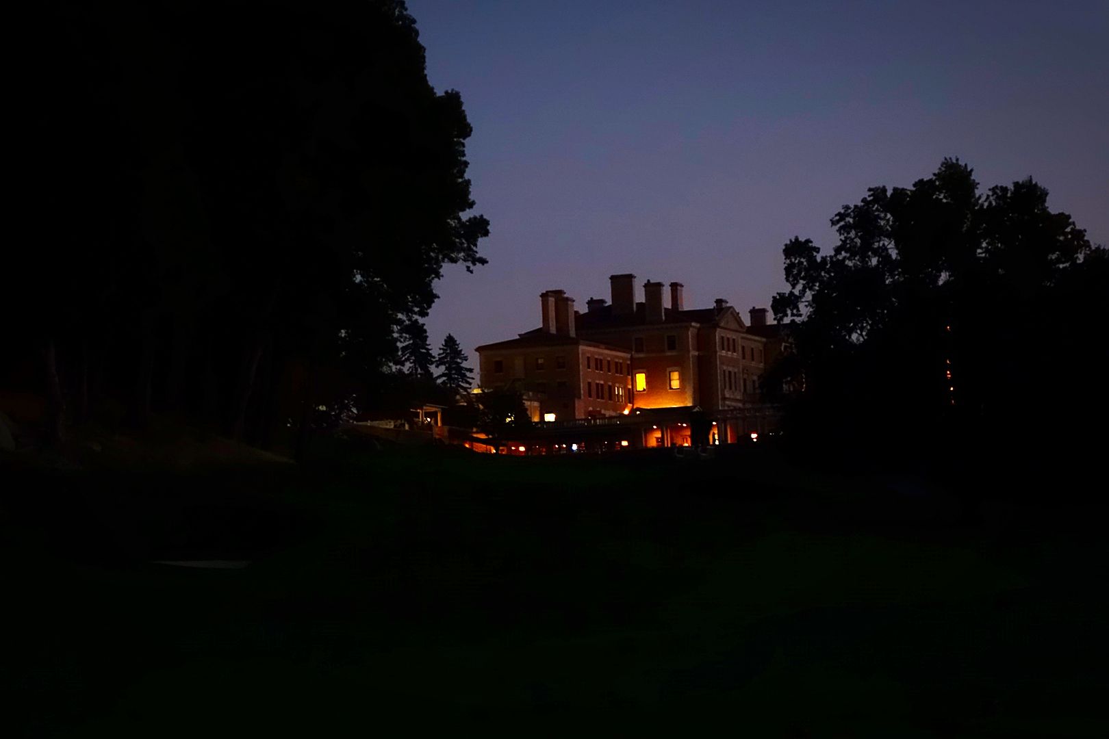
Jon's superb photographs and words, as always, do an excellent job of conveying the experience, so I will limit my comments to a few additional observations. What's always interesting to me about tree removal is that it counterintuitively makes a course more intimate. Although a de-treed course takes on a more open and expansive feel, the ability to see more of the course at a single glance also ties it together in the golfer's eye. At Sleepy Hollow, the extensive tree removal (to say nothing of the remolding of the bunkers and green complexes) allows for epic long views beyond the property--the "Short" 16th hole, set atop a hill with the Hudson River and its cliffs framing the background, now vies for most photograph-ready hole in the world. But the tree removal also allows for numerous long views within the property, making the experience more cohesive even if at the same time revealing a scale that few other courses can compete with. A single vantage can yield views of upward of five separate greens, and, in certain instances (2 and 16, 4 and 14 most notably), ever-pleasing side-by-side greens.


My incredibly generous host was kind enough to drive me back, at sunset after our round, to the hill overlooking the 2nd and 16th holes, as well as Sleepy Hollow's famed wooden bridges, to take additional photographs. Although Jon has been gracious enough to allow me to post a few of my photographs in this thread, I do not want to clutter it, so I will limit myself to a few of my favorites from twilight. I'll consider posting more in a separate thread.


I very much hope others get to experience a course that is now, for the first time in a long time, in all its glory.
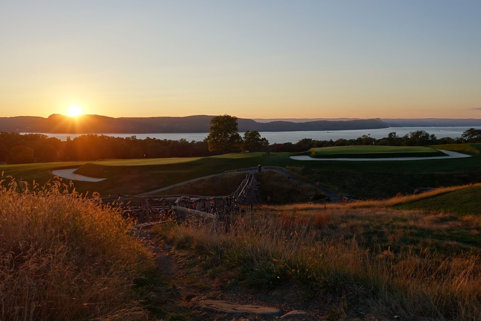
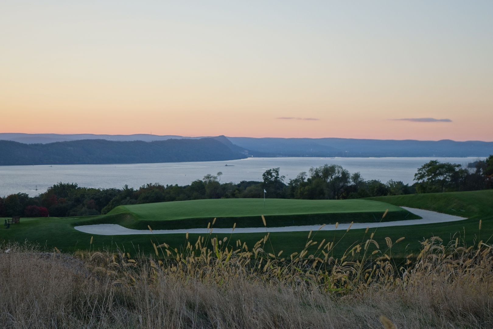
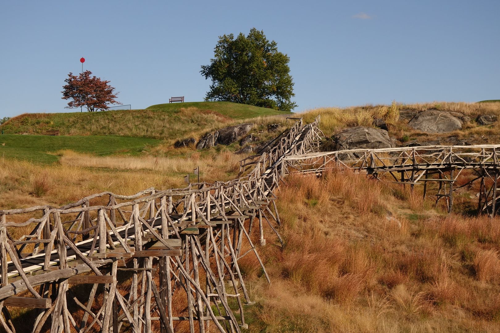
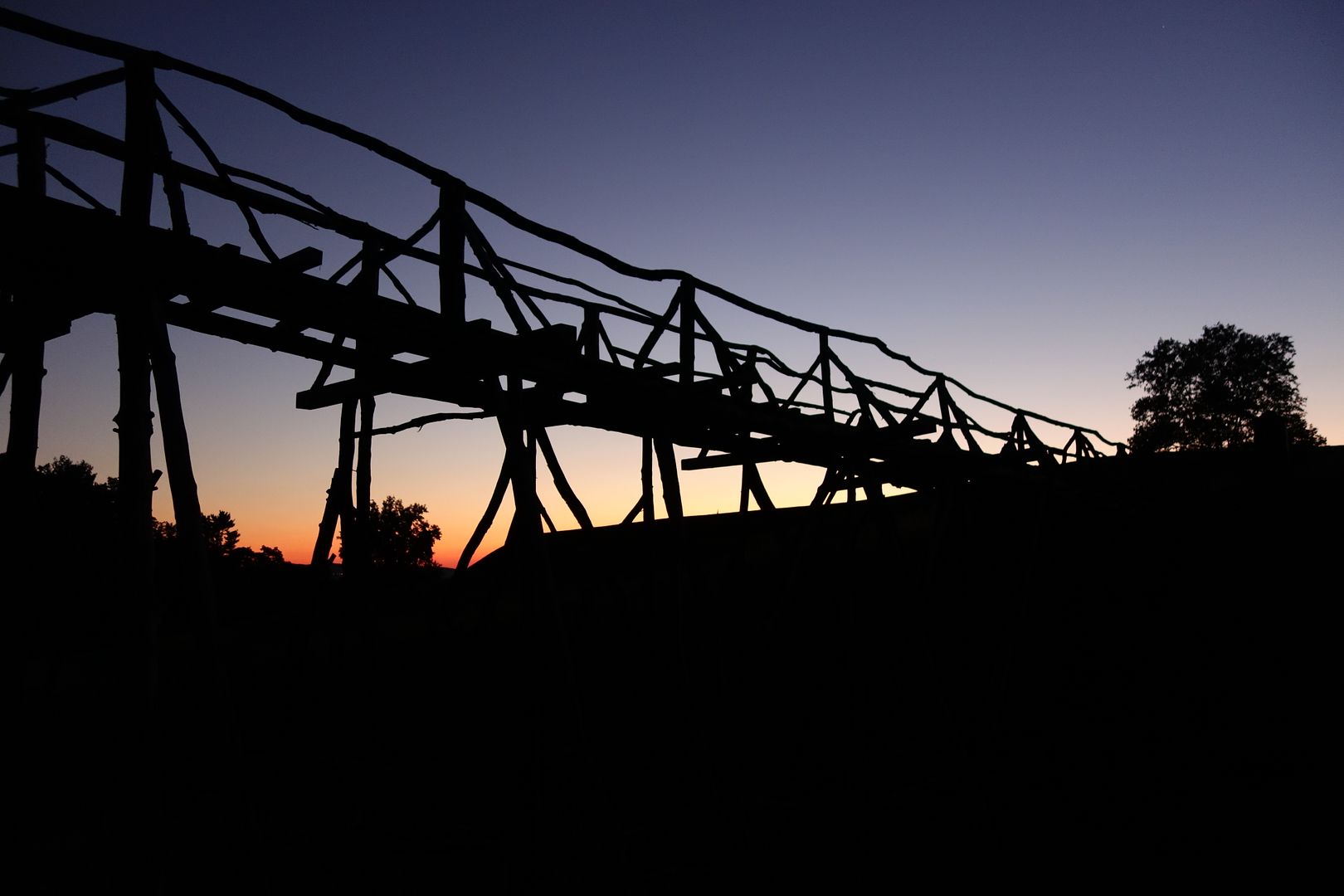


"One will perform in large part according to the circumstances."
-Director of Recruitment at Agahozo-Shalom Youth Village in Rwanda on why it selects orphaned children without regard to past academic performance. Refreshing situationism in a country where strict dispositionism might be expected.

Joe Bausch

  • Karma: +0/-0
@jwbausch (for new photo albums)
The site for the Cobb's Creek project:  https://cobbscreek.org/
Nearly all Delaware Valley golf courses in photo albums: Bausch Collection

Michael Moore

  • Karma: +0/-0
my focus, foolishly, was on swing and score instead of design
Let it be all three! I promise you it's more fun that way and that the course will be happy if you play well on it.
Metaphor is social and shares the table with the objects it intertwines and the attitudes it reconciles. Opinion, like the Michelin inspector, dines alone. - Adam Gopnik, The Table Comes First

Jim Franklin

  • Karma: +0/-0
I played there for the first time a couple of weeks ago. Loved it. While my host was apologizing for the fairways being a little brown, I was like a kid at Christmas enjoying every bounce and roll. The greens were spectacular. The 15th hole was my favorite as well although the view on 16 was pretty awesome.

I have always loved the tee shot on 18 at Oakmont with the clubhouse in the background and Sleepy's 18th was just as nice. I am glad they left that mansion as the clubhouse. SH was a fabulous experience and certainly deserves a top 100 nod.
Mr Hurricane

Tags:
Tags:

An Error Has Occurred!

Call to undefined function theme_linktree()
Back