Andy/Pat:
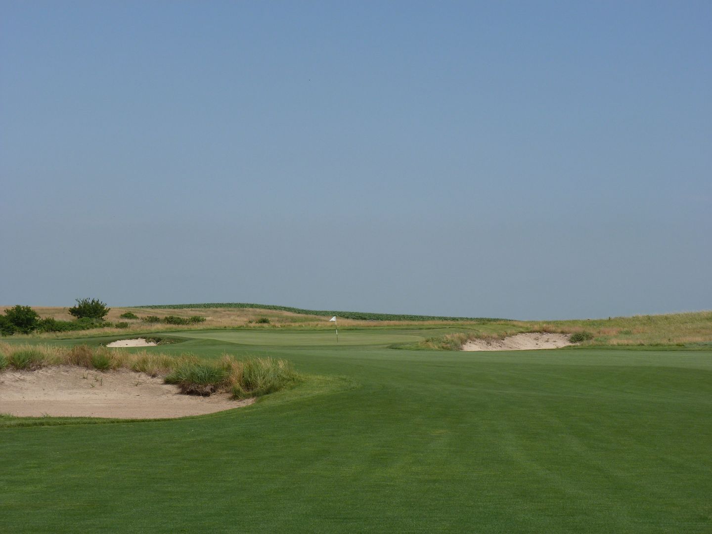
Great setting, yes, for those middle holes. Great golf architecture? I'm not convinced. Just look at how "busy" these holes look -- Dye pulls out all of the tricks in his bag to force decisions on the golfer, in a setting that begs for a more natural look and feel to the golfing.
Here we have bunkers and mounding left, rough and deeper rough coming in from the right, a narrowing fairway that -- well now -- splits in two, with a green up there somewhere, fronted by a deep bunker:

More busy-ness in the bunker near the 8th (once again, I'll give credit to Dye for a green of great interest -- to me the clear highlight of the River):

To my eyes, this just looks cluttered and confused. Options -- yes? But in the pursuit of what? It all looks just so forced upon the land -- land that I'd reiterate is beautiful and good golfing material, that doesn't need to be all cluttered up with this manufactured-looking stuff.

Compare to the genius subtlety of Wild Horse, where Mark Saltzman's outstanding thread shows just how a course should blend into its surroundings -- this course isn't 20 years old, but looks like it's been there forever.
Here's the approach shot into the 1st hole; look how the course is at one with the land it came from -- nothing artificial or forced here, with a shaggy look to the blowout bunkers that resembles the tall grasses of the Nebraska plains.
This from behind the 3rd green; again, look how the course simply blends into the natural surrounds. No artifice needed (or thankfully used) here:
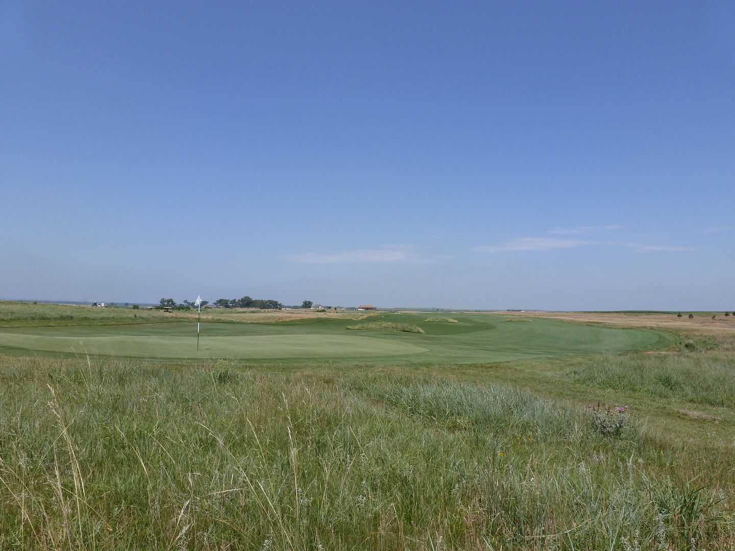
The tee shot of the par 5 6th -- beautiful in its simplicity, nothing cluttering up the landscape, the fairway just seems to bleed off into the horizon. But it's a shot that gives pause to the golfer, as the fairway movements hints at a dogleg right, but the outcome of chewing off too much of the corner is unknown to the golfer on the tee.
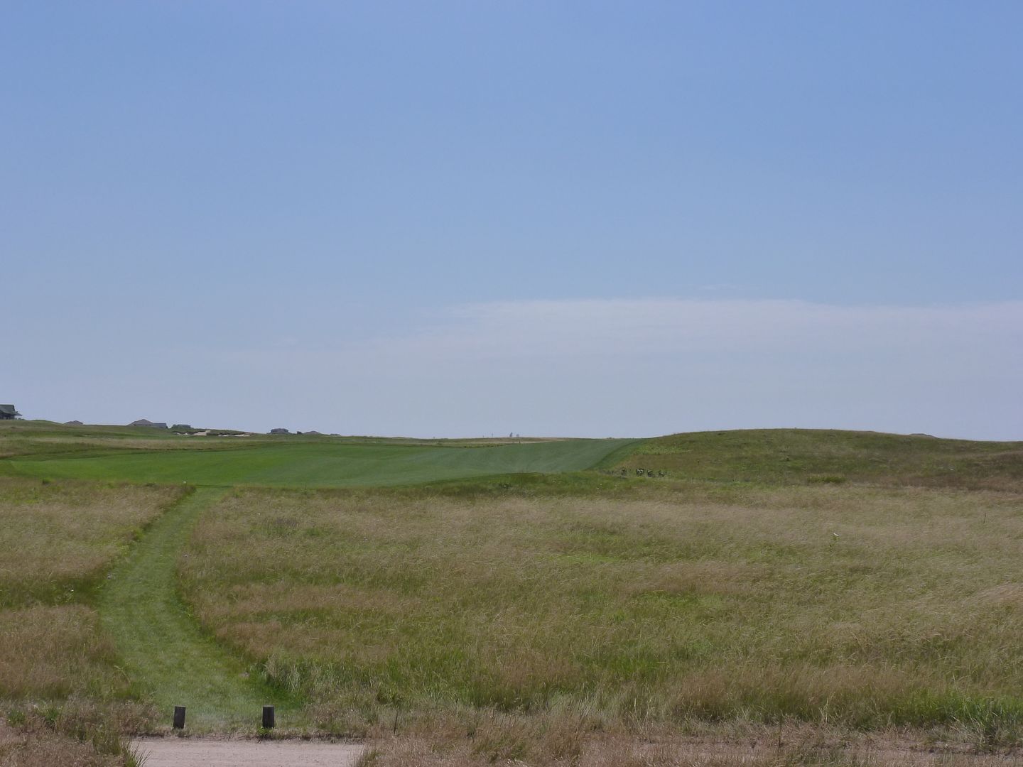
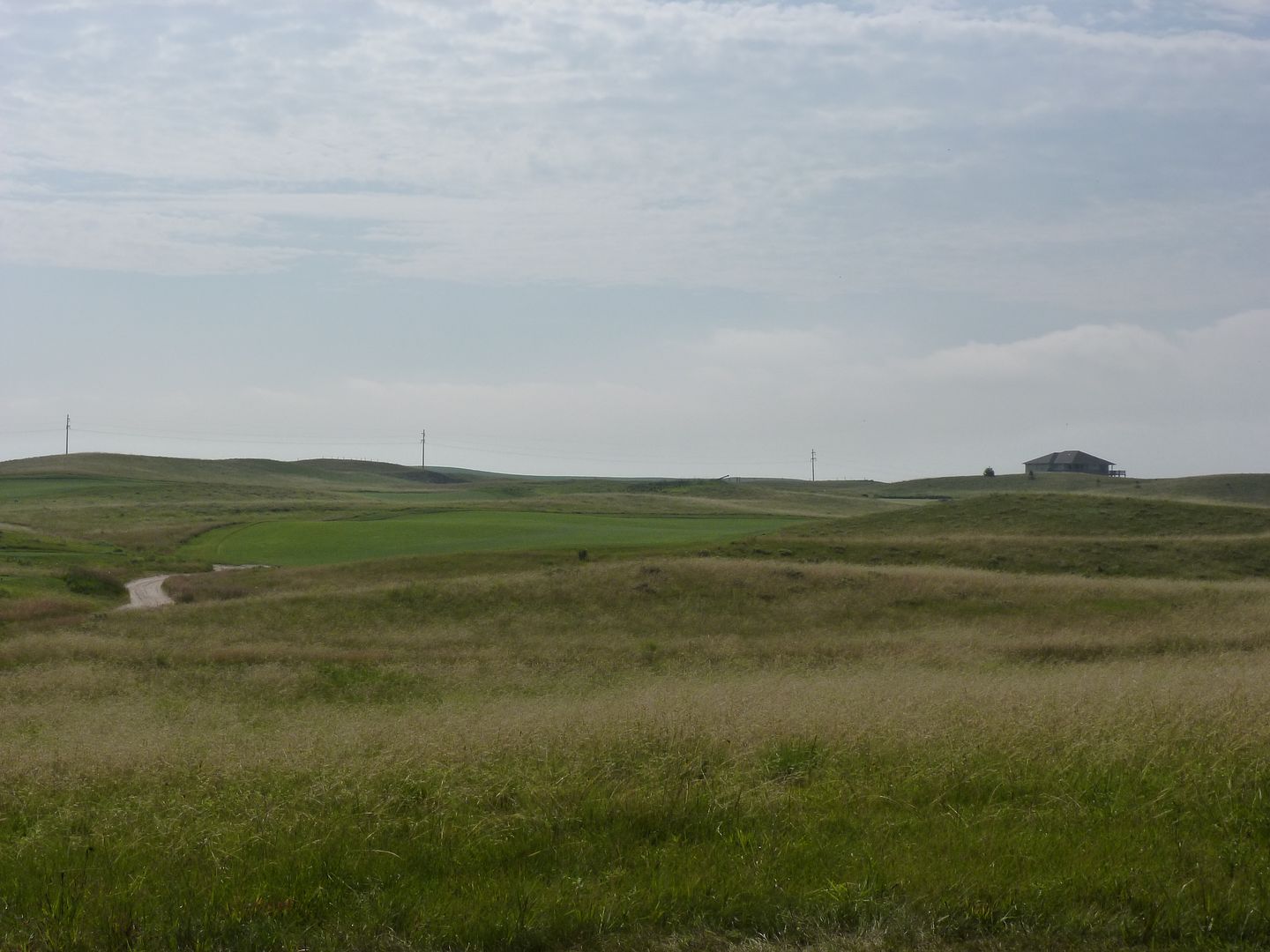
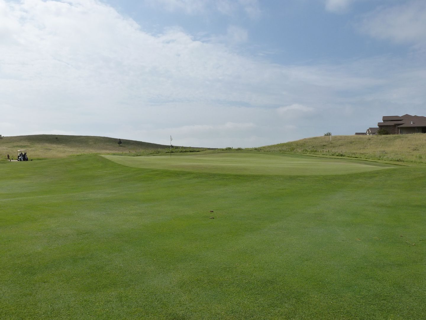
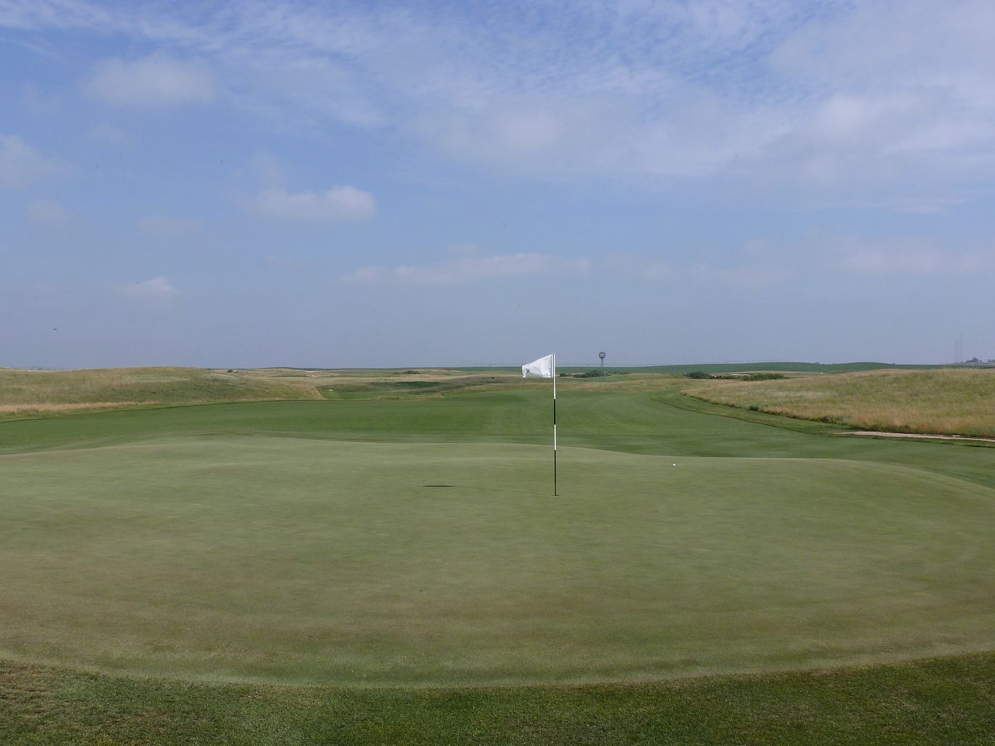
Three views of the par 4 10th -- this in an architect(s) willing to let the land do the work. Look how seamlessly this hole blends into the natural surrounds:
