News:

Welcome to the Golf Club Atlas Discussion Group!

Each user is approved by the Golf Club Atlas editorial staff. For any new inquiries, please contact us.


Ian_L

  • Karma: +0/-0
Armchair Architecture 2: Results
« on: September 15, 2008, 01:27:23 AM »
Here are some of the results from the "Armchair Architecture" experiment.

If you haven't read the original thread "Armchair Architecture," here's a short explanation about what's going on:

Charlie Goerges has come up with a fun way to design and create golf holes using the free 3D modeling program "Google Sketchup."  He has made some simple, easy to understand tutorials on how to route your holes, color the terrain, level tee boxes, and create bunkers (so simple even I could follow it).  Three of us are currently in the process of making our holes on a small piece of terrain just a few holes.  Now that we've got a good part of the learning out of the way, we can show our first holes here.  We would appreciate any criticism, no matter how harsh, of our golf holes, and any recommendations.  If you would like to try for yourself, the original thread is located at http://golfclubatlas.com/forum/index.php/topic,36362.0.html

Here's my first routing (note: the problem with filling in some of the bunkers with color was fixed):

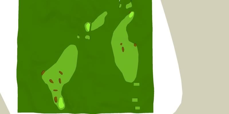
Overhead view:  Hole 1 begins in the lower right, hole 2 is the par 3, and hole 3 is another par 4.  Listed yardages are from the back tee.


Hole 1, 405/420 yards (right/left)
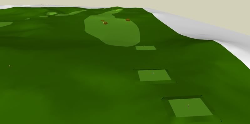

This hole turns to the right.  A drive down the right side yields a shorter shot to the green, but it is blind unless you can hit it 295+ yards.  The right bunker is very deep.

Tee view:
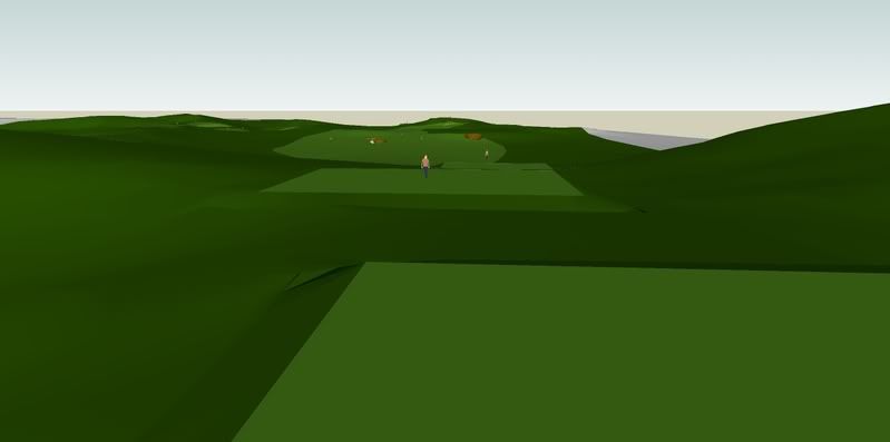

Green view. Notice the shorter hitter (260-270yd drive) who chose the right fairway is behind the hill and has a blind approach, whereas the player who chose the longer route has a good angle:
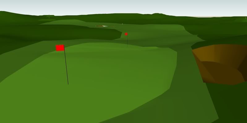


Hole 2, 203 yards:

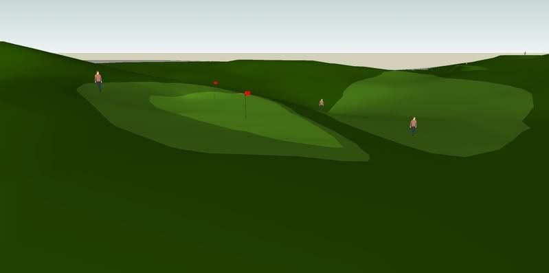
The natural ledge on the hill interested me, so I decided to try to use it.  The idea is that if the golfer carries the lone bunker on the right, the ball will bounce onto the green.  Maybe I need to add some more fairway on that side?  The layup is partially blind (less so with the raised tee) and leaves a severe uphill pitch.

Tee view:
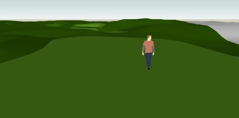

Green view, a long shot has a chance at coming back onto the green:


Hole 3, 355/310 yards:
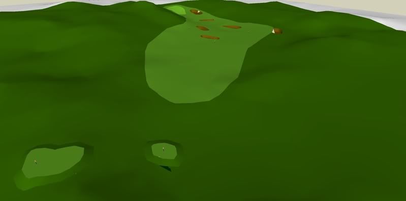

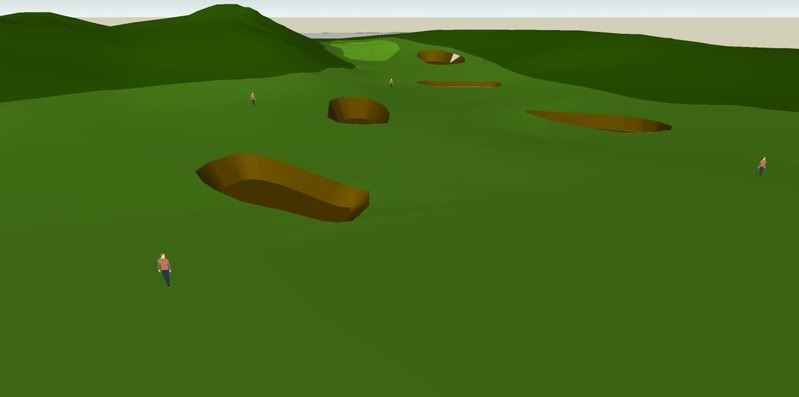
I originally had a lot more bunkers on this hole, but I've thinned them out a bit.  Are there still too many?  I was trying to give the golfer several options here:

-Drive the green (almost 300 yard blind carry over the hill).
-Lay up short and left, leaving a short but blind 2nd.
-Lay up short of all the bunkers, leaving about 165 to the green from a mediocre angle.
-Hit to the right side of the fairway, leaving 140-155 to the green with a good angle.
-The shorter hitter can try to thread the needle between the hill and the leftmost fairway bunker.
-Hopefully some players will be tempted to hit to the open area between all the bunkers.

Tee view:
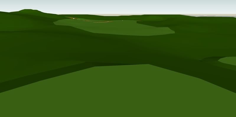

Approach:

Green (notice the player who laid up left has no view of the green):
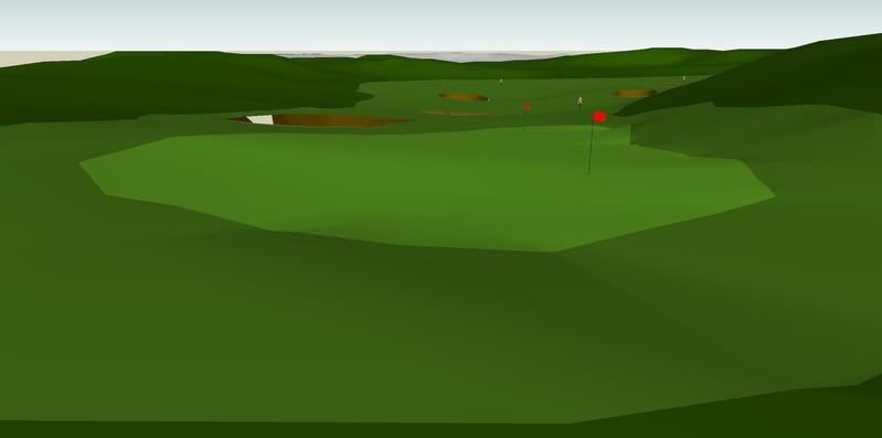


Again, I don't expect accolades here, so please don't spare me.  Thanks for reading, and have at it.

Charlie Goerges

  • Karma: +0/-0
Re: Armchair Architecture 2: Results
« Reply #1 on: September 15, 2008, 10:10:24 PM »
I'll post my results, with minimal explanation and see if it stands up to scrutiny.

My overview, with some yardages. Hole 1 starts in the bottom right, and hole 3 ends in the upper left:


Hole 1 overview:


View from Hole 1 back tee:


View from left side of the fairway:


View from the right side of the fairway:


Look back at hole 1 from above:


Hole 2 overview:


View from Hole 2 back tee:


View from Hole 2 middle tee:


Look back at hole 2 from above:


Hole 3 overview:


View from Hole 3 tee:


View from left side of Hole 3 fairway:


View from right side of Hole 3 fairway:


Look back at Hole 3 from above:


There she be. Let me know what you think.

Ian, I'll give you my thoughts once I've got a chance. Do you mind if I post 1 or 2 images of your holes with a few tweaks to non-architecture aspects (e.g. the shading and field of view etc.) that I think will show off your work a bit more?

Thanks,

Charlie
« Last Edit: September 15, 2008, 10:21:06 PM by Charlie Goerges »
Severally on the occasion of everything that thou doest, pause and ask thyself, if death is a dreadful thing because it deprives thee of this. - Marcus Aurelius

Ian_L

  • Karma: +0/-0
Re: Armchair Architecture 2: Results
« Reply #2 on: September 15, 2008, 11:51:36 PM »
No problem, Charlie, you can do anything you want with them.

Here's what I like about your holes:

-I think the three green sites are great.  #1 offers two very different holes depending on pin position.  I suspect many people people might not like the blind approach to the left pin, but I think it's interesting.  I like your #3 green complex as well.

-I like how you kept hole #1 bunkerless, since the terrain is plenty to deal with already.

A couple suggestions:

-I would take out the front bunker on #2.  200 yards is a pretty long way, and many people won't be able to carry that.  Without a good layup area, I think it's a bit harsh on the shorter hitter.  Taking out that bunker will also promote a low draw to the hole which could be fun (kind of a redan I suppose).

-Have you considered adding 10 yards or so more room right of the bunker on #3?  That way shorter hitters aren't forced to take the long route to the left, where they might not have a chance at reaching the green (especially if the pin is on the left).  Since the terrain falls towards the bunker on the right side, it will still be a demanding shot, and won't make it any easier for the big hitter.

How much did you modify your greens?

Charlie Goerges

  • Karma: +0/-0
Re: Armchair Architecture 2: Results
« Reply #3 on: September 16, 2008, 02:07:31 PM »
Hi Ian, Well, here is my analysis with a couple of images that I output to help illustrate my points.
Hole 1:


I like it very much. A very strategic hole. Off the tee you have the choice of more visibility (to the right) or a better angle (to the left). I originally said I thought the green might be too small. It is small, but things funnel on from the left and right increasing the effective area. If you come up short, the ball could roll all the way back down (probably 20 yards) into the fairway; an effective hazard.

Hole 2 (overview and view from tee):


The one has grown on me a bit. But two factors have contributed to that.

The first is the fact that I have spent more time looking at it in 3D, which just goes to show how much presentation matters. (In other words, can you make someone understand what you are trying to achieve? For an aspiring architect (I don’t know if that’s what you are) hopefully this exercise helps increase your ability to communicate your ideas to the unwashed masses like me.) But I digress. The hole is better and more interesting than my first opinion.

The second factor is the idea that compromises sometimes have to be made, if indeed the hole is a compromise, in order to connect excellent holes. Or in other words, you spotted good/excellent holes in numbers 1 and 3 and you needed to connect them. I don’t know if this was your process at all, but whether it was or not, holes 1 and 3 are worth creating no matter what the hole in-between looked like, and after more examination it seems better to me than a mere compromise and certainly a lot better than the other options for a connecting hole.

One caveat is that perhaps pushing the tee to the right and giving the green/ approach a redan-esque quality might be an improvement (though it might not). But if you did something like this, you’d almost certainly have to move the bunker.

Hole 3 (overview and side view):


Not much that I can add to my previous analysis, but it is still my favorite and I could still see losing 1 bunker (the one circled in red). In that case, it would make the layup option a bit easier, but wouldn’t make the second shot any easier. All in all, a fun looking tee shot and a fun hole. (And what’s the point of golf if it isn’t fun?)

Now with all that said, I was wondering a bit more about you Ian. What is your background as it pertains to GCA and your interest in it? To show you what I mean I’ll give you mine. I like golf, I am a half-decent player, and I don’t get to play enough to satisfy my golf craving. Perhaps a bigger impact on my interest in GCA is my artistic personality. I like to take photos, design and illustrate things (from furniture to computer hardware). I spend a lot of time using programs like sketchup, photoshop, and adobe illustrator. I am a technical writer/graphic designer by occupation, but I like working with my hands and seeing real/physical objects take shape. So there is my design background, if you don’t wish to answer, I won’t be offended, it’s just my inate curiousity that drives me to ask such questions.

Charlie
P.S. I’ll respond to your critique/ideas when I get a chance. All in all I agree with you.
« Last Edit: September 16, 2008, 02:10:32 PM by Charlie Goerges »
Severally on the occasion of everything that thou doest, pause and ask thyself, if death is a dreadful thing because it deprives thee of this. - Marcus Aurelius

Ian_L

  • Karma: +0/-0
Re: Armchair Architecture 2: Results
« Reply #4 on: September 16, 2008, 03:59:35 PM »
Charlie, I think my interest in GCA is somewhat different form yours.  I am not artistic; I can't draw or model, and as you've seen I'm not familiar with modeling programs and the like.  I'm a 12-14 handicapper.  I think my interest in GCA comes from my love for the mental side of the game, which is really what the architect controls. He/she can intimidate, give the player options, promote creativity around the course, etc.   I have thought so much about golf architecture that it really is fun to take on the challenge of routing a few holes, even if it is a simplified exercise.  Hopefully that sort of answers your question!

Interesting comments on holes 2 and 3.  I think you're right that moving the 2nd tee to the right (and maybe making it a  bit shorter) could add some interest to the hole, assuming the visibility was still OK.  I might move the bunker to back left in this case?   I'll see if I can do something with that. 

On #3, I'm hesitant to remove that bunker, because it provides the longer hitter a much wider fairway.  But maybe I'm just too equitable.  What would you think about removing the right-most bunker instead?

I've got a couple more holes on the way, I'll post them as soon as they're done.


I'm surprised more people on this forum aren't pitching in their critiques and trying it out for themselves...


« Last Edit: September 16, 2008, 04:06:31 PM by Ian_Linford »

Charlie Goerges

  • Karma: +0/-0
Re: Armchair Architecture 2: Results
« Reply #5 on: September 17, 2008, 10:24:26 AM »
Hi Ian,

I wanted to respond yesterday, but ran out of time. First, regarding your assertion that you are not artistic, I think the fact that you enjoy the design of golf holes means that you are in some sense artistic. I do hear you as far as the drawing and graphics etc. Honestly though, that puts you in good company among course architects from what I've read. You definitely think things through very well. Which is in contrast to me, most of the decisions I made were just a whim or because I thought it looked neat. I think long term (like over the timeframe of the construction of a course) that the thinking approach will yield better results than the "me like pretty" approach.

I don't think you should change anything on your design. Hopefully we'll get a few more responses so you can get some feedback from more experienced GCAers than I.

Oh, RE your question about modifying greensites, I did use the technique that I alluded to on the other thread. I'll try to post a quick tutorial on the original thread about that. But I definitely won't get to it before tonight.

all the best,

Charlie
Severally on the occasion of everything that thou doest, pause and ask thyself, if death is a dreadful thing because it deprives thee of this. - Marcus Aurelius

Matt Kardash

  • Karma: +0/-0
Re: Armchair Architecture 2: Results
« Reply #6 on: September 17, 2008, 02:48:26 PM »
For about 10 years I have been doing a similar thing on this crappy program I have. i have come a long way in that time. I usually create a random terrain and try to design the holes overtop it...almost like i'm actually discovering them. I think I have made 12 courses so far. Here are 3 random holes I chose to give you guys an idea of what it looks like.

First hole:
314 yard driveable par 4.
If you go for the green on the tee shot you will have to drive it over that bunker short-right of the green, which requires a 285 yard carry.


If you hit an iron off the tee to lay up you end up here. from here it's about 100 yards to a tough, relatively shallow, elevated green. A pretty intimidating shot.


A view from behind the green. You can see how the fairway slopes into the green, allowing the golfer who wishes to attempt the green in one shot to bounce it onto the green.


Next hole:
456 yard par 4
Pretty simple stuff here. A longish par 4 where if you challenge the bunker on the left you get a better angle(but not necessarily a better view). If you bail right you have a very bad and intimidating sngle into the green, but the view is cetainly less blind.


View from the landing zone in the middle of the fairway. The bunkers in the foreground don't come into play, but are there more as intimidation and to play with the depth perception.


View just short of the green.


View from behind the green. You can see how the green is slightly sunken.


Third hole, from a different course i made
557 yard Par 5.
Tee shot tempts you to bite off as much as you can chew. However, if you go into the large deep bunker you will probably end up with a long third shot into the green. in fact, you can safely drive completley to the right of the fairway bunker and still be in the fairway.


After the the drive, there is a decision to be made: challenger the cross bunkers short of the green and go for the green in two, or lay up? As you will see, the lay up isn't so obvious.


If you lay up short and to the left you are blocked out by the cross bunkers.


An agressive layup to the right, or a little further down the fairway opens up the view nicely.


This is the view from behind the green. Notice how from here how much room short of the green there is to run the ball up. It looks a lot less intimidating from here.


the interviewer asked beck how he felt "being the bob dylan of the 90's" and beck quitely responded "i actually feel more like the bon jovi of the 60's"

Charlie Goerges

  • Karma: +0/-0
Re: Armchair Architecture 2: Results
« Reply #7 on: September 17, 2008, 03:23:21 PM »
Matt,

I am impressed; by both the quality of the designs, and by the quality of the images produced by the software. What Software are you using? I don't have time now to comment at length, but I will. I noticed that you have a background image composited in as well, and to Ian and others, you can import a background like that into sketchup, or of course you could composite it in photoshop.

Also, can you bring real-world topography into it?

Once again, very nice work, feel free to comment more and to answer the same questions I asked Ian a couple of posts earlier.

Thanks,

Charlie
Severally on the occasion of everything that thou doest, pause and ask thyself, if death is a dreadful thing because it deprives thee of this. - Marcus Aurelius

Matt Kardash

  • Karma: +0/-0
Re: Armchair Architecture 2: Results
« Reply #8 on: September 17, 2008, 03:47:08 PM »
Charlie,
The software used is the Course Designer from the computer game Jack Nicklaus 5. This program has to be a good 10 years old now because I've had it for about that long. I've made about 12 courses in that time. I pretty much taught myself, so it took me a few courses until I was able to make all my shapes look very natural and realistic. I get a real kick knowing that I started with a blank canvas and end up with some professional looking golf holes.
The background image is an option in the program. You can choose out of maybe 7 or 8 possible backgrounds. It really helps tie in the whole look.
With regards to real world topography. There is no way to import that into the software, but I could probably recreate the general topography of the real world if I wanted to. I usually prefer to create a random topography and discover holes over it. For some holes I manufacture some features, for other holes I literally don't even contour a green site because I find a perfect natural one.
If anyone wants to see more I can post more holes. I have a ton of them...
the interviewer asked beck how he felt "being the bob dylan of the 90's" and beck quitely responded "i actually feel more like the bon jovi of the 60's"

Ian_L

  • Karma: +0/-0
Re: Armchair Architecture 2: Results
« Reply #9 on: September 17, 2008, 07:22:26 PM »
Very cool Matt!  I'd be interested in seeing more holes if you've got the time.

Charlie, how difficult and time consuming is it to make new terrain based off a topo map?  It would be fun if we could eventually get bigger pieces of land just to try out a 9 or 18 hole routing.

Jim Colton

Re: Armchair Architecture 2: Results
« Reply #10 on: September 17, 2008, 07:30:03 PM »
Charlie,

  You should try the Arnold Palmer Course Designer for Microsoft Links.  It's 6-7 years old, but probably the best I've seen.  Check out this link to see the amount of detail that's available.

http://mikejgolfdesign.com/crzimg/269_RD1024.jpg

Matt Kardash

  • Karma: +0/-0
Re: Armchair Architecture 2: Results
« Reply #11 on: September 17, 2008, 07:42:05 PM »
Jim,
Wow, the level of detail blows my 10 year old course designer away. I bet there are even better ones out today. I should look into getting one. I think I've run the course with mine.
the interviewer asked beck how he felt "being the bob dylan of the 90's" and beck quitely responded "i actually feel more like the bon jovi of the 60's"

Charlie Goerges

  • Karma: +0/-0
Re: Armchair Architecture 2: Results
« Reply #12 on: September 17, 2008, 10:57:06 PM »
Hi Jim,

I did download APCD, unfortunately I haven't had time to really try it out. I know that you can import USGS Digital Elevation Models (DEMs) into APCD.

Matt,

If I am not mistaken, the only newer video game course designer than APCD is the one with one of the older Tiger Woods games, and I don't think that it can import real-world information.

Ian,

It doesn't take terribly long, and in fact I've done it with 10-foot contours for a 400 acre+- piece of property. The file ends up fairly large but it works and is manageable. The detail level isn't nearly as good as with the file we are using here. It could be done with more detail if the contour map has it, I just don't know how well the program would perform at that level of detail.  We'll try it again with a larger parcel at some point.

Charlie
Severally on the occasion of everything that thou doest, pause and ask thyself, if death is a dreadful thing because it deprives thee of this. - Marcus Aurelius

Ian_L

  • Karma: +0/-0
Re: Armchair Architecture 2: Results
« Reply #13 on: September 18, 2008, 12:05:21 AM »
Thanks, Charlie.  I'm sure some GCAer has a topo map they'd be willing to share.

Philippe Binette

  • Karma: +0/-0
Re: Armchair Architecture 2: Results
« Reply #14 on: September 18, 2008, 12:37:41 PM »
I prefer the Jack Nicklaus 5 course designer... ArnoldPalmerGD is about vector... Jack's make you feel like a shaper

Charlie Goerges

  • Karma: +0/-0
Re: Armchair Architecture 2: Results
« Reply #15 on: September 18, 2008, 12:53:23 PM »
Oh, and I should have mentioned that the cleaner the topo map, the better. Basically, if it is scanned, it would be best if the artefacts, elevation numbers, wetland info, etc. are removed in photoshop. That process was easily the most time consuming, because after that I do a simple auto-trace in Illustrator and then export in a format that Sketchup can read.
Severally on the occasion of everything that thou doest, pause and ask thyself, if death is a dreadful thing because it deprives thee of this. - Marcus Aurelius

Tags:
Tags:

An Error Has Occurred!

Call to undefined function theme_linktree()
Back