News:

Welcome to the Golf Club Atlas Discussion Group!

Each user is approved by the Golf Club Atlas editorial staff. For any new inquiries, please contact us.


Scott Warren

  • Karma: +0/-0
Royal Melbourne (East) changes by Renaissance Golf Design
« on: February 24, 2012, 07:01:10 AM »
Had a nice walk around the revamped Royal Melbourne (East) on Tuesday with a long-time member who was kind enough to show me the changes and explain what had been done, which in many instances is extremely subtle and wouldn't be noticed by someone not intimately familiar with the course (such as me!).

The holes in question are 6, 7, 8, 10, 11, 12, 13, 15 and 17 -- ie. every hole on the outer paddocks except for 5, 9 and 14 (I trust Tom D or someone else will inform me if I missed small changes to these three holes).

I don't have pictures of every hole, but I did snap what I thought were the most significant alterations.

The 6th is changed fairly significantly, with a greater width at the front for a running approach and softening of the shaping in the back and left of the green, which previously were fairly sizeable. There is also a great little chipping area long left that may well prove to be the preferred miss to back pins. Would the hole be further improved by the removal of that large gum tree?
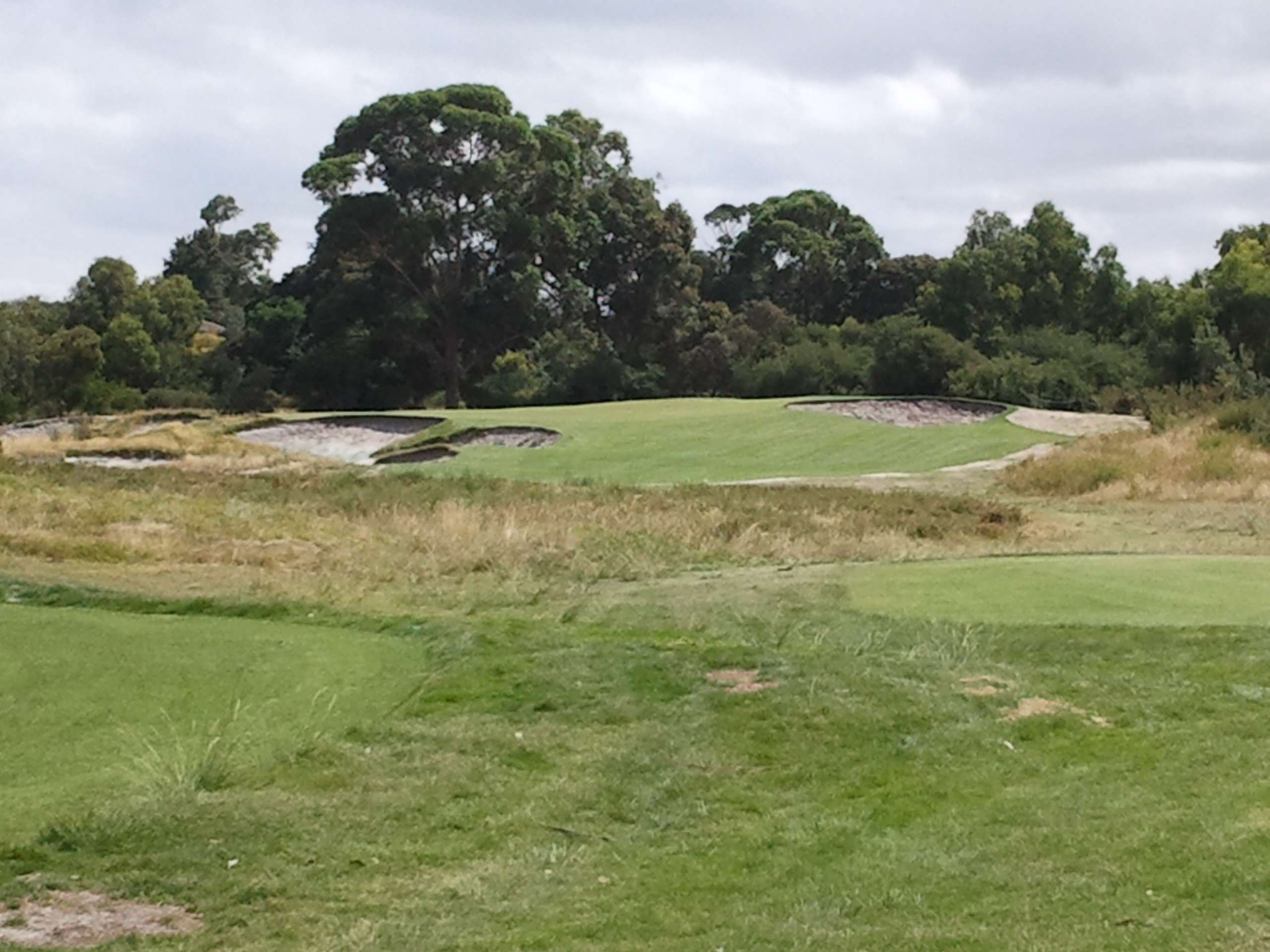

The par five 7th appears to have seen the bunker outside the dogleg on the drive reduced in size, as well as the cross bunkering short of the lay-up being increased in width, eating more into the fairway and adding some interest on the second shot.
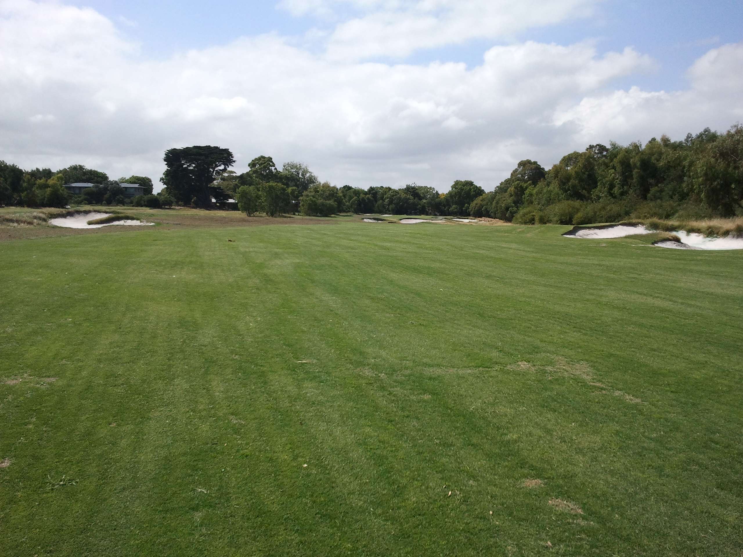

Bunkering inside the dogleg at the 8th has been made smaller, eating less into the fairway and allowing the inside line to be taken without so much carry over the sand.
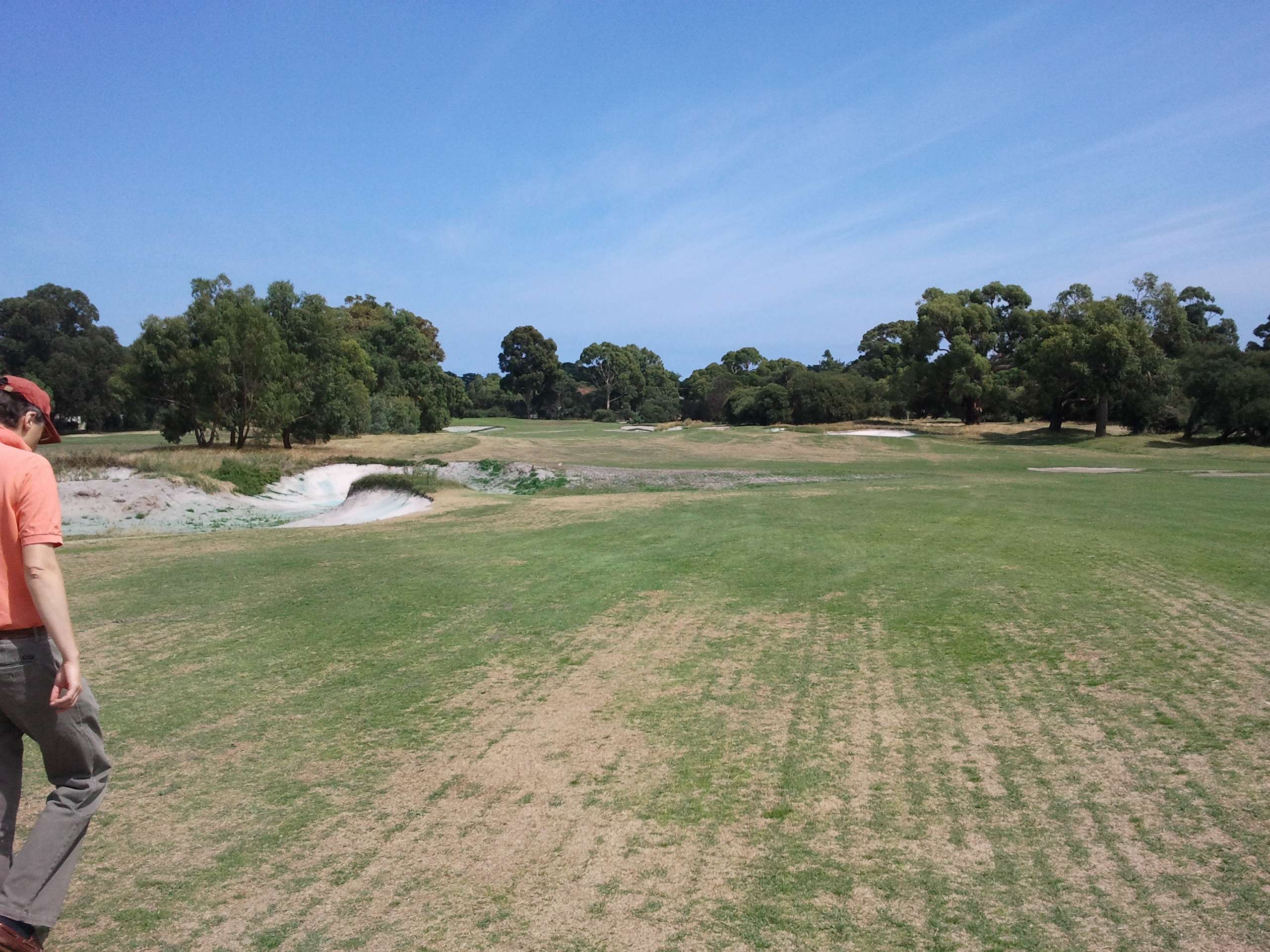

An expanded second fairway bunker at the 10th creates new challenge for big hitters who could previously hoist a high cut over the first bunker and inside the second one. This has been paired with clearing on the left that widens the fairway out there for the weaker golfer/shot.


The 11th has had changes that appear to be at once extensive and also nigh on unnoticeable, at least for me. Has the fairway been raised to improve drainage? I'm not sure. I do know the angled ridge short of the green has been altered somewhat and I must say the angle and slope has it feeding the front left bunker the way you see that done so effectively on 2 and 12 at Rye. It also feeds -- if the ball has insufficient speed to reach the bunker -- a little chipping area that will mean a pitch over the front left bunker to a left pin. No pic, sorry.

At the 12th, a small bunker greenfront left is gone and replaced with a fairway-height chipping area fronted by a small ridge up to the green. The old bunker was small and rendered blind by the giant foreshortening bunker 30-70m in front of the green, probably a good change.

The short par three 13th used to have some fairly unattractive long grasses in front of the tee, but that has been replaced by a short bunker that then creates a "string of pearls" that stretches all the way to the greenside bunkering, much like 15 at Kingston Heath. The tee has also been expanded and now flows more naturally out of the 12th green, another great touch. Bunkering and tee look wonderful and lift the hole a couple of notches in my book.


Finally, the 15th has been changed significantly, and most noticeably at the green, where the predominant left-to-right slope is gone in favour of a noticeable front-to-back tilt in the rear half of the green and a gentle front-to-back-running valley that aims at the outside of the dogleg, where the club and architect would really appreciate if you hit your drive, taking care not to rain 46 grams of terror on the houses that flank the RHS boundary!! Unfortunately, the vegetation at the right remains, and it is still out of character with the other 35 holes that comprise Royal Melbourne. For my money, that area is similar, but not nearly as well done as the grassy areas on 12 West that guard the boundary. In any case, these changes improve 15, though not so much as to make it a strong hole, but it is what it is and like the 3rd at Yarra Yarra, the major issue at play is the boundary proximity and its related legal and safety issues.
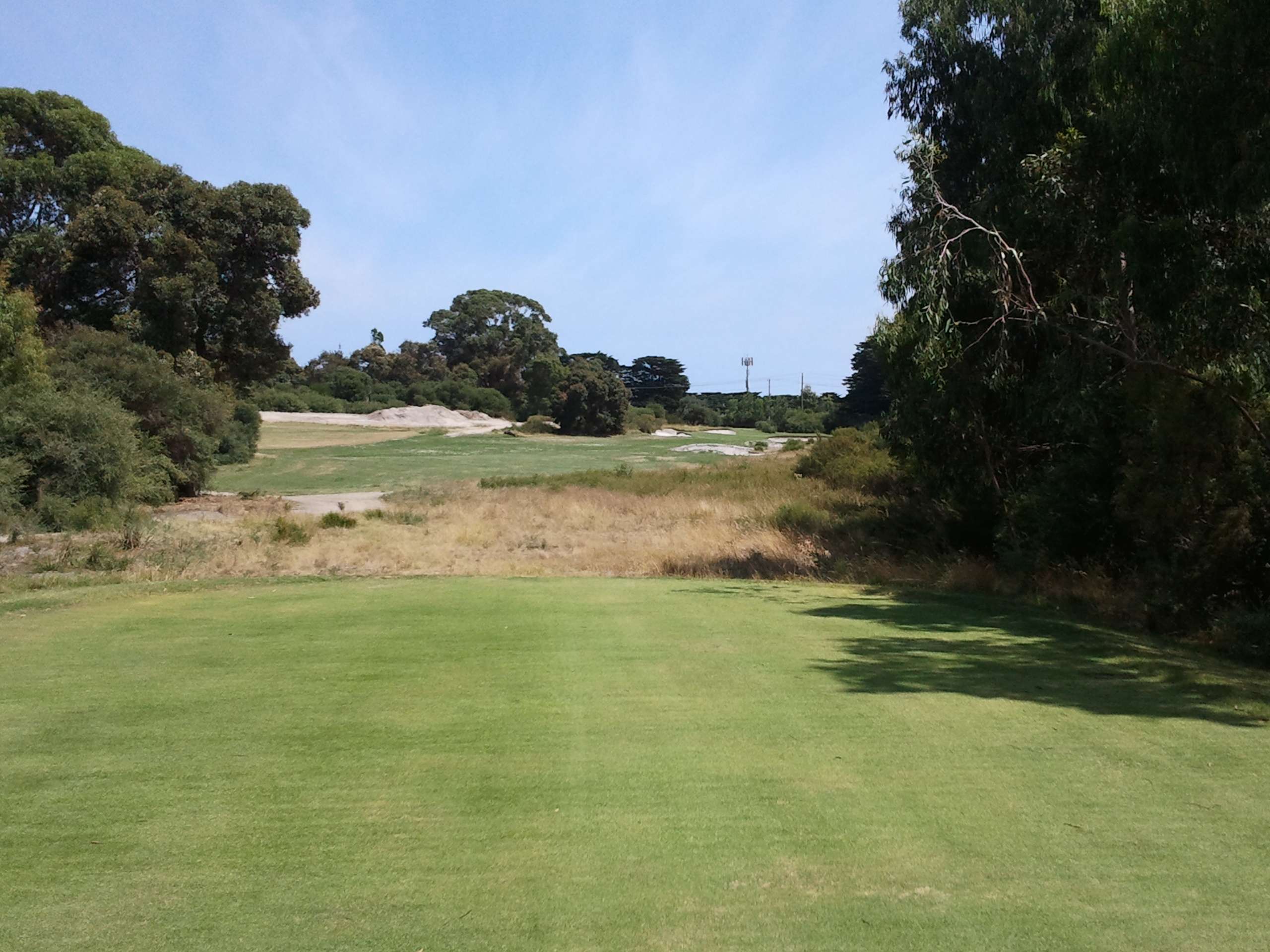
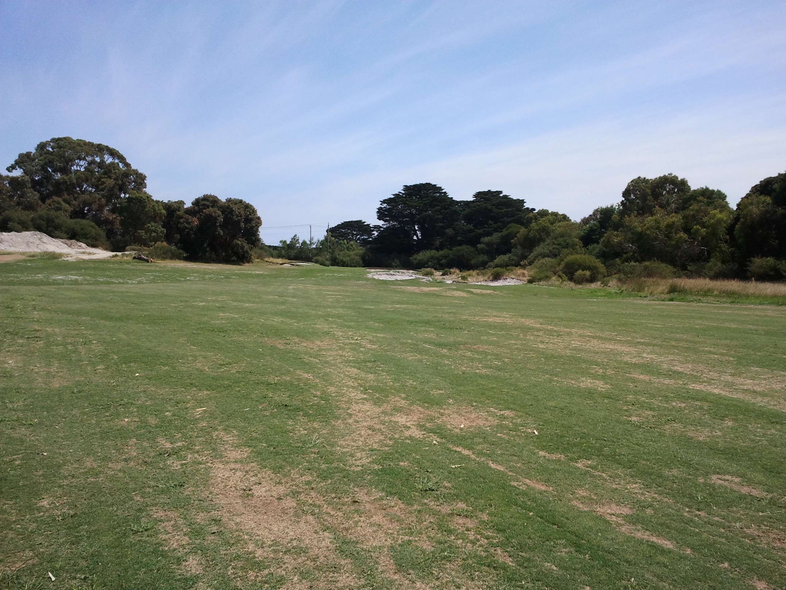

The 17th hole is also getting a new set of tees, which were being shaped (edit - by Brian Slawnik) while I was there. I can't see that they are in a significantly different place than their predecessors and would be interested to know whether it was simply a case of re-construction, or if they have indeed been moved.

For the most part, the changes are fairly subtle and look extremely faithful to the spirit of Royal Melbourne.

15 is now better, but for my money 6 and 13 are the most improved holes, and I also suspect 10 will play more true to the design intent as a result of the new bunkering that should mean more players must interact with the cross bunkering on their second shot.
« Last Edit: February 24, 2012, 08:03:02 AM by Scott Warren »

Tom_Doak

  • Karma: +3/-1
Re: Royal Melbourne (East) changes by Renaissance Golf Design
« Reply #1 on: February 24, 2012, 07:55:05 AM »
Scott:

That's Brian Slawnik, not Schneider, who has been in Melbourne since December doing all the work down there.

You've hit most of the changes we made, except for some more subtle things:  lowering bunker faces here and there which had become too built up from sand play at the edges of greens, raising the front right corner of the 9th green to gain a hole location there, thinning out a lot of the trees in the triangle between 10-11-12.

I appreciate seeing the pictures of #6 and #13, since when I left we had just polished out the revised green on 6, so it was still dirt, and Brian had yet to restore the old bunkering on #13.  Both of those changes are restorative ... the bunkers on 13 had been allowed to grow in, and the green on 6 was rebuilt based on a plan done years ago by the Royal Melbourne Institute of Technology, before it had to be moved away from the boundary.  The green that was rebuilt a few years ago was actually pretty close to the contours of the old one, but they struggled to create similar tie-ins and recovery shots around the green because the surrounds were so much lower in relation to the green.

The removal of the bunker on #12 was also a restoration, as it had been added 20 or 30 years ago.  It seemed to take away from the intent of rewarding a second shot over the big bunkers short left, and encourage players to take a right-hand line off the tee [where there is yet another boundary issue].

The little tweaks on #7 and #8 and the bigger tweak on #15 were all meant to be subtle improvements of the work done by Hawtree in moving those holes away from the boundary ... we just didn't think the construction work on those holes looked indistinguishable from everything else at Royal Melbourne.

Finally, the work on #11 included some changes inside the green, which had become so tilted over the years [by build-ups along the right due to bunker play, and because of increased green speeds] that it was almost impossible to play a bunker shot from the right and even hold the green.  It's still far from easy, but the members should have some more reasonable options now.  We did change the fairway lines on that hole, but didn't raise the fairway as you suggested; that work was done many years before.

Anthony Butler

  • Karma: +0/-0
Re: Royal Melbourne (East) changes by Renaissance Golf Design
« Reply #2 on: February 24, 2012, 11:58:22 AM »
Scott:

I appreciate seeing the pictures of #6 and #13, since when I left we had just polished out the revised green on 6, so it was still dirt, and Brian had yet to restore the old bunkering on #13.  Both of those changes are restorative ... the bunkers on 13 had been allowed to grow in, and the green on 6 was rebuilt based on a plan done years ago by the Royal Melbourne Institute of Technology, before it had to be moved away from the boundary.  The green that was rebuilt a few years ago was actually pretty close to the contours of the old one, but they struggled to create similar tie-ins and recovery shots around the green because the surrounds were so much lower in relation to the green.

The removal of the bunker on #12 was also a restoration, as it had been added 20 or 30 years ago.  It seemed to take away from the intent of rewarding a second shot over the big bunkers short left, and encourage players to take a right-hand line off the tee [where there is yet another boundary issue].

The little tweaks on #7 and #8 and the bigger tweak on #15 were all meant to be subtle improvements of the work done by Hawtree in moving those holes away from the boundary ... we just didn't think the construction work on those holes looked indistinguishable from everything else at Royal Melbourne.
Tom/Scott,

The description of what's going on at RME #13 confuses me a bit. Based on my memory and what you see in Scott's photos, it would be well nigh impossible to create the same 'string of pearls' effect from the tee as you see on #15 at Kingston Heath since that hole plays significantly uphill. (To anyone under 7ft tall it's a blind green, so the bunkering on KH #15 takes on a much larger visual dimension than what you see here.)

I was surprised to see mention of my alma mater RMIT as being in the greens rebuilding business. Had I known they offered a GCA course, perhaps I might have changed my major... Anyway, what you seem to be saying is that they significantly raised the green pad or lowered the surrounding area at some point. So what's the construction solution to connect the green more to the areas around it?

Cheers, arb:
« Last Edit: February 24, 2012, 12:12:59 PM by Anthony Butler »
Next!

Tom_Doak

  • Karma: +3/-1
Re: Royal Melbourne (East) changes by Renaissance Golf Design
« Reply #3 on: February 24, 2012, 12:06:25 PM »
Anthony:

RMIT was just asked on two occasions to come and survey all of the greens at Royal Melbourne precisely.  It's an interesting exercise, as you can see in a few of the maps that greens have changed slightly, through maintenance practices and not architectural changes.  But, having a map of the original green [which had been moved] was quite helpful to us in trying to make its replacement more like the original.

On #13, all we did was clean out some bunkers which had been allowed to grow in.  The hole is downhill, but the lips of the bunkers are high enough that you lose a lot of the ground between tee and green, visually.  I don't think that Brian Slawnik raised the lips of those bunkers at all, but am not sure since I didn't see the work myself.

Anthony Butler

  • Karma: +0/-0
Re: Royal Melbourne (East) changes by Renaissance Golf Design
« Reply #4 on: February 24, 2012, 12:16:17 PM »
On #13, all we did was clean out some bunkers which had been allowed to grow in.  The hole is downhill, but the lips of the bunkers are high enough that you lose a lot of the ground between tee and green, visually.  I don't think that Brian Slawnik raised the lips of those bunkers at all, but am not sure since I didn't see the work myself.

I didn't expect your talents to extend to tilting the earth, Tom...  ;) I will leave the other part of my observations on #13 to Scott to address when he gets up on Saturday and no doubts checks GCA on his smartphone...
Next!

Scott Warren

  • Karma: +0/-0
Re: Royal Melbourne (East) changes by Renaissance Golf Design
« Reply #5 on: February 24, 2012, 06:25:24 PM »
It doesn't climb the way KH15 does, so it doesn't dominate the eye as greatly, but the bunkers are visible nonetheless. It definitely works in the flesh. The bunker lips to create a little bit of distance uncertainty by hiding some of the ground between tee and green, and they look sensational.

Tom_Doak

  • Karma: +3/-1
Re: Royal Melbourne (East) changes by Renaissance Golf Design
« Reply #6 on: February 24, 2012, 07:19:10 PM »
It doesn't climb the way KH15 does, so it doesn't dominate the eye as greatly, but the bunkers are visible nonetheless. It definitely works in the flesh. The bunker lips to create a little bit of distance uncertainty by hiding some of the ground between tee and green, and they look sensational.

I had no doubt it would turn out well.  If you can't have Alex Russell to carry out his ideas in the flesh, having Brian Slawnik work on them is probably the next best thing.

Scott Warren

  • Karma: +0/-0
Re: Royal Melbourne (East) changes by Renaissance Golf Design
« Reply #7 on: February 24, 2012, 07:50:52 PM »
Tom,

Given the restorative nature of a lot of the changes, was any consideration given to restoring the massive bunker inside the dogleg at the 11th?

Tom_Doak

  • Karma: +3/-1
Re: Royal Melbourne (East) changes by Renaissance Golf Design
« Reply #8 on: February 24, 2012, 09:30:25 PM »
Tom,

Given the restorative nature of a lot of the changes, was any consideration given to restoring the massive bunker inside the dogleg at the 11th?

Scott:

I did think about it for a while, after reviewing the original aerial photo.  But I don't think the club would have opted for it, as they weren't too interested when Martin Hawtree did his report.

Apparently that original bunker was in a fairly wet area and they had some problems with it, so they later added a bunch of fill to the area ... when you wondered if we put in some fill on that fairway, I assumed you were seeing the fill they put in years ago to fix the low spot.

Kyle Henderson

  • Karma: +0/-0
Re: Royal Melbourne (East) changes by Renaissance Golf Design
« Reply #9 on: February 25, 2012, 03:18:38 PM »
Comparison photos between Scott's initial @ RME 1 year ago and what he saw last week:

6th before:

6th after:


7th before:

7th after:


13th before:

13th after:


15th tee before:

15th tee after:


15th approach before:

15th approach after:

"I always knew terrorists hated us for our freedom. Now they love us for our bondage." -- Stephen T. Colbert discusses the popularity of '50 Shades of Grey' at Gitmo

Scott Warren

  • Karma: +0/-0
Re: Royal Melbourne (East) changes by Renaissance Golf Design
« Reply #10 on: February 25, 2012, 03:25:44 PM »
Thanks for adding those, mate. Much appreciated.

Brian Walshe

  • Karma: +0/-0
Re: Royal Melbourne (East) changes by Renaissance Golf Design
« Reply #11 on: February 25, 2012, 09:05:33 PM »
Tom,

The bunkers on 13 that you restored, do you know when they were put in originally as they aren't on the 1945 aerial. 

Warwick Loton

Re: Royal Melbourne (East) changes by Renaissance Golf Design
« Reply #12 on: February 26, 2012, 03:09:37 AM »
Thanks Scott and Tom for your comments

Tom, may I ask a few questions:

6th
- Do you know how much this green surface was raised when it was relocated & rebuilt under Dr Hawtree's guidance?
(No doubt you're correct that the height relative to the tie-ins is what matters most.)

- If I remember correctly there was a diagram floating around that Dr Hawtree had prepared prior to altering this hole, which showed the existing and proposed green complexes. It looked as if the green complex was simply being shifted to the left - it wasn't to be rotated at all. Given that the tee wasn't to be relocated, the angle of the tee shot to the green complex was to be altered (ie to recreate the original approach angle after the reconstruction of the green, you'd have had to tee off from (something like) 15-20 paces to the left of the tee.)
Is this your understanding of what happened?
Does this not matter much, or might this explain suspicions that the hole plays very differently to the way that it used to?
Did you contemplate a more substantive rebuild, with the entire green complex being rotated to recreate the original approach angle?

12th
- Where you've removed the front left bunker, Scott describes a swale/depression that you and Brian have created. Was this a feature that existed before that bunker was first created (ie have you recreated an original feature)?
If not, could you run us through your thinking - why you added it / what you want it to do?

15th
- What do you think of the trees on the left of the fairway, roughly 60-90yds short of the green?
Have you had one of them removed?

- I seem to recall that you've previously written in glowing terms of the original version of this hole.
Might you be prepared to explain any other options you might have considered when thinking what to do to this hole?

« Last Edit: February 26, 2012, 03:11:36 AM by Warwick Loton »

Tom_Doak

  • Karma: +3/-1
Re: Royal Melbourne (East) changes by Renaissance Golf Design
« Reply #13 on: February 26, 2012, 12:17:00 PM »
Thanks Scott and Tom for your comments

Tom, may I ask a few questions:

6th
- Do you know how much this green surface was raised when it was relocated & rebuilt under Dr Hawtree's guidance?
(No doubt you're correct that the height relative to the tie-ins is what matters most.)

- If I remember correctly there was a diagram floating around that Dr Hawtree had prepared prior to altering this hole, which showed the existing and proposed green complexes. It looked as if the green complex was simply being shifted to the left - it wasn't to be rotated at all. Given that the tee wasn't to be relocated, the angle of the tee shot to the green complex was to be altered (ie to recreate the original approach angle after the reconstruction of the green, you'd have had to tee off from (something like) 15-20 paces to the left of the tee.)
Is this your understanding of what happened?
Does this not matter much, or might this explain suspicions that the hole plays very differently to the way that it used to?
Did you contemplate a more substantive rebuild, with the entire green complex being rotated to recreate the original approach angle?

12th
- Where you've removed the front left bunker, Scott describes a swale/depression that you and Brian have created. Was this a feature that existed before that bunker was first created (ie have you recreated an original feature)?
If not, could you run us through your thinking - why you added it / what you want it to do?

15th
- What do you think of the trees on the left of the fairway, roughly 60-90yds short of the green?
Have you had one of them removed?

- I seem to recall that you've previously written in glowing terms of the original version of this hole.
Might you be prepared to explain any other options you might have considered when thinking what to do to this hole?

Warwick:

Of course, I can't read Dr. Hawtree's mind, and I haven't discussed with him his work at the club ... I've only read his report.  My impression is that he reconstructed the 6th East green at the exact same elevation as the original, so it would be the same relative to the tee.  The bunker depths were also matched up with those on the original hole.  But, because the green was built in an area that was at least a meter lower to begin with, the recoveries from all sides were different.  The key difference, which we couldn't fix, is that originally everything short and right [until you got to the road] kicked left, and that is impossible to do with the hollow that's now to the right of the green ... we had to content ourselves to helping out any ball that might find the green, and not worry about the ones that wouldn't have, anyway.

I had heard some stories about the "rotation" of the green but it did not seem to be wrong to us; the relationship of the left bunkers to the centerline appeared correct, to me.  However, the tilt of the approach fairway was wrong, so that low-trajectory players did not get the advantage of the right-to-left sweep up to the green that was part of the original hole; we lowered the edge of the left bunkers a bit and hollowed out that side, to increase the right-to-left tilt.  I did spend at least an hour out there with Dr. John Green, picking his brain about how the hole used to play ... he is the perfect source for such things because he was a clever player and he remembers exactly why it was better to miss the green in one place or another depending on the hole location.  Anyway, if the rotation of the green was wrong, we changed it, because we used the old RMIT spot elevations based on the current centerline to rebuild it.

With regard to #12, the depression has always been there between the big bunkers and the green, we just took out the bunker that had been dug into a part of it sometime later.  It is deep enough (and the bunkers are far enough back) that you can't just carry the bunkers and expect to wind up on the putting surface, but the hidden bunker was overkill, in my view.

On #15, we did remove the first of two trees on the left, short of the green.  You can see this in the photos above if you look carefully ... it's why you can see more of the path coming off #5 tee in the newer photo.  The second is a much loved tree within the club, so its removal was never under consideration.

I do think that the original 15th East was a terrific hole, and I'm terribly sorry that we couldn't restore it as it was originally, but once it was identified as a safety problem, it was done.  Indeed, the fear of the o.b. right was part of what made the hole great; the tilt of the green was more accepting of a pitch from the right side, but the right side was difficult to attain, and you had to give up on it if you were trying to drive up to the opening at the left front of the green.

Instead, we had to devise a 300-yard par-4 that encouraged play AWAY from the boundary, to the outside of the dogleg.  Dr. Hawtree's version did not really achieve this, possibly because the club were not prepared to give up on the original hole yet, and because the change was made very quickly based on safety concerns; I had a bit more time to think about my solution.  And when you state the problem as above, the solution that comes to mind is the 10th at Riviera, which is the basis for the revised hole.  Of course, a green that narrow would have looked very out of place at Royal Melbourne, but the green has been changed so that there is a narrow shelf along the right side for hole locations, and then it falls off to the back left, so that an approach from short and right is very daunting.  I hope it works!

Warwick Loton

Re: Royal Melbourne (East) changes by Renaissance Golf Design
« Reply #14 on: February 29, 2012, 03:37:22 AM »
Tom, many thanks for such a considered reply

John Mayhugh

  • Karma: +0/-0
Re: Royal Melbourne (East) changes by Renaissance Golf Design
« Reply #15 on: March 01, 2012, 10:50:46 PM »
Great thread.. Thanks to Scott for the original pictures and comments, Kyle for the side by side comparison (or top & bottom I guess), and to Tom for explaining the work.  This is the kind of thread that sometimes gets lost in the shuffle, but is such a valuable part of the site. 

I may just have to go see those changes for myself, but afraid it will be after a multi-year grow-in.