News:

Welcome to the Golf Club Atlas Discussion Group!

Each user is approved by the Golf Club Atlas editorial staff. For any new inquiries, please contact us.


Mark Bourgeois

We all know that any chimp, when not consumed with the decapitation of a neighbor, could frame a green.  Big mounds and bunkers do the trick.

But are there more subtle and artful ways to frame greens -- assuming we believe greens should be framed in the first place.  (An argument for depends on which side of the suppressio-veri / suggestio-falsi argument you fall, as well as the value you place on visibility.)

In his military and golf writings, Mackenzie commented that the principles of camouflage were equally valid to military and golf; the application differs in that one reverses the principle for golf.  Visibility, rather than camouflage, is the goal.

One of the fundamental principles of the doctrine of camouflage (there actually are several doctrines of camouflage) is disruptive patterning: break up the line.

So, the logical transposition for golf is that if the line is not broken up then visibility will increase.

One application of this transposition which I have found is what I call "Chippendale" greens: these are greens whose topline is well-defined, thus increasing the green's visibility.

I think many modern designers understand the general concept, but they botch it in the application.  Specifically, they lard the back of a green with mounds that look dreadful.  (As I have written before, I think what is missing from these mounds is the understanding of naturalist principles which can give mounds, if not a natural or camouflaged-natural look, at least an aesthetically pleasing look.  This pleasure I believe comes from the mind's ability to quickly assess whether a form is in keeping with nature; in simple English, the mind processes very quickly and subconsciously whether something on a golf course "looks right.")

Examples of botching appear all too clearly, sadly, on Mackenzie courses that have been worked on by modern designers.

And so to this notion of "Chippendale" greens.  I define this as a method of framing greens not with mounds, at least not with obvious mounding, but rather by designing a top line which is visible to golfers.  Chippendale framing provides clarity without sacrificing aesthetic pleasure or subtlety.

It breaks a forced compromise.

I believe a critical principle for creating aesthetically-pleasing, naturalistic toplines is a sinusoidal line.  Sinusoidal motion has been demonstrated to require less energy than straight-line motion, and this is why a sinusoidal line implicitly is "natural" to us.  (It is why rivers flow in a sinusoidal wave rather than a straight line.)

If I had the time, I would graph these toplines and take a crack at deriving the mathematical formula that explains them, then determine whether those lines truly are sinusoidal, and whether their parameters like angular frequency and amplitude are analogous to anything in nature.  (I learned how to do all of this in a few minutes the other night while watching "Killer Waves" on The Science Channel.)

Maybe someone mathematically inclined out there would like to take on this fun project!

Great examples of this can be found at Royal Melbourne.  Is this something Mackenzie taught Russell (and Morcom), or is this a lesson, an inference rather than directly taught, they took from Mackenzie? Does credit actually go to Crocky, who secretly rebuilt a number of the greens?

I haven't had time to go through my Mackenzie pictures and writing to present a truly compelling argument that Chippendale greens represent an intentional effort by Mackenzie to use transposed principles of camouflage for golf.  Nevertheless I do believe Mackenzie must have conceived of Chippendale framing since he clearly and repeatedly wrote that one applied camouflage principles to golf by transposing those principles.

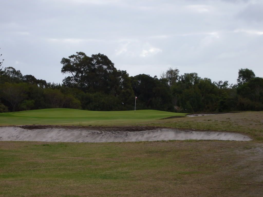
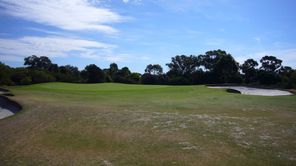
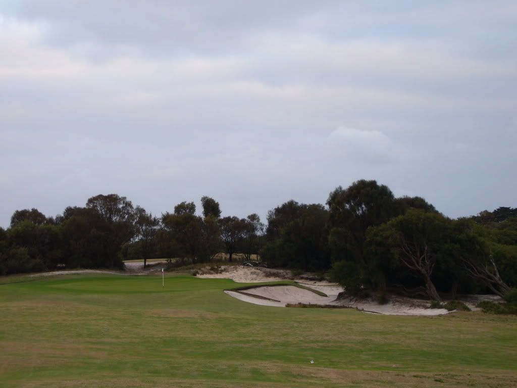
So for now here are a few pictures illustrating what I mean by topline framing:
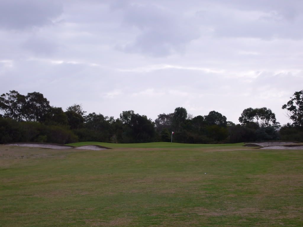


Here "texture" is used with slope to create a visible topline -- note the contrast of grass with trees:
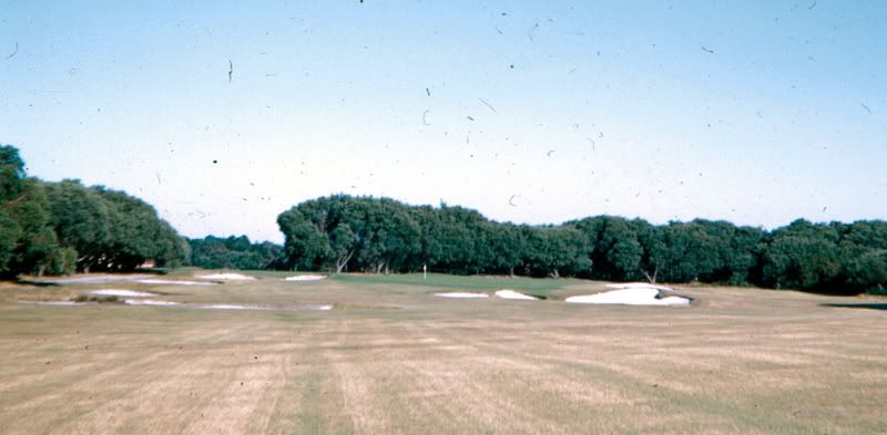


Lastly, my favorite example -- notice how the bunker toplines integrate with the green topline in a continuous sinusoid:


Can you come up with any other pictures, from old or new designs, that illustrate Chippendale green framing and any principles of success I have missed?

Mark

Mike_Cirba

Mark,

Whatchu talkin' 'bout Willis?   ;) ;D

Charlie Goerges

  • Karma: +0/-0
Just so I understand what you mean, are the following examples of what you are talking about?


Severally on the occasion of everything that thou doest, pause and ask thyself, if death is a dreadful thing because it deprives thee of this. - Marcus Aurelius

Adam Clayman

  • Karma: +0/-0
Mark, I'll try to come up with some pictorial examples but it may be difficult considering the courses cited and angle of photos.

First I'd challenge the notion of the good Doctor always having visibility, using the 8th at Cypress Point as i.e.. Granted, the tee shot is blind but the approach is not.

 The 15th's green there is obscured from the teeing ground due to the high lip of the fronting bunkers, but, that may be an evolved look. 

Here's the 13th. Not sure how it fits your criteria but impressive still.


One of the coolest i.e.s of framing is Crystal Downs 17th. The framing comes from the 3 sisters, pictured here on the 5th hole, probably 1/3rd of a mile from the 17th green.


This pic of 17 green barely does the framing justice


Here's another awesome green.


How does it jibe with your query?
« Last Edit: March 07, 2009, 03:04:45 PM by Adam Clayman »
"It's unbelievable how much you don't know about the game you've been playing your whole life." - Mickey Mantle

Mark Bourgeois

This whut I'm talkin bout Mike:


Charlie, not the first one, probably not on the second and definitely the third!

First one has a bunker which obscures any back top-lines that may exist on the left. The line seems to run more through the middle of the green and looks more like a manmade arc than a natural wave.  So: there is a lateral line there, but it does not appear designed as (or effective) as aesthetically-pleasing top line that serves to frame.  (Perhaps "back top-line" is a better description than "top line.")

Second one does seem to have a top line built along the back of the green, although like the first it lacks the naturalistic sinusoidal curve.  Another demerit, as far as this exercise goes, is the positioning of the mound on the left.  It should have been used to extend or highlight the back top-line.  Instead, it forms a line which is then carried into the middle of the green, diluting the back top-line.

The third one, now that one's worth studying. Lovely how the back top-line folds into the woods on the left.

Mark
« Last Edit: March 07, 2009, 03:25:18 PM by Mark Bourgeois »

Mark Bourgeois

Adam,

Many thanks for the help.

Yes, some of those pics seem to capture what I am after, and some of them don't.

For example, Crystal 17 does -- look at the clean back top-line.

But 13 at Cypress -- first, is that the view that approaching golfers have?  If it is, then I would say no, the Doctor chose to build a big, bunker-laden amphitheater to create visibility.  Which is fine, I guess, but not the type of visibility I am thinking of.

(The analogous line at 13 Cypress would be the actual top line in the photo, way above the green.)

I imagine there is an entire taxonomy of how a green's visibility can be enhanced.  Flanking bunkers, big mounds in the back, and amphitheaters are three classes.  But what I am after is a subtle, more economical means of accomplishing what others use these "big" and obvious methods to do.

Another method, which I think probably must go with the Chippendale approach, is tilting the green from back to front.  I think this is neither good nor bad, unless variety is sacrificed for it.  Then it's bad.

Interesting to me that Royal Melbourne West 10, for its marvelous Chippendale, has a steep drop in the back.  And Royal Melbourne West 3, a crazy back-running green, has a lovely front top-line.  It's like turning a Chippendale chair around.

But then, a reverse Chippendale can't really be said to enhance the visibility of the green, just of the entrance to the green.

Mark

PS Having stared at that photo of the Crystal Downs hole with the Scabs for more than a decade, I have yet to understand where the hole is!

Neil_Crafter

  • Karma: +0/-0
Unless I've missed it before, this is almost certainly the first posting of a chair on Golf Club Atlas - so congratulations are in order Mark!

You'll be pleased to know I have checked in on the Chippendale Chair Collector's Compendium website (or 4C as its known by its users) and have posted a picture of a Mackenzie green there for comment - just so the universe is back in balance.

Royal Melbourne West has very few greens where there are bunkers behind the green, whereas Pasatiempo and Cypress Point have a number. Even those greens set into upslopes at RMW like 5 and 6 have no back bunkers. The examples you have shown of Chippendale top lines at the back of greens typically occur when the green falls off at the back, and there are low mound/ridge elements that work up into the green, giving the high points of the Chippendale.

Whether this is a solely Mackenzie phenomenon is up for debate though, I think if you look further afield you will find many examples of this elsewhere. I even found one looking quickly in my own portfolio - my 3rd green at Glenelg GC is one, and I have to say it was not deliberately a homage to either Mac or Chippendale!


Peter Pallotta

Mark - nothing much to add, sparkling thinking as always on your part.

But if you don't mind, I'll take a stab at offering another aspect or quality of the Chippendale green (off just the examples you provide).  It seems to me that their genuis lies in making at one and the same time the green more visible and yet more subtly deceptive. My eye tells me it's because Mac was using a sinusoidal line not only from side to side but also from front to back. The wavy back/top line creates visibility, but is also suggest to the eye that, being a top line, it must be hiding/obscuring what is happening behind it, i.e. hiding all that is not the top line; the bottom line in other words. Because just as the wave looks natural side to side, the eye/mind expects a wave from front to back/back to front, such that we tend to assume that the green falls off dramatically towards the back, even if it doesn't. Or in other words, the trick is that, despite the visibiolity that Mac creates, he puts doubt in my mind about going long....

A ramble and a jumble, sorry - but maybe you can pull something out of it.

Peter

Charlie Goerges

  • Karma: +0/-0
Thanks for the reply Mark, I do think I'm beginning to understand what you mean. I don't have a ton of course pictures, but I was surprised how difficult it was even to find a few possible examples (and only one actual example) of what you are talking about. I guess it's just not used that often.
Severally on the occasion of everything that thou doest, pause and ask thyself, if death is a dreadful thing because it deprives thee of this. - Marcus Aurelius

Adam Clayman

  • Karma: +0/-0
Mark, Thanx for correcting re Scabs. The green is directly over the scabs. In my minds eye the right dot is likely the front of the green and the left, the rear.

The 13th's approach is from much farther left in the photo. The high ridge (former dune I would guess) is mostly left of the green but as you can tell in that photo, it gradually rises from the right and rear of the green.

Subtle, I get it now.

"It's unbelievable how much you don't know about the game you've been playing your whole life." - Mickey Mantle

Sean_A

  • Karma: +0/-0
Neil

I agree with you.  IMO Colt used to this what I call corner mounding to frame greens, but I don't think the idea was over-used. 

Peter

What has always interested me is something along lines Peter is talking about.  The creation of this framing from front to back using mounds and bunkers.  It may not be quite the same thing Mark is on about, but it is related and in to some degree teh idea has a bit more about it.

Notice how the front right bunker ties into back right and left mounding.


Another example of the framing creating, but the framing suggests depth without giving a proper view.


Yet another example but with the idea carried out to all corners extreme.


This example really stretches the front to back aspect of the framing and once again the mounding continues well off the edge of the green to create a sense of something bigger than what is actually there.  In a way many of these examples are anti-framing because they do frame, bt in a bit of a deceiving way.


A great example of spreading the framing from left to right and front to back.  This one has the extra kick of a texture frame job as well with hair on the front right bunker matching the back left.


Finally, here is a not subtle backward version of Mark's thesis which conspires to conceal rather than reveal the green surface.


Ciao


New plays planned for 2024: Nothing

Mark Bourgeois

Here are two additional Mackenzie Chippendales.

With bunker top lines incorporated, alas defeated by a forest:


From his Augusta "High Amplitude Period":


Adam and Neil, interesting to think that Mac favored amphitheater framing in his CA designs, less so in his designs elsewhere.  Could be down to the assistants and partners he chose, or something else.

Neil, in the opinion of the chair, Chippendale framing has been absorbed into your subconscious via extensive study.  Thus Mac's influence at Glen Elg -- the effect akin to Yeats's automatic writing!

Sean, some apparently good examples there, but this one looks more like an amphitheater framing:


Peter, still thinking on that post...

Mark

Peter Pallotta

Sean - thanks for the pics, the insight, and a clear way of saying it, i.e. "framing [that] suggests depth without giving a proper view".

Mark - the Augusta "High Amplitude Period" pic is a good one for trying to explain what I mean - look at how the waves side to side tie into the apparent "troughs" of the wave back left and back right.

Peter

Emil Weber

  • Karma: +0/-0
Great thread and I can't understand why it got lost so fast...
This is Saunton's 5th hole as fotographed from the 4th green:

Mark Bourgeois

Well done, Emil.  I like the concept as an example of energy conservation or minimalism.  There are lots of ways to frame a green, but Chippendale framing is the most efficient in the sense of accomplishing the goal with a minimum of resources. Yes?

As such, the aesthetic is very natural, because at heart nature is very lazy and does not expend any more energy than necessary.

As for why the thread died quickly, it could be that many threads which spur deep thought are regarded with fear and loathing, online miasma not inhaled but absorbed via haptic transmission, spurring Derangement.  And so the slings and arrows launched at the brilliant Chindogu thread (Bob H), the unseemly kink / fetish thread (Rich G), and the Behr handicapping system for BUDA (everyone).

But, come, Emil, let us hold our breath in the presence of this thread, even as it sets below that fresh green breast of a horizon, and remember the last time in history we met something commensurate with our capacity for wonder.

Mark Carraway

Charlie Goerges

  • Karma: +0/-0
The wise person's misfortune is better than the fool's prosperity.

-Epicurus
Severally on the occasion of everything that thou doest, pause and ask thyself, if death is a dreadful thing because it deprives thee of this. - Marcus Aurelius

Mark Bourgeois

What about the fool's misfortune, does he have anything for that?

Charlie Goerges

  • Karma: +0/-0
Just bring the whole house of cards tumbling down why don't you! ;)
Severally on the occasion of everything that thou doest, pause and ask thyself, if death is a dreadful thing because it deprives thee of this. - Marcus Aurelius